weekly[5] & exercise[4]

lim jia sheng,
0344034.
BDCM
.Design Principles
::weekly[5] & exercise[4]
lecture[1]: Harmony & Unity & Proportion
In this recorded lecture, we were taught about the ins and outs of the two above design principles
Harmony
Formed as an artifact when a group of elements share the same value of a property, made more apparent when there are multiple principles of design at play. This loose requirement fosters Variety, as without it, harmony becomes monotony.
(A clearer more refined definition might be Harmony++)
Unity
Formed as an artifact when a group of elements is composed in a balanced way and creating an overarching theme.
(A clearer more refined definition might be Unity++)
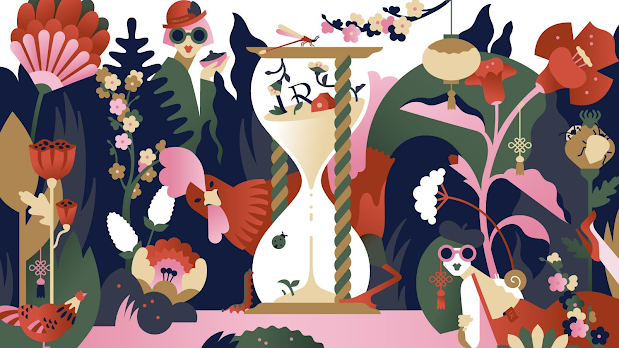
Figure 1.1.1, The best example of an artwork with Harmony & Unity, 23/4/2021
Variety
Formed as an artifact when a group of elements each contain slight changes between each instance (eg. angles, exposure, composition, etc).
Proportion
Formed as an artifact when a group of elements contains relationships between instances of itself, as well as how each of them are compared to each other.
Harmony within Proportion:
Happens when """correct""" relationships between instances of elements with respect to size or quantity.

Figure 1.1.2, My favourite examples from the lecture with Harmonious Proportions, 23/4/2021
lecture[2]: Harmony & Unity++
We started out this live lecture with a brief run through of the self assessment procedures for this module. It was mainly explained to be a self-driven, moderated, gamified, progressive, grading system. A mouthful sentence akin to a gargle certainly has tons more nuances, so there is an accompanying video that we can refer to as well:
Harmony++
Formed as an artifact when a group of design elements contains instances that implement differing design principles, but are bound by Similarity or Repetition — has the same properties or property values. (eg. elements that curve together into one point are bound by their Movement).
Unity++
Formed as an artifact when a group of design elements that are composed in a way which binds them by an overarching attribute. (eg. multiple element groups that curve together into one point are bound by the fact that they're visually clumped together as related, but different, design subjects).
Harmony vs Unity
- Harmony
- Elements are bound between each other.
- Created by differing the properties between instances of design subjects.
- Like a linked list (one node connects to another node).
- Unity
- Elements are bound by a larger """vision"""; by the illusion of a group.
- Created by merging differing individual design subjects to create a composition.
- Like an array (a continuous string/chunk of elements which come together to form a cohesive data structure).
tutorial
We looked at a few artists together that were favourites of my classmates. Names include RHADS, Ilya Kuvshinov, Miles Johnston, & my own pick of Justin Maller.
The main objective was analyzing their works to uncover Harmony & Unity artifacts, as well as how the artist themselves came to that final """conclusion""" of said design principles.
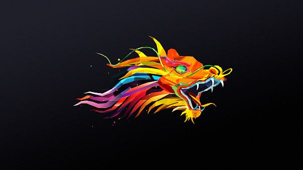
Figure 2.1.1, One of Justin Maller's work analyzed, 28/4/2021
The discussion of the use of polygons and their subsequent creation of harmony & unity was held, with the main point falling to the use of "retro" limitations in "modern" works.
One thing though, was that earlier polygons in the PS1 & old CGI was described to be n-gons (polygons which can have arbitrary amount of sides), while in fact it was most likely they only supported tris & quads (3 & 4 sided polygons respectfully). Big bad n-gons are mostly found in modern 3D apparatuses, as they're a lot more hard to figure out. For example, you can move each point of a triangle & rectangle and still get a flat surface, but try it with a pentagon and you'll quickly bonk stuff up. Even in modern times, n-gons are frowned upon since they can be slower to move around in memory & create bad topology in models.
So, with that rant aside, we move on to... other stuff.
practical
We were given feedback for exercise[3].
exercise[4]: Harmony & Unity
info:
todo:
Create two pieces of design on paper using poster colour or acrylic; one showcasing Harmony, & one showcasing Unity.
todid:
research:
The first thoughts coming into mind for Harmony were "Turbulence Displace" & "Fractal Noise". These are one of my favourite effects in Adobe After Effects, as they generate procedural noise which have the signature """satisfying""" feel.


Figure 3.1.1, Simple distorted procedural fractal noise, 28/4/2021
All the lines and stuff so complex, but they all seem to be in some sort of order, having space in between them, as well as macro/micro patterns. Super nerd shiz but super cool to me!
This brought me into the rabbit hole of finding similar states of order within """noise"""

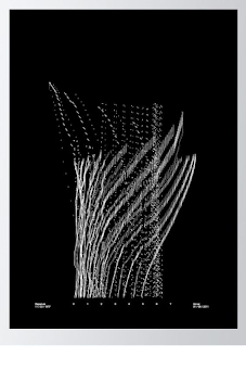

Figure 3.1.2 , Examples of harmonious artworks, n.d
This then brought me into the wild world of spectrography — turning audio into images.

Figure 3.1.3, Example of a spectrogram, n.d

Figure 3.1.4, My attempt of a spectrogram using my own song, n.d
If you can see, or rather not see, I'm not doing that using acrylic. Also, in practice, it looks a lot less cooler than it would leave one to believe. What if, I made my own audio to visual conversion, using the power of human inaccuracy instead?
At this point, I was pretty happy with the material I had for Harmony, so I went on to Unity.


Figure 3.1.4, Examples of unified artworks, n.d
These examples have way more obvious showcases of using Repetition & Similarity to create a collective.
Another after effects plugin actually came into my mind at this point — "Plexus". It's a plugin that (also procedurally) creates points that can be rendered in ways that have lines & facets linking them.


Figure 3.1.5, Simple Plexus cube, 28/4/2021
sketches:
I wanted to make this week's pieces, sorta like a series. They're both based on the audio from a song I made to vent, with the main concept of the artwork being "dried blood". (Can you tell this wasn't a good day xd) They're both a continuation of the concept of "human generated graphics", which I feel is a great way to add an organic element to otherwise mathematical procedures.

Figure 3.2.1, Sketches for Harmony & Unity, 29/4/2021

feedback:
- 5/5/2021
- There is a clear rhythmic aspect to the artworks.
- The exploitation of space is successful, and portrays the principles well.
- "Boop boop" - Dr. Charles.
final:

Figure 3.3.1, Final render for Harmony, 30/4/2021

Figure 3.3.2, Final render for Unity, 30/4/2021
reflection
The main takeaway of this exercise to me was the research, as it felt more like a breaking down of a common idea rather than proposing a new one. This was because it made me notice that I've been using these principles all along, not knowing their nuances. I learnt that distinctions between Harmony & Unity are subtle, but that just makes it even more interesting when used mutually exclusively. At the end of the day, knowing the true definition of a mystery not even known, will enable me to better optimize & execute my future stuffs.
Comments