weeklies & exercises

0344034.
BDCM
.Illustration & Visual Narrative
::weeklies & exercises
weekly[1]: Introduction
In this live class, we were introduced to Ms. Anis, which some of us had previously met in orientation as well. She brought us through the regular spiel of class communication channels and project briefings. She also showed us some of our seniors' work, which was pretty intriguing to say the least. One more piece of information was the theme for project 2 — one shot (all 3 acts in 1 chapter), slice of life, & feel good — pretty cool.
Other than those, there wasn't any hardcore teachings in this class, as its point was just to familiarize us with things and act as a buffer/filler until everything was prepared and up to snuff. We were left with a task though, to sketch out ideas in preparation for the first exercise — the Vormator challenge — which is below.
weekly[2]: Characters
In this live class, it started out with a padlet where all students put their favourite characters. Some of us were then asked to correlate their design with their personality traits. A few examples given were:
- Lion from Steven Universe
- Is grand — has a mane
- Toad from Mario
- Cheerful — smiling facial expression
- Clumsy — designed using round shapes
This segway-ed into the main properties in creating a character.
Shapes
The general shape of a character can portray their personality (eg. square shapes showcase balance, round shapes showcase softness, bottom heavy shapes showcase stability).
One cool artifact of these designs was noted to be how good characters have balanced designs, while the bad characters have imbalanced designs (which creates tension/uneasiness).
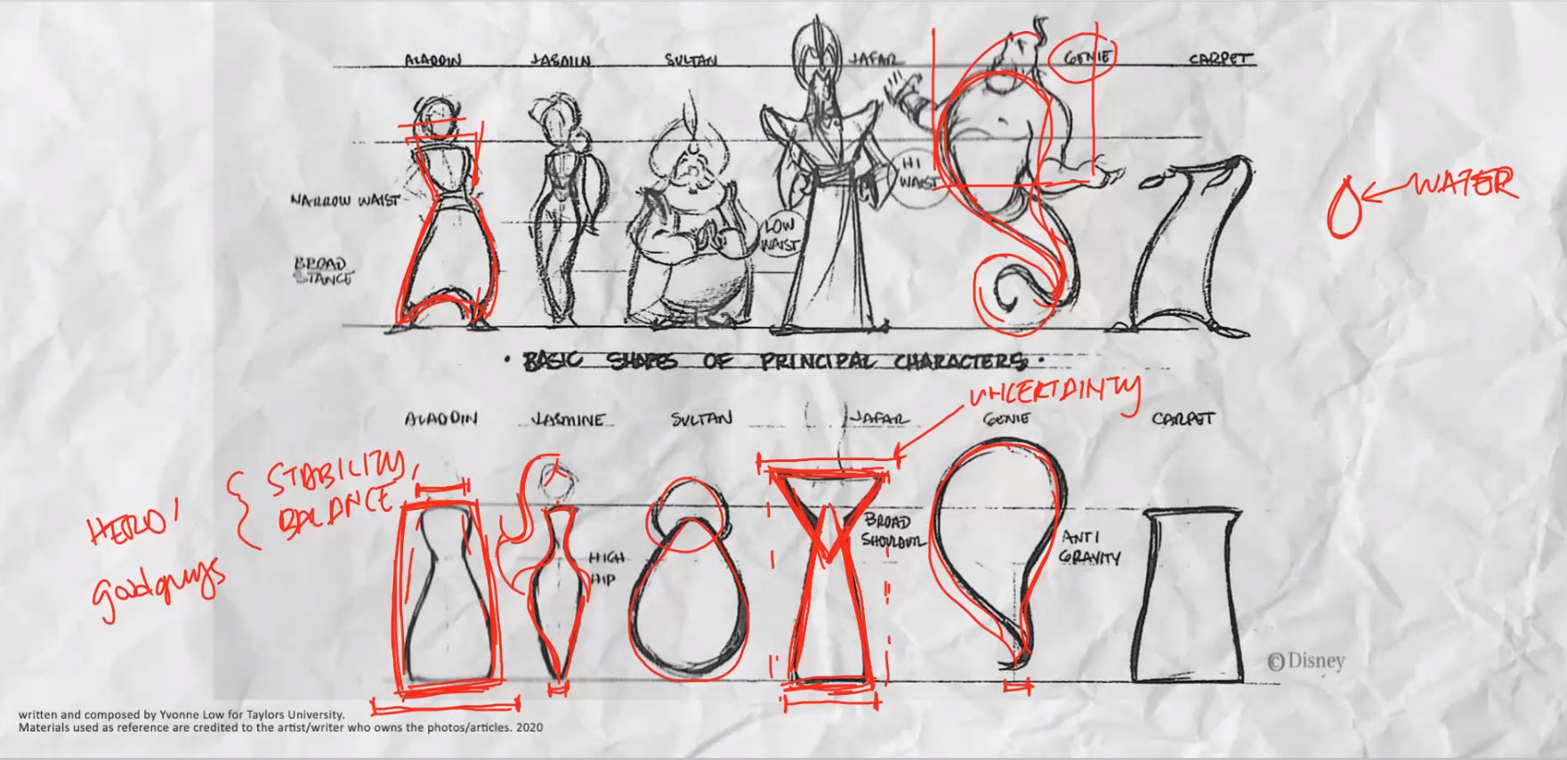 |
Figure 1.1.1, Examples of characters with their correlated shapes, 9/4/2021 |
Colour
Colour can express emotion. Good characters normally inherit bright colours, while bad ones inherit darker colours. This extends to the general palette of a visual story as well (eg. cold colours == sad story, bright colours == happy story).
 |
Figure 1.1.2, Colour wheels that can be used in character designs, 9/4/2021 |
Emphasis & Contrast
A good character design will have an emphasis on a visual element, that's usually exaggerated. This also applies to the composition of the characters, with different properties of characters framed together (eg. big character with small character, flat character with solid character, round character with square character).
Harmony(/Visual Heirachy)
Elements of a character should be put together to complement each other (eg. boring shape offsetted with expressive eyes). Then, their position relative to each other drives the eyes to explore the character, and enable the audience to digest what they're trying to express quickly.
Expression/Poses
Posing expresses the personality of a character through their quirks in their movements.
Chiaroscuro
Chiaroscuro was described as the artifact of an image with one strong light source.
weekly[3]: Composition
In this live class, we started out with a question — why do some visuals look better than others? Well, a combination of good Composition and design principles. More specifically, things like contrast, hierarchy, & balance created by the placement of design subjects.
 |
Figure 2.1.1, Quick analysis of the design principles created in an image, 16/4/2021 |
types:
 |
Figure 2.2.1, Types of composition, 16/4/2021 |
- Establishing — shows something the first time
- Bird's eye view — shows scale
- Framing — shows something secretive
- Medium — shows the character, and introduces them
- Close-up — shows a subject to create emotion
- Worm's eye view — shows drama
Positive & Negatives (B/W composition arrangement)
- Positive — bright parts a composition
- Negative — dark parts of a composition
If a composition works in greyscale, then it'll most likely work wherever. Mainly focuses on the visual hierarchy that tells the story the best. Commonly used in industry as a drafting medium. The B/W associations with Negative/Positive can be inverted as well, when they swap roles of who's acting as the focal point (eg. a picture with a silhouette and a bright background will have a dark Positive and a bright Negative).
Fore/Mid/Back-ground
Can be very helpful in setting up a scene with a character, especially for world building. A character in the foreground automatically creates hierarchy through the perceived depth that drives the viewer's eyes.
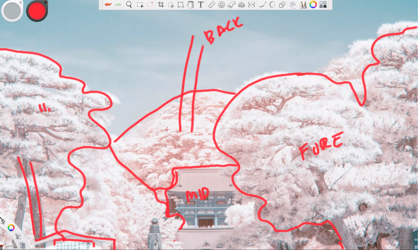 |
Figure 2.3.1, An image with |
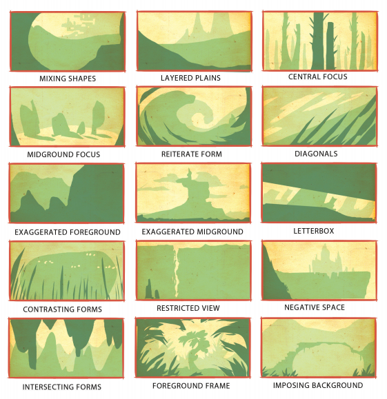 |
Figure 2.3.2, Types of |
weekly[4]: Perspective
This live lecture started with some history on perspective, and then continued with a whole deep dive on perspective itself.
history:
Before 14th century, paintings were rich with many types of paints & decorations, but perspective weren't used and that made them look """low-key dorky""". This all changed when Fillipo, the architect came onto the scene using linear perspective on their paintings, inspiring the rest of time.
 |
Figure 2.4.1, |
definition:
An illusion that creates depth through the representation of 3D objects on a 2D frame.
types:
- 1 point
- 2 point
- 3 point
- 4-5 point (fisheye)
To differentiate between types, we'll have to look for the number of vanishing points — points where illusory lines end.
![1-point $weekly[4]:Perspective example, n.d](https://blogger.googleusercontent.com/img/b/R29vZ2xl/AVvXsEg_eBO27bVl9PiceMWaW05_HMUz5QAHohKpps736A7VF6gf1yrXLYPhv6nd1ZTDmexL88inKsSCS6mu12EyTV2xpw_RVWuMT0b98rtxA7Yp3ePwnxSIPhYOYMz6DKTAiSc1qpNfnifIgejx/w1300/image.png) |
Figure 2.5.1, 1-point Perspective example, n.d |
![2-point $weekly[4]:Perspective example, n.d](https://blogger.googleusercontent.com/img/b/R29vZ2xl/AVvXsEig3LJuVCWQWMbumqS8gIFIWGfgE7KK4kfRU3P9-ddg1-tB6hKmN1vy2mWKBrlWBp5yj9UvPTdJmRBhpHZdqaRPlr-4ZwJpQeZaT_tu-0d-2GsDbBQSzRQyTfj-tnhfwnxVgJIW_0Xk-_yt/w1329/image.png) |
Figure 2.5.2, 2-point Perspective example, n.d |
Parallax (Fake Perspective)
Achieved by layering different layers that portray depth. Commonly used in comics. As long as a pseudo foreground, midground, & background are presented, depth will be created.
 |
Figure 2.6.1, Example of piece using the parallax effect, n.d |
We were then given a small task to create 3 sketches using perspective, showcasing a character in 3 different """shots""". I went with the character from the previous exercises — "Sharc"
Figure 2.6.5, My sketches with different perspectives, 23/4/2021
Outline Stroke
Creates a path with fill, from a path with stroke.
- Pros
- Little work needed to create something up front.
- Cons
- Slow to handle down the line, because the geometry is dirty with many anchors.
Tips for Shaded Stacked Elements
- Use "Multiply" for shadowed gradients (colour → black gradients), on top of background.
- Use "Paste in Place" for easy duplication.
- Use "Transform" right click functions on patterns applied to create variety.
- Apply Chairoscuro shading using separate shapes, gradients, & "Multiply"
- Group it when its done to turn it into an asset.
- Dim subjects which are further away to create a pseudo-depth effect
Depth of Field (DOF)
Blurs design subjects out of the focus plane to create emphasis on the important layer (normally midground). Can be achieved by using "Gaussian Blur" effect.
 |
Figure 2.7.1, Mix of all the techniques above, 23/4/2021 |
exercise[1]: Chiaroscuro Pear
todo:
- Create an illustration of a sliced pear using chiaroscuro techniques.
todid:
 |
Figure 2.8.1, Chiaroscuro pear, 11/4/2021 |
 |
Figure 2.8.2, Sliced Chiaroscuro pear, 11/4/2021 |
 |
Figure 2.8.3, Coloured & sliced chiaroscuro pear, 11/4/2021 |
exercise[2]: Colour Mangling
todo:
- Experiment with clipping masks & textures.
todid:
We first went on texture hunting, on which I found a few cool textures.
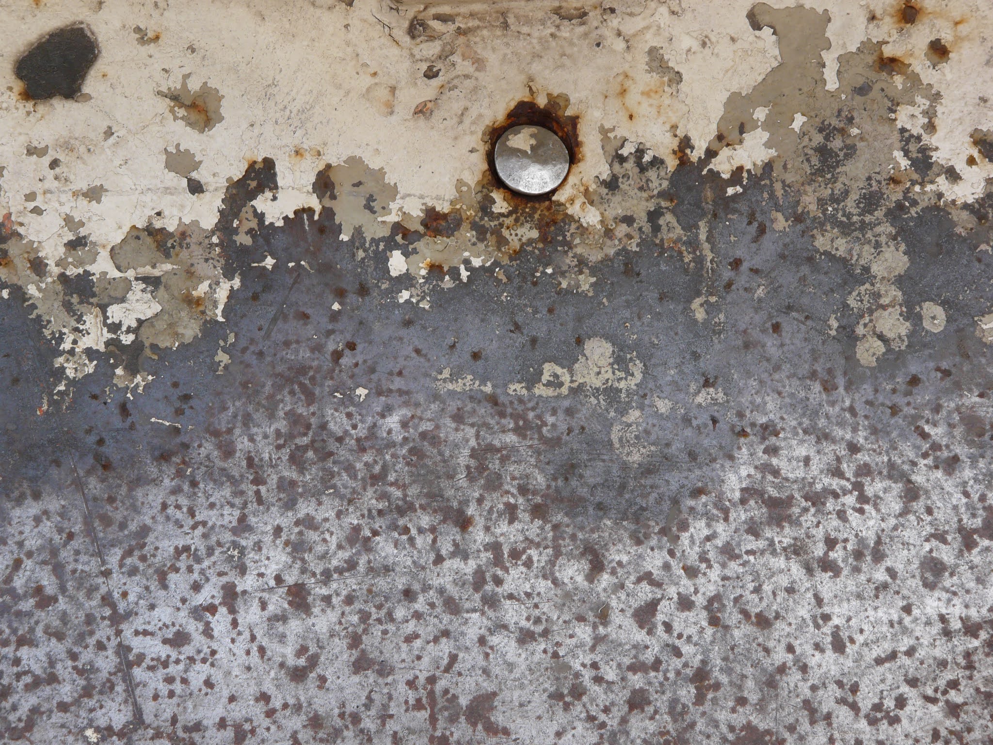 |
Figure 2.8.4, Corroded metal texture, n.d |
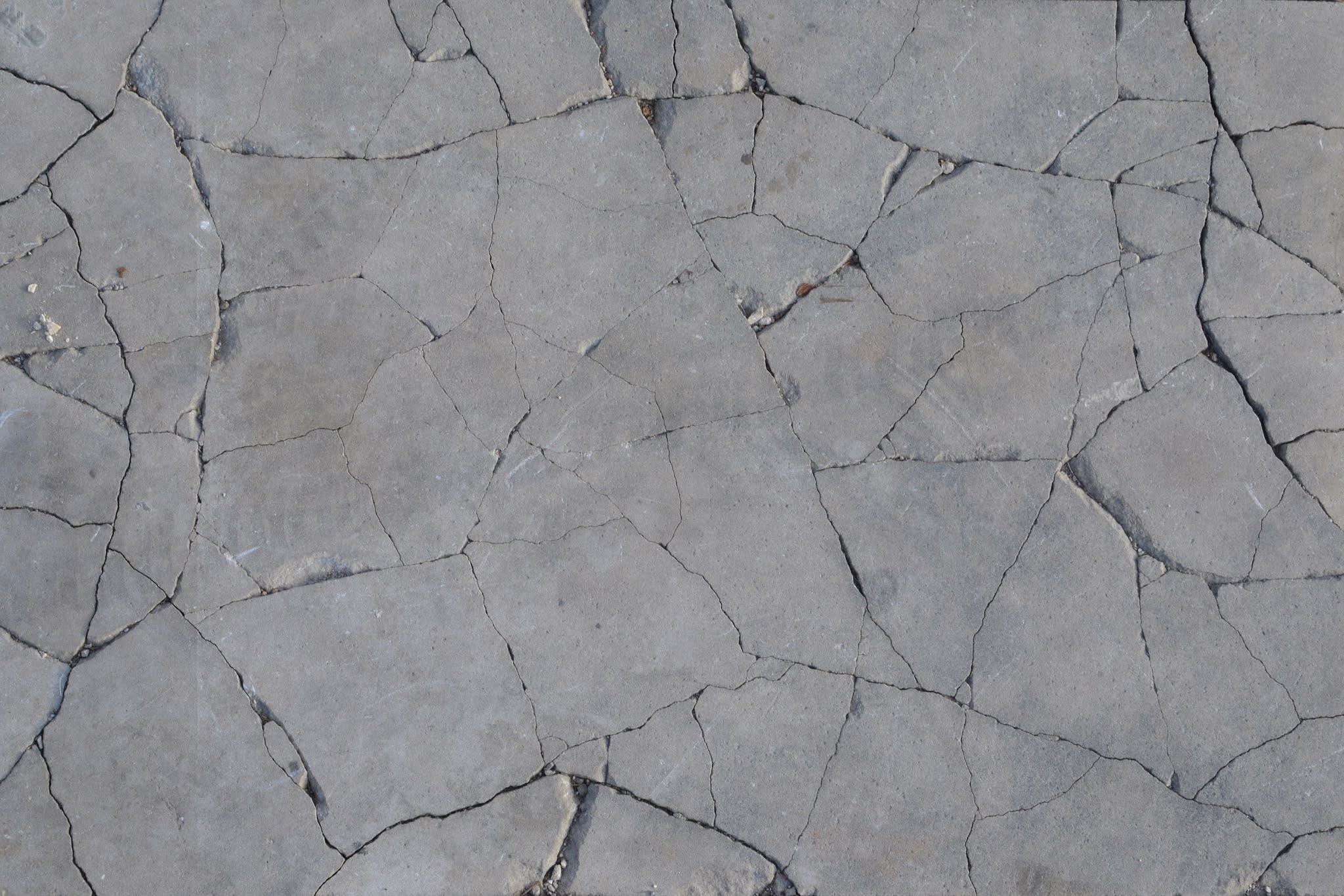 |
Figure 2.8.5, Cracked concrete texture, n.d |
Then, we experimented with gradients with the textures.
 |
Figure 2.8.6, Masked textures, 16/4/2021 |
 |
Figure 2.8.7, Masking experimentation, 16/4/2021 |
After that, we pulled out the chiaroscuro pear from last week, and gave it a few touches by adding cool textures & gradients onto it.
 |
Figure 2.8.8, Textured Chiaroscuro pear, 16/4/2021 |
exercise[3]: Chiaroscuro Me
todo:
- Create an illustration of me under chiaroscuro lighting.
todid:
I started out finding a picture of me. I ended up deep frying this as it had the most """posed""" pose, which would show up the best after simplifying.
 |
Figure 2.8.9, Deep fried me, 30/4/2021 |
I then dumped it into Illustrator & startedsufferingtracing.
 |
Figure 2.8.10, Shapes inside Illustrator, 30/4/2021 |
 |
Figure 2.8.11, Chiaroscuro me, 30/4/2021 |
reflection:
// todo
Comments