task[3]A

0344034.
BDCM
.Typography
::task[3]A
instructions:
project[2]: Type Design & Communication
todo:
- Analyse & deconstruct an existing font.
- Create our own font consisting of the characters — 'a', 'i', 'm', 'e', 'p', 'y', 't', 'g', 'd', 'o', 'b', '!', ',', '.'.
- Create a poster showcasing the typeface.
research:
I started things out with an idea. I like monospaced fonts, & also serif ones, combining them couldn't be too hard right?
As usual, starting out with some general scouring of the web to find inspiration, it became quickly apparent that "serif monospace" wasn't a common combination. A few forum threads in and apparently "slab" instead of "serif" variants were more common. What's the difference? Serif typefaces generally have curved serifs, while slabs have fixed height straight ones. (At least I think that's the difference, some places online hint that slabs are only historically categorized this way, & in modern times just describe any font that's heavy?)
With the target locked down, I went to hunt.
 |
Figure 1.1.1, Iosevka Slab Serif, 24/4/2021 |
 |
Figure 1.1.2, ITC Souvenir Mono, n.d |
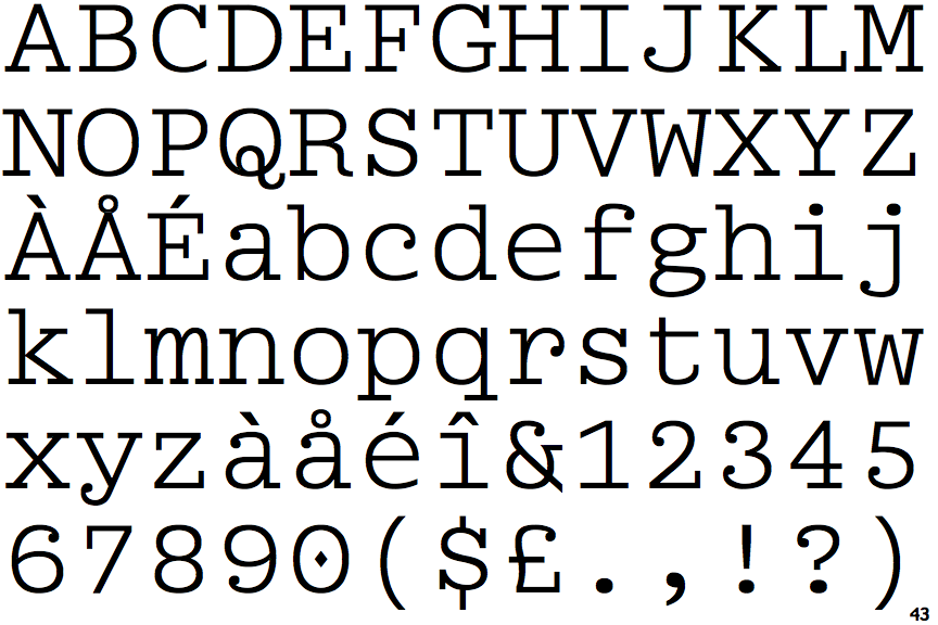 |
Figure 1.1.3, Briem Mono, n.d |
 |
Figure 1.1.4, Adore Mono, n.d |
deconstruction:
With my idea fragmented between slab-serif, monospace, & serif, I did what a sane person would do, & deconstruct all three.
General
takeaways:
- There are many places where the stroke is shrunk/grown to accommodate for perceived weight balance, eg. point where the bowl meets stem, sides of counters, etc.
- Curves are rarely properly circular, & will be rotated/squashed/aligned to the stems.
- Stems will maintain the same thickness throughout the typeface, but it might not be true for every other part.
- Serifs/slabs are asymmetrical.
Slab-serif
 |
Figure 1.1.5, Serifa Std deconstruction, 22/5/2021 |
takeaways:
- Slabs are all the same thickness.
- Slabs & stems don't have the same thickness; slabs are thinner.
- Slab widths aren't the same as stem widths.
- The ascent line is a lot shorter.
Monospace
 |
Figure 1.1.6, Space Mono deconstruction (monospace), 12/5/2021 |
takeaways:
- Body widths are not actually the same, only the full letter including its spacing is.
- The small little gaps are uniform, & used to make the letterform look lighter than it is.
- The tail of the 'y' is thinner than the stroke width.
- The overshoots are relatively larger.
Serif
 |
Figure 1.1.7, Baskerville Old Face deconstruction, 20/5/2021 |
takeaways:
- There are a massive c*ck load of minor adjustments/accidents made to the individual letters, eg. the two counters of 'm' are not the same width.
- Has the shortest x-height & tallest ascender height.
- Some top serifs are diagonal.
sketches:
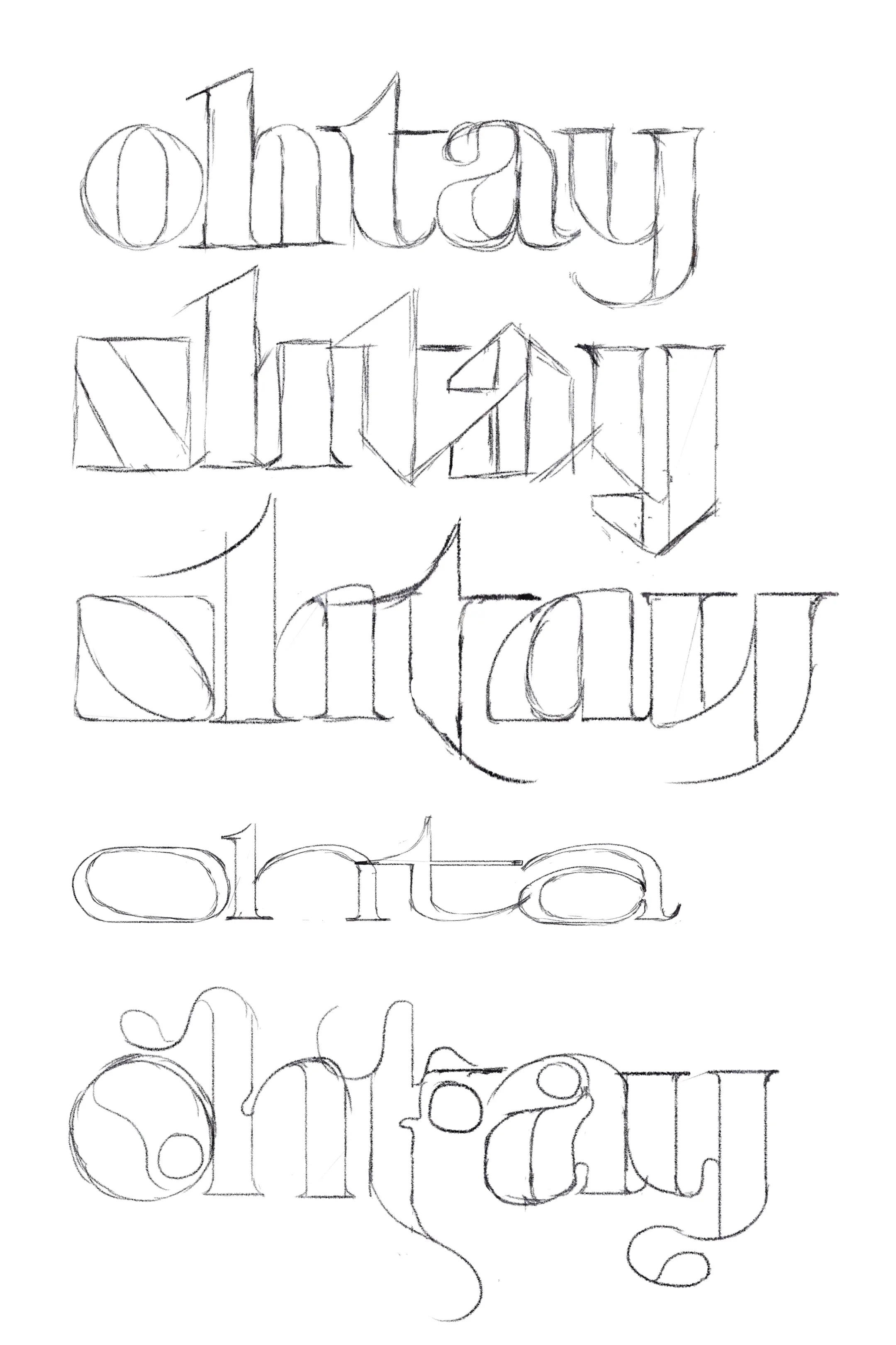 |
Figure 1.2.1, Sketches, 22/5/2021 |
The reason I chose these few letters was because Mr Vinod said these were the letters a typographer starts with then they're making a typeface.
The typefaces I came up with aren't the most legible, but they're bold & I think pretty interesting to execute.
_1.webp) |
Figure 1.2.2, First digitization attempt, 23/5/2021 |
It was here I found out that kerning it was kinda difficult, as the 't' didn't seem to want to sit right. (oooo foreshadowinggg...)
 |
Figure 1.2.3, First digitization draft, 25/5/2021 |
This was a long & painful process, as there was a lot to keep in mind about — width, weight, overshoots, thickness, etc. After that, I """baked""" it by joining the miscellaneous shapes & prepared to dump them into a font program.
The font program started out, horribly honestly. FontLab 7 was super slow on my computer for some reason, FontLab 5 had a UI made for dumpster cyborgs, & FontForge... we won't talk about FontForge, its an experience that I wouldn't wish on my worst enemies. I managed to get FontLab 7 to behave, but copying to it was still super finicky, as it was insistent on placing the copied elements on the middle relative to the viewport, instead of the glyph.
A tedious process & a half later, I went to work on the kerning.
 |
Figure 1.2.4, Working on the kerning, 26/5/2021 |
Here, it was when the monospace decision peeked its questionable head out. Overall it looked, surprisingly well balanced, but with certain combinations, it looks wonkier than a bridge made out of faith in humanity.


Figure 1.2.8, Wonky combinations, 26/5/2021
...Where do I start?
ugly:
- t
- The circle element was used to balance our the weight of the stem, shifting weight awkwardly.
- The monospace weighting with serif attributes combines like vomit.
- The stem was way more off-centre than it should be.
- The pseudo-tail didn't contribute to balance.
- The crossbar is above x-height (yeah this is my bad).
- i
- Learned that it's not shouldn't be centred; needs the bar to be almost left-aligned in monospace typefaces.
- The foot is distractingly wide.
- Still looks imbalanced even after the massive shoulder.
- b/d/h/y/o
- Inconsistent (!!)
- Initially I wanted the typeface to be sorta asymmetrical, with the left facing letters having different counters to the right ones, but that didn't work at all, forcing them to all just be jumbled.
- The previous version of 'o' was wider also (refer to sketches), forcing me to use the full width counter variant on all of the ones that would've used the 3/4 version (eg. 'a' is 3/4, e is 4/4).
To fix the ugly though, I had 2 options. Either make ligature variants to fix weird kerning pairs (like this: fi), or make better letters.
Here are some better letters:
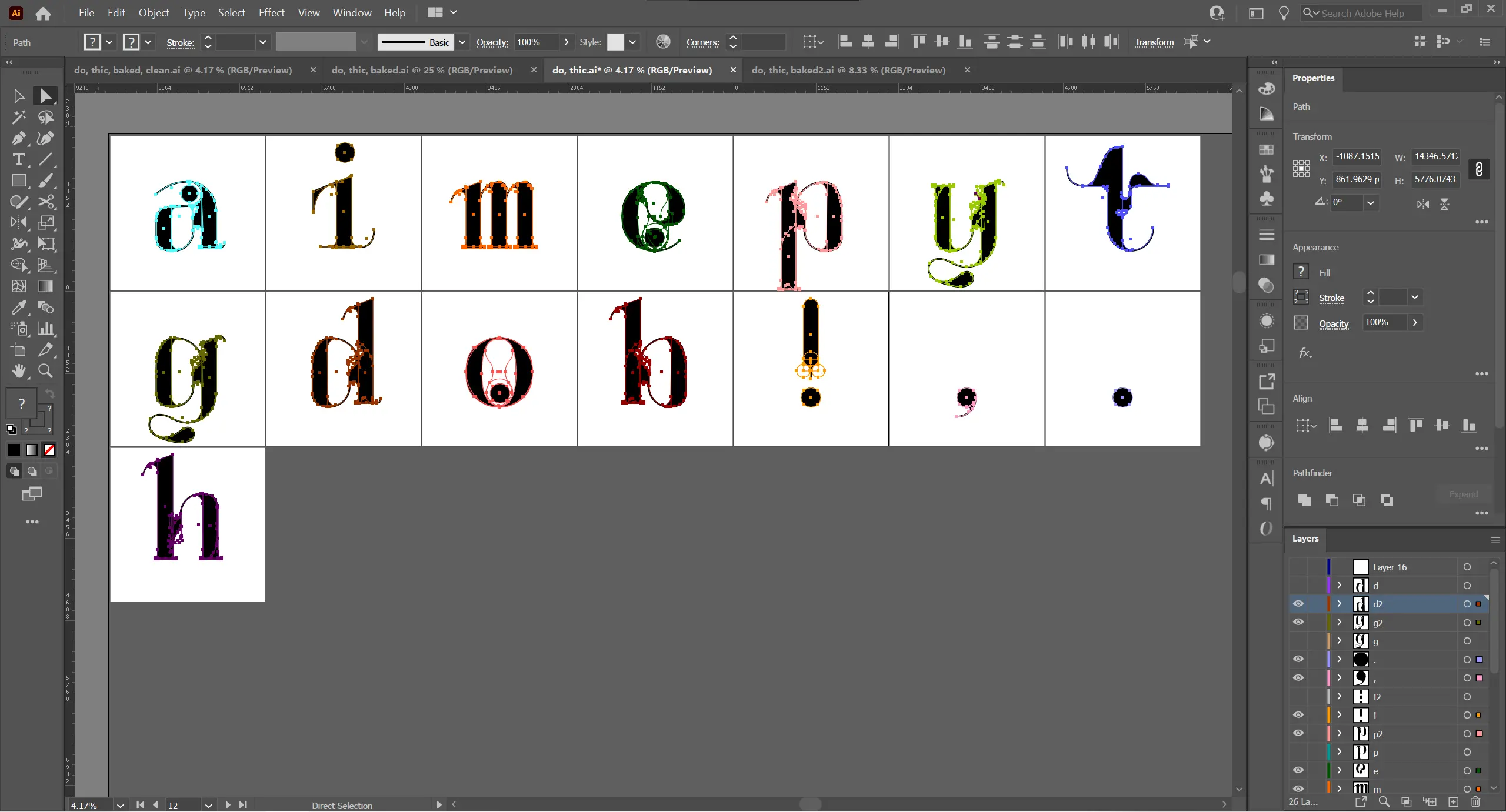 |
Figure 1.3.1, Better letters, 28/5/2021 |


Figure 1.3.5, Improved wonky combinations, 28/5/2021
Not perfect, but a lot better in my opinion.
changes:
- t
- The crossbar is now within x-height.
- Added the thick top thing which is present in serif fonts (Baskerville & Garamond).
- Shortened pseudo-tail & made it contribute to the weight distribution, as found in normal monospaced typefaces.
- The right edge of the stem is now centred.
- i
- Made the bar slightly less wide.
- Curved right side of foot & shorten left foot to offset weight added by shoulder.
- Reduced the height of the curves at the foot.
- b/d/h/y
- Remake to use the same counter style as 'a'/'e'
Upon typeface completion, we needed to create a poster. I started out with moving things around, & ended up with this:
 |
Figure 1.4.1, poster-01 |
Feedback was given for this, mainly talking about how there was not enough emphasis on the type. I thus took out most of the unneeded things & was left with what you can see in the final.
feedback:
- 25/5/2021 — sketches
- The last sketch was approved & noted to be very decorative.
- A problem brought up might be the potential readability of it.
- 1/6/2021 — digitized
- The typeface was noted to be good, and would be nice to have all the characters finished.
- 1/6/2021 — poster
- There are too many non-objective elements.
- The type should be bigger to showcase the intricate details.
playground:
Try typing characters from the set — 'a', 'i', 'm', 'e', 'p', 'y', 't', 'g', 'd', 'o', 'b', '!', ',', '.' (+ 'h').
final:
 |
Figure 1.5.1, Final strip from Illustrator, 1/6/2021 |
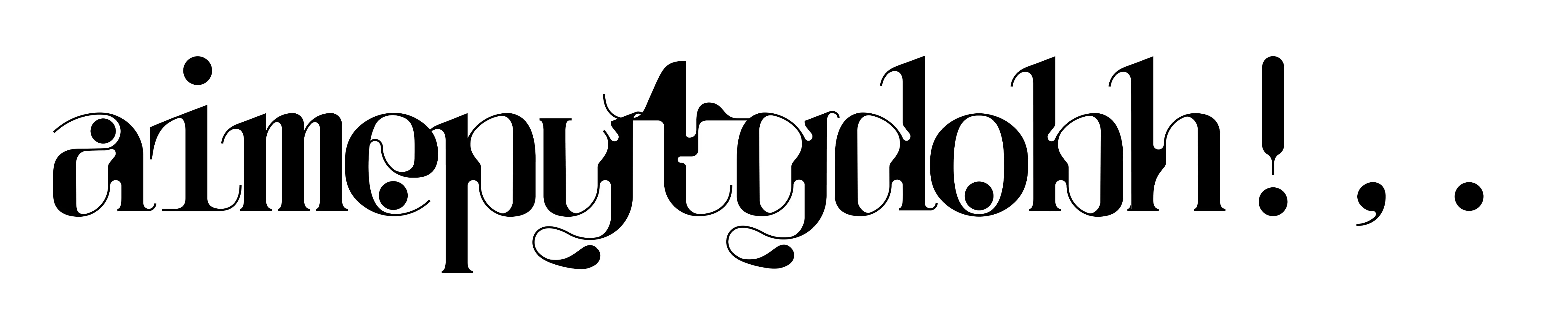 |
Figure 1.5.2, Final kerned text, 1/6/2021 |
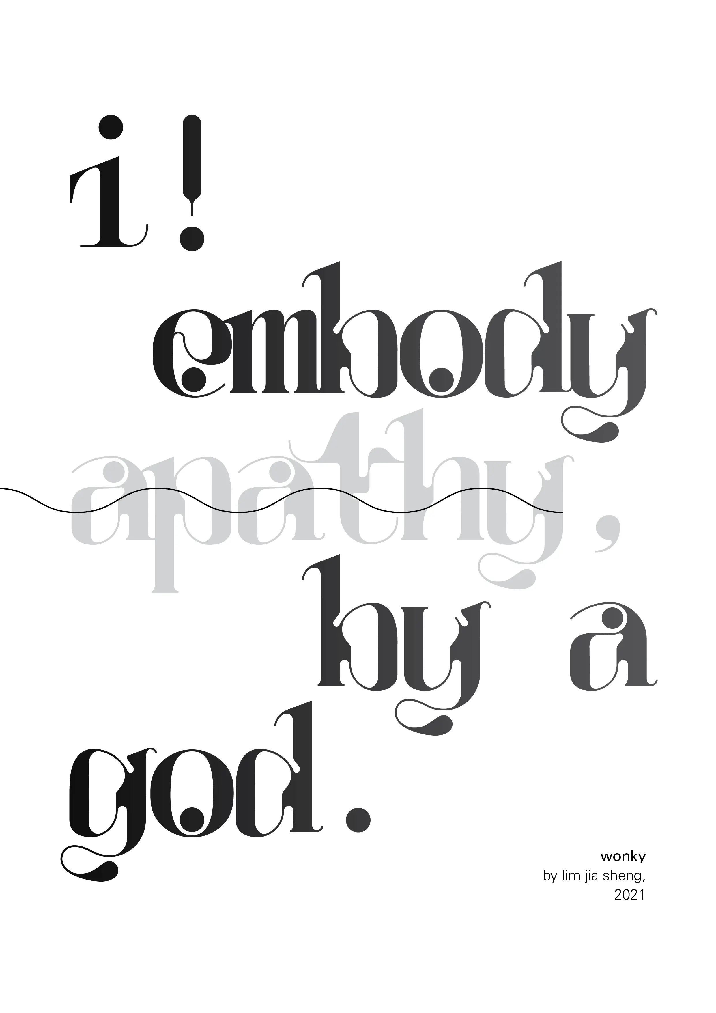 |
Figure 1.5.3, Final poster, 1/6/2021 |
Figure 1.5.4, PDF versions of all the above, 1/6/2021
reflection
My experience in this project is almost 100% positive. The main pain points were all technical. Fontlab being a sh*tshow, Illustrator working as well as a paraplegic swimmer, & my own lack of experience when it comes to complex fonts. Do I think if I was a little too ambitious in making my first fancy typeface, both monospace AND serif? Yes. Do I regret it? Not really. I still find that I learnt a lot.
Firstly, the largest thing I found was by far how much attention to detail & tedious shaping it goes into crafting a timeless typeface. I already had a pre-existing idea, but it wasn't until I was immersed myself into the super technical twists & curves that it gave me an even larger appreciation for typographers that are able to balance aesthetic & readability. Secondly, the largest practical takeaway I have is the ways unconventional typefaces like the mine take to have a consistent weight. From stem weights to curve angles, the number of properties are almost countless.
Overall, This task has definitely crammed information about type making into me. I've always found that this activity super fun, but everything surrounding it, from technical to superficial, became a roadblock, & I'm glad I got to continue my exploration into this art. "What's a pretty face without what's behind it?" A good typeface will always look great, but if they read great & if they inspire are separate questions. Who knows? Maybe one day I'll even have one to my name.
further reading
Introducing Space Mono a new monospaced typeface by Colophon Foundry for Google Fonts
 |
Figure 1.6.1, Cover of "Mono Space, Space Mono", which the essay above is taken from, n.d |
This essay talks about the behind the scenes construction of "Space Mono" for Google Font's 2016 relaunch. It describes how it turned Space Grotesque into a fully geometrical monospace potion. Their drive for a display-oriented monospaced typeface instead of a text-intensive optimized path directly influenced my typeface. It also includes a bunch of super interesting historical, typographer nerd stuff that I find actually super interesting too.
Font design: 17 top tips to create your own typeface
 |
Figure 1.7.1, Monospace? More like My menace... space, n.d |
This is a pretty comprehensive article that talks about type creation. It takes one through the entire process, start to end, including all the conceptualizing stuff. One of the most important parts I think are the ones that fall into the category of "post-processing". It mentions "testing out words", as well as "scaling it down", both super useful to get a feel for the final typeface's good & bad attributes, as well as directions to move forward.
The best and worst fonts (and why they’re good or bad)
 |
Figure 1.8.1, Screengrab from the article, 29/5/2021 |
This article is actually awesome. It lays out objectively what makes a good typeface, & what ruins it. Albeit some are from a non-technical view that might not be applicable to the ones designing typeface, compared to the ones using them, but a fully painted picture is still better than half. It goes into detail about example typefaces & why they're great (eg. Futura has great kerning, Bodoni's super balanced, etc). It also goes into detail about why some types are bad, which is really interesting. The point that caught my attention the most was "Fauxotic™ fonts". These describe fonts that attempt to rip off other media (culture/personality) to stand out & be less boring. Examples of this were Comic Sans, Courier, Papyrus, & Bonzai letters. All in all, it definitely gave me a good sorta ruleset to keep my own typeface in line.
Comments
"A good typeface will always look great, but if they read great & if they inspire are separate questions." It's inspiring too. Heck, you make me want to be a better CS student hahahah (cries)
That's all, I shall continue to stalk your blog~
All d bestt