task[2]

w[5]—w[8].
lim jia sheng,
0344034.
BDCM
.Typography
::task[2]
lectures
weekly[5]: Letters
In this recorded class, it mainly focuses on our understanding of letterforms.
Asymmetry in Letterforms
Certain uppercase letterforms may suggest symmetry, but is in fact asymmetrical. Main differences may include obvious ones like stroke weights, or less obvious ones like the arc circumference of each bracket connecting serifs to the main body.

Figure 1.1.1, Uppercase "A" of Baskerville, 7/2/2020
The differences can even be found hidden in plain sight, with the widths of slopes being thinner ever so slightly to maintain internal harmony & the type's expressive qualities.

Figure 1.1.2, Uppercase "A" of Univers, 7/2/2020
Character-building in Letterforms
What a character expresses all comes down to the details, eg. how the stems of the letterforms finish, & how the bowls meet the stems. These details are what separate seemingly similar typefaces from one another.

Figure 1.1.3, Lowercase "a" of Helvetica & Univers respectively, 7/2/2020
An important piece of information laid out here was also how new designers tend to """oversaturate""" their first typefaces to the point where it seems obfuscated. A good note I feel like was to keep things simple & not make too many changes at once.
Maintaining X-height
X-height generally describes lowercase letterforms, but some curved strokes of them must rise above the median line/sink below the baseline, in order to appear to be the same size as the vertical/horizontal strokes they adjoin (eg. "s", "r", "a", "o", etc.).

Figure 1.1.4, Lowercase letters with regards to their median & base lines, n.d
Counterform/Counter
The easiest way to describe this, is the space between & inside of the letters when they're joined together forming words. Letters like lowercase "r" have no inner Counters, and thus are more sensitive to how well it hangs together with other letters; how well it can be read.
Understanding form & Counterform can be done by examination of letterforms up close, giving the observer a more detailed understanding of the letter's unique characteristics, as well as a peak to the decisions made that affected it.

Figure 1.1.5, Counterforms of several letters, 7/2/2020
Contrast
Contrast can be created as an artifact from many different properties of a letterform.

Figure 1.1.6, Variations of Contrast in type, 7/2/2020
weekly[6]: Typography in Different Media
In this recorded lecture, it focuses on the digital & analogue versions of type; screen & print versions of type.
Historical vs Current Typography
- Historical
- Medium was paper.
- No further changes after it was edited, typeset, & printed onto its medium.
- Predictable, typesetter is 100% responsible of the result.
- Current
- Medium is screen.
- Subject to constant change on its medium (eg. OS, system fonts, screen/viewport itself, etc.).
- Unpredictable, can be affected by parameters outside of the typesetter's control.
Print Type vs Screen Type
- Print Type
- Mainly uses classic & versatile typefaces.
- Desirable characteristics:
- Elegant
- Intellectual
- Readable at small font sizes
- eg.
- Caslon
- Garamond
- Baskerville
- Screen Type
- Uses new optimized/modified typefaces for onscreen readability & performance.
- Desirable characteristics:
- Taller x-height(/reduced ascenders & descenders)
- Wider letterforms
- More open Counters
- Heavier thin strokes & serifs
- Reduced stroke contrast
- eg.
- Verdana
- Georgia
Hyperlink
Is a word/phrase/image that redirects a user when clicked to a new set of content. They're found in nearly all web pages & are usually blue and underlined. Another expected behaviour is for the cursor to change to a pointer when hovering over a hyperlink.
Font Size for Screen
16px on a screen is similar to size of text printed in a book or magazine when accounting for reading distance. This is because we read books (set at 10pt) only a few inches away from our eyes, compared to screens (set at ~12pt) being about arms length.
System Fonts vs Web Safe Fonts
- System Fonts
- Come preinstalled on one's OS.
- Can differ slightly based on their environment.
- eg. Windows vs Mac vs Android vs iOS using different fonts for the "serif" font setting.
- Web Safe Fonts
- Served by the website instead of relying on the base system.
- Will be consistent among environments.
- eg. An obscure font won't fallback to the system's default type when not found on a system.
Pixel Density Differences Between Devices
Pixels are differently sized based on the device one would be reading type on (eg. TV's has less density vs phones).

Figure 1.1.7, Average pixel densities across devices, 26/2/2020
Static vs Motion
- Static
- Minimal expression characteristics.
- Only features traditional characteristics (eg. Bold & Italic).
- The impression left by static type depends on the emotional connection of viewers.
- Motion
- Increased expression characteristics.
- Enables type to be expressed with another temporal dimension (eg. animation & motion graphics)
- Used in:
- Movie titles
- Brand identity
- Music videos
- Advertisements
- Can be used to invoke impressions & prepare the audience for what comes next, instead of relying on the surrounding content.
instructions:
project[1]: Typographic Exploration &
Communication
todo:
Create a two-page editorial spread using only type & minor graphical elements, containing the heading, subheading, & body content provided.
todid:
research:
I went scouring a little for editorial spreads or just general graphical layouts that I found interesting.
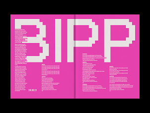


Figure 2.1.1, Various layout inspirations, n.d
Looking through the things I saved, it would seem like I really liked the concept of body content eating into text, as well as the relatively mono-spaced looks of the heading types.
I also found this, which was basically a dump of "codes". Kinda an awesome concept for one of the titles — "Be Good, Do Good, Follow The Code."

Figure 2.1.2, Lenguaje Invisible by Jorge Torres, 5/8/2019
Another concept that might do well is if I fit the heading within a comment block of common coding languages (C, C#, C++, Java, JavaScript/TypeScript, CSS); within "/* */". I wanted to use straight up mappings to code dialects, but changing the writer's content was noted to be a big no-no, so I think this is a good alternative to deliver the """code""" part of the heading.

Figure 2.1.3, Example of a multiline comment in JavaScript (JSDoc), n.d
Another possible idea would be for this message to be targeted at an AI, to """instruct""" it to follow its programmed code. Super cool, but being restricted to minor graphical elements & no images will make it pretty challenging.
Out of all the challenges though, is going to have to be finding a way to make proportional fonts act in a way that looks authentic to any message that I would like to portray.
sketches:
Starting things out just trying to barf out ideas based on what I had before. Initially I tried to do it by hand, rendering text using drawing, but that was kinda just super inefficient as most of the time used trying to lay things out/find ideas were wasted on drawing characters 1 by 1.

Figure 2.2.1, First attempt at editorial spread, 30/4/2021
While doing the above sketch though, it also became more and more apparent that I'm definitely not getting away with anything even close to monospace with the typefaces provided. I had to pivot.


Figure 2.2.2, Various attempts at an editorial spread, 1/5/2021
Ah yes, my good old friend Adobe XD, this abusive relationship never fails to deliver. It's very much not built for what this is, but it works well enough and is quick to use, so it's here.
Feedback was given for these attempts, refer to feedback.week[6].

Figure 2.2.3, Updated previous attempt series's no. 2, 4/5/2021

Figure 2.2.4, RC layout design, 5/5/2021
Feedback was given for these attempts, refer to feedback.week[7].
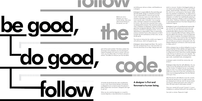
Figure 2.2.5, Final layout design, 11/5/2021
feedback:
week[6]:
- 4/5/2021 — sketches
- The 2nd one of the "various attempts" was noted to be a good layout.
- However, there seemed to be some elements that were unneeded & unrelated to the main "follow" idea on the bottom right, and it would be better if they were integrated into the title sequence.
- 6pt size for the body text is very small, it should be at least 8pt, 7pt only acceptable with higher x-height typefaces.
week[7]:
- 11/5/2021 — final
- The kerning on the subheading is a bit tight.
reflection:
My experience through this was generally positive, fun almost. Playing around with how text is laid out & how the eye moves around definitely gave me a kick, especially when achieving something that's unique. Stepping away & coming back to see everything I did wrong, then patching them up made the progression pretty natural as well.
I found that editorial spreads like these are a little more challenging that what it makes itself up to be. This is mainly because of the integration of body text. Making sure you fit everything into a defined space & have it be readable was super challenging. Other than that, I also found that kerning 3 column text really is a lot more challenging. I had to do bunch of gymnastics to get ragging under control, which resulted in cohesiveness I'm pretty chuffed about.
All in all, this task definitely has instilled in my wonky brain new knowledge about typesetting, & dealing with large chunks of text along with graphical elements which are more familiar to me. The attitude of "readability comes first" was also interesting to pick up & will definitely change the things I make in the future.
further reading:

Figure 3.1.1, Cover of article, n.d
One of the super interesting points they bring out is "Typography vs Typesetting". Typography is described as the art form of creating the text itself, while Typesetting simply tries to put the created text onto a page. It then goes on to describe the responsibilities of Typesetting — from kerning to book blocks — just to drive home the point on how you absolutely cannot simply use simpleton tools like Microsoft Word to do typesetting. All in all, it has a bunch of knowledge that one wouldn't normally find laying around when they have some text they need typeset, significantly increasing the potential quality of one's future textual creations.
Comments