final compilation & reflection
0344034.
BDCM
.Typography
::Final Compilation & Reflection
instructions:
- (↓) task[1]A: exercise[1]: Type Expression
- (↓) task[1]B: exercise[2]: Type Formatting
- (↓) task[2]: project[1]: Typographic Exploration & Communication
- (↓) task[3]A: project[2]: Type Design & Communication
- (↓) task[3]B: project[3]: Typographic Sticker Design
task[1]A: exercise[1]: Type Expression
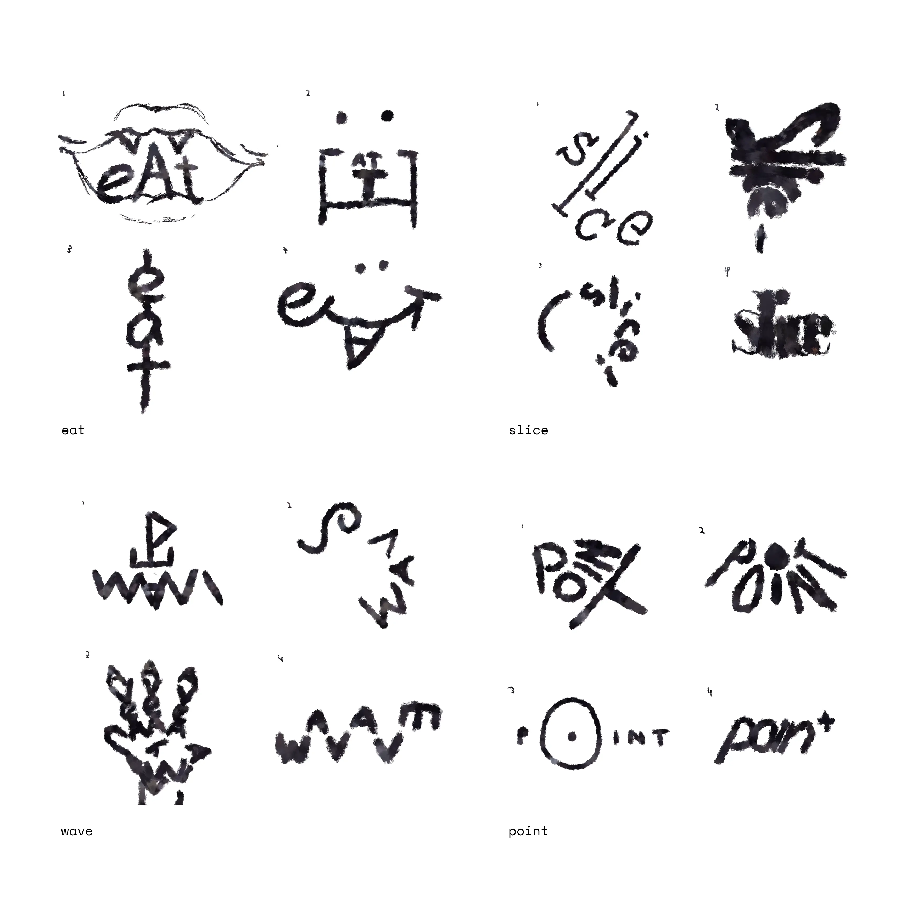 |
Figure 1.1.1, Type expression sketches, 30/3/2021 |
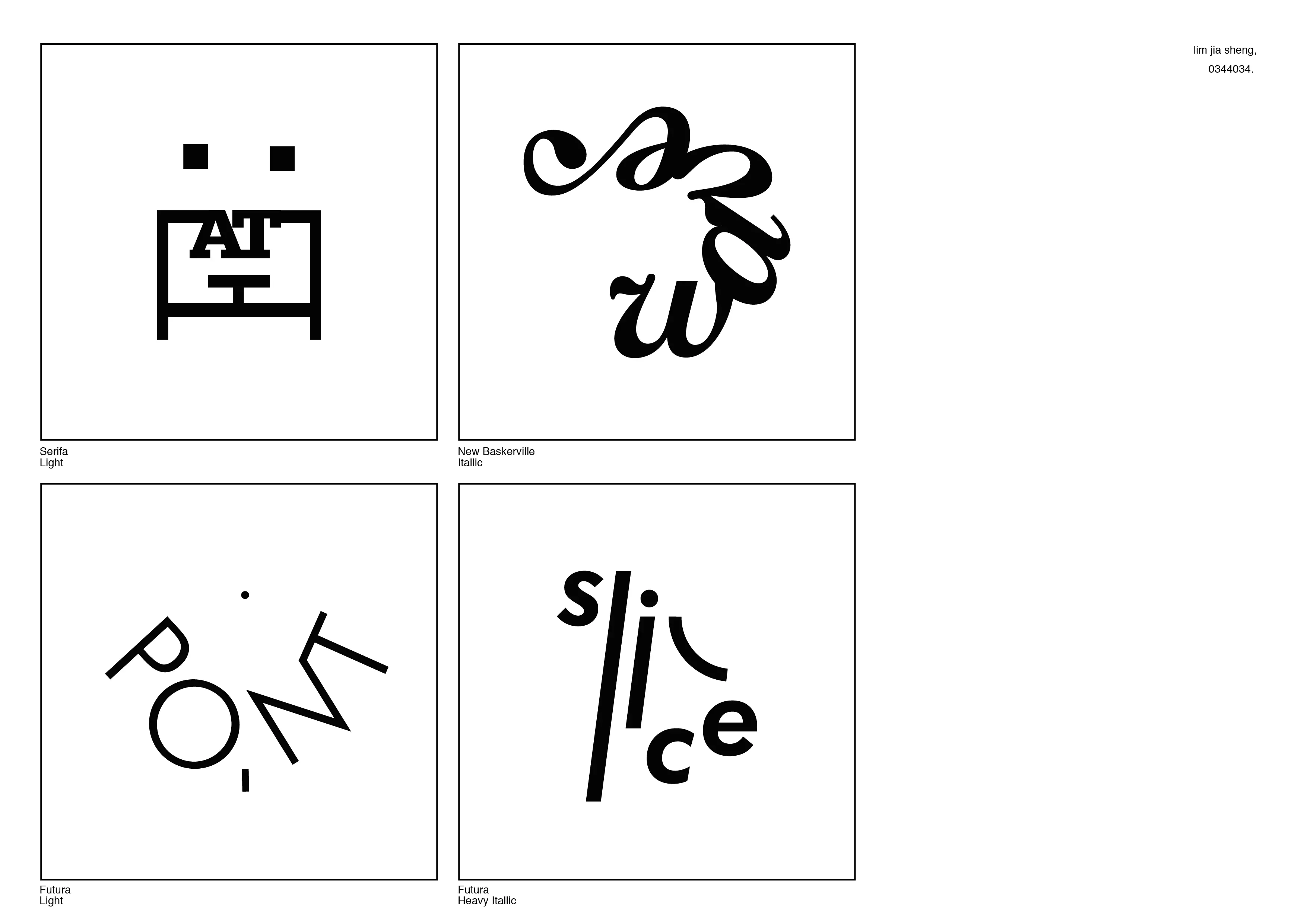
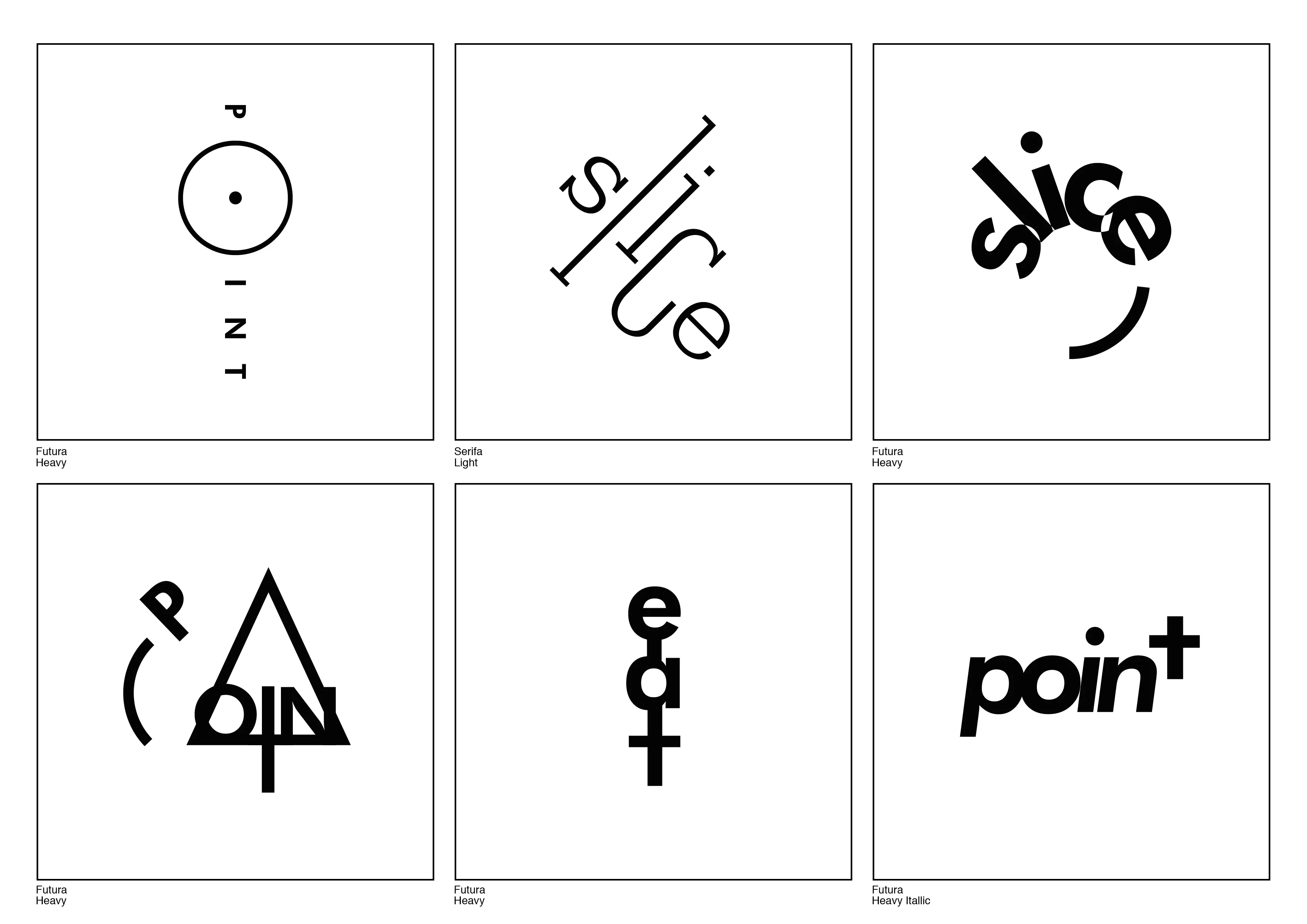
Figure 1.1.4, Digitized text expression, 6/4/2021
 |
Figure 1.1.5, Animated text expression, 13/4/2021 |
task[1]B: exercise[2]: Type Formatting
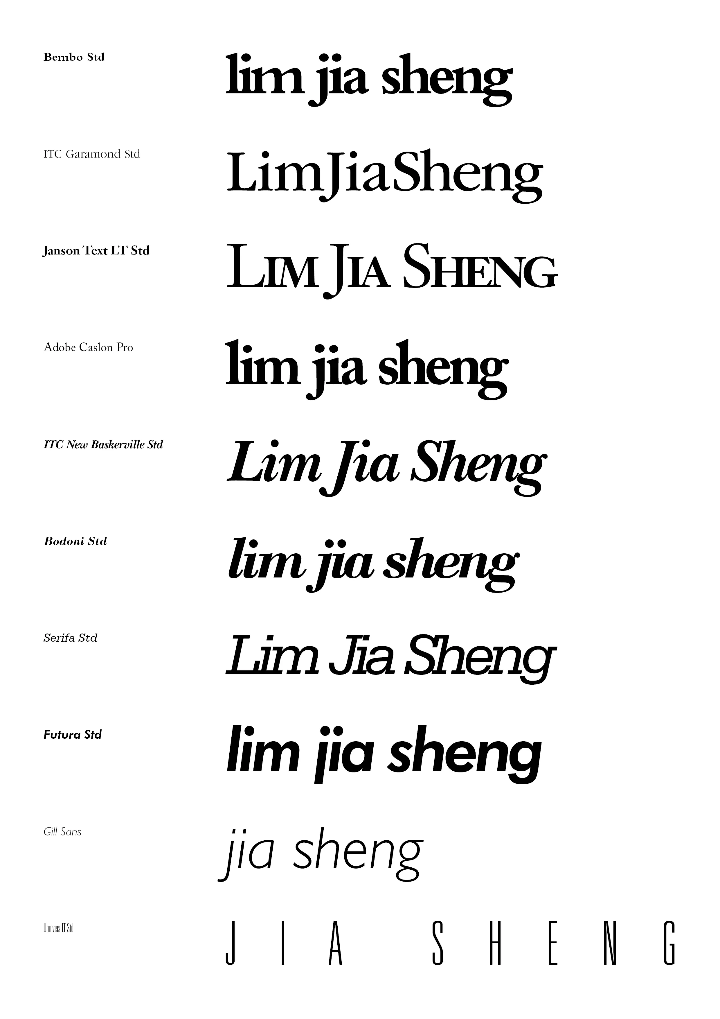 |
Figure 2.1.1, Tryouts before the real text formatting, 21/4/2021 |
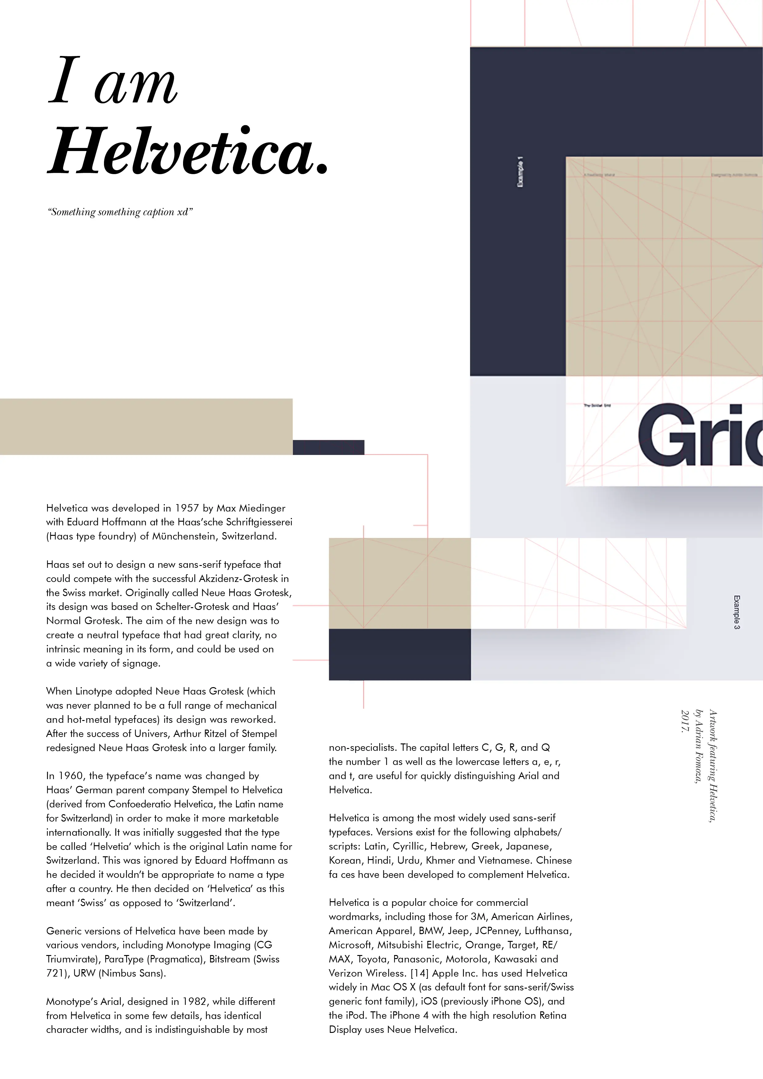 |
Figure 2.1.2, Text formatted layout, 27/4/2021 |
Figure 2.1.3, PDF version of text formatted layout, 27/4/2021
task[2]: project[1]: Typographic Exploration & Communication
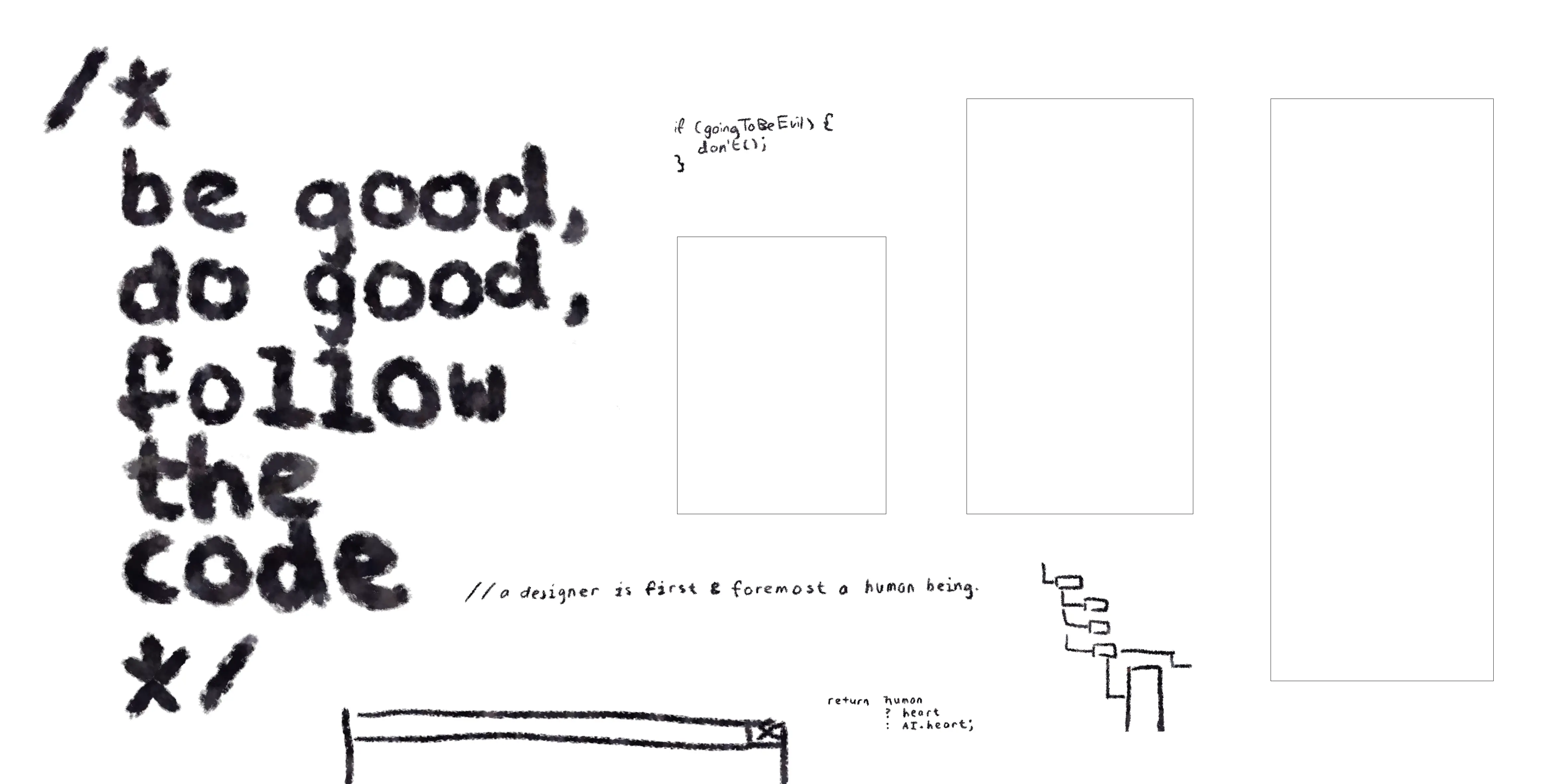 |
Figure 3.1.1, Rough sketch of editorial spread, 30/4/2021 |
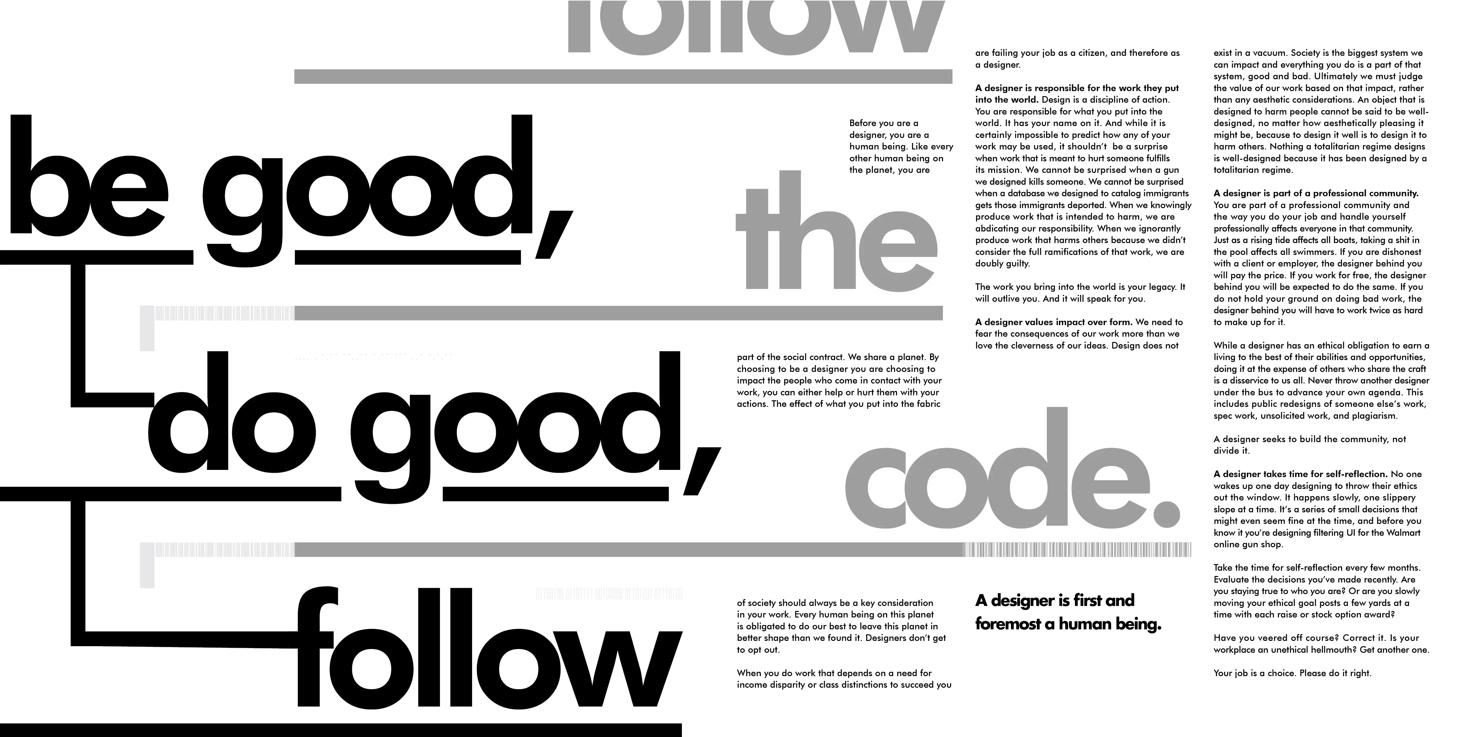 |
Figure 3.1.2, Final editorial spread, 11/5/2021 |
Figure 3.1.3, PDF version of final editorial spread, 11/5/2021
task[3]A: project[2]: Type Design & Communication
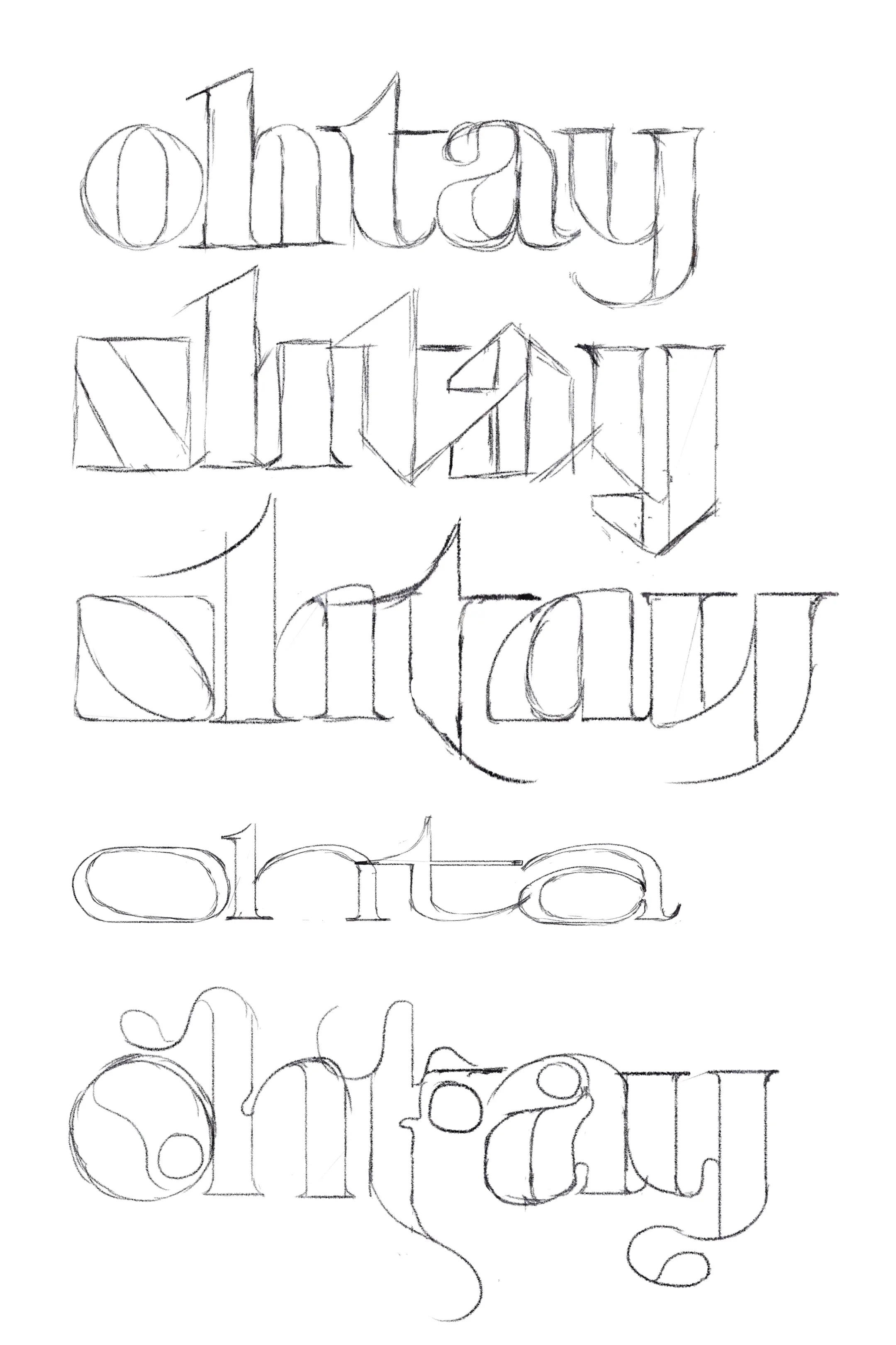 |
Figure 4.1.1, Sketches of typefaces, 22/5/2021 |
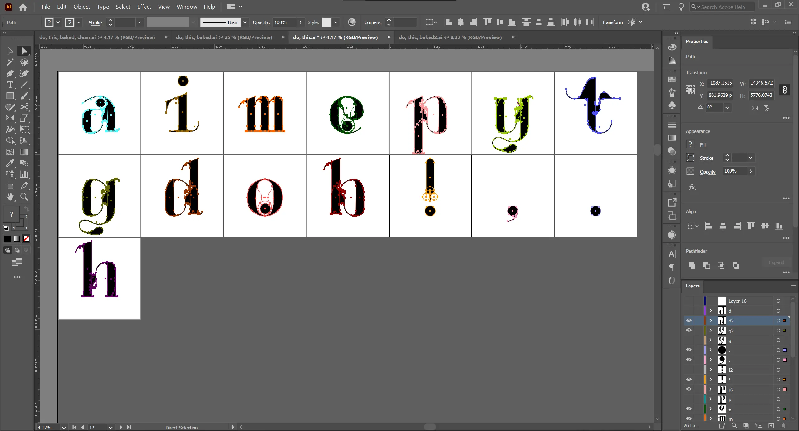 |
Figure 4.1.2, Process of making the typeface, 28/5/2021 |
 |
Figure 4.1.3, Final strip from Illustrator, 1/6/2021 |
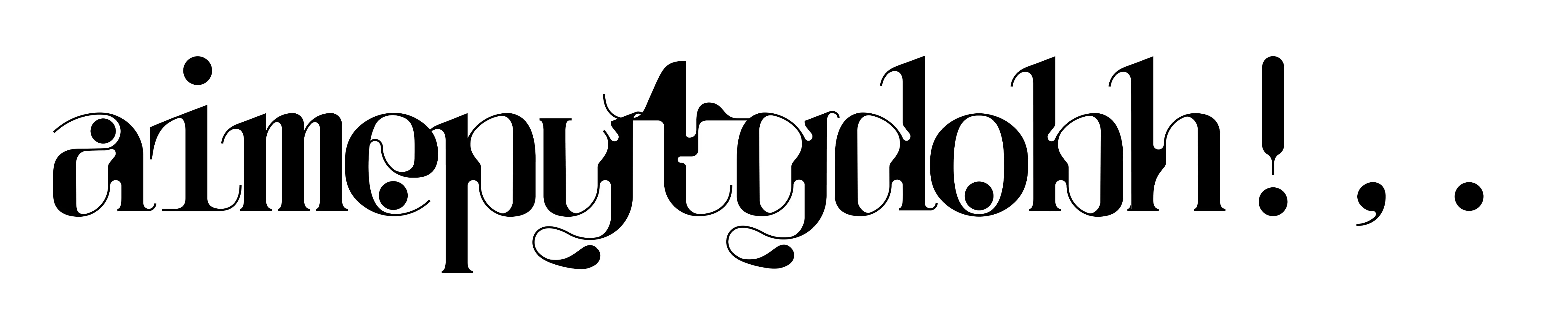 |
Figure 4.1.4, Final kerned text, 1/6/2021 |
|
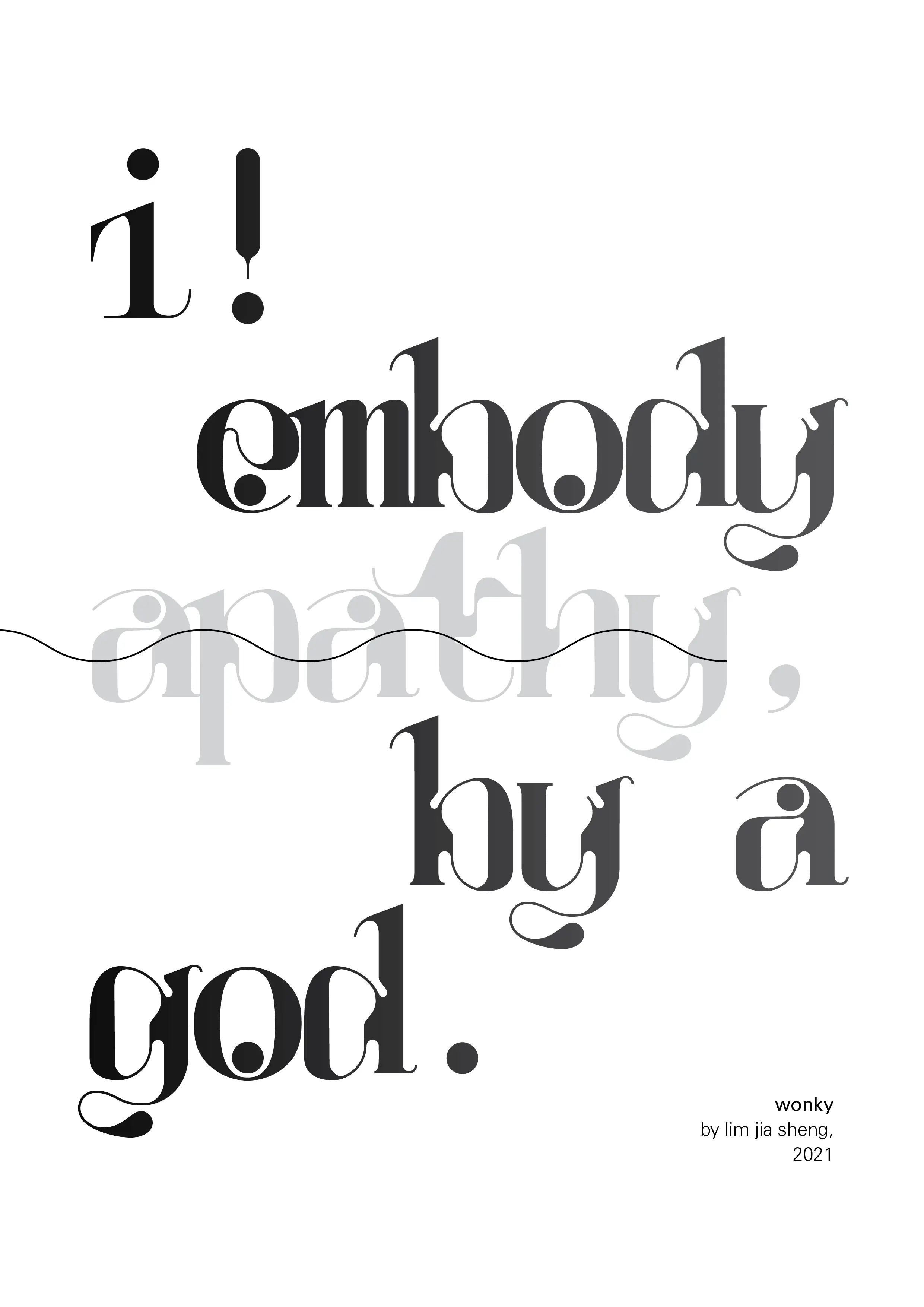
Figure 4.1.5, Final poster, 1/6/2021 |
Figure 4.1.6, Type playground, 1/6/2021
Figure 4.1.7, PDF versions of all the above, 1/6/2021
task[3]B: project[3]: Typographic Sticker Design
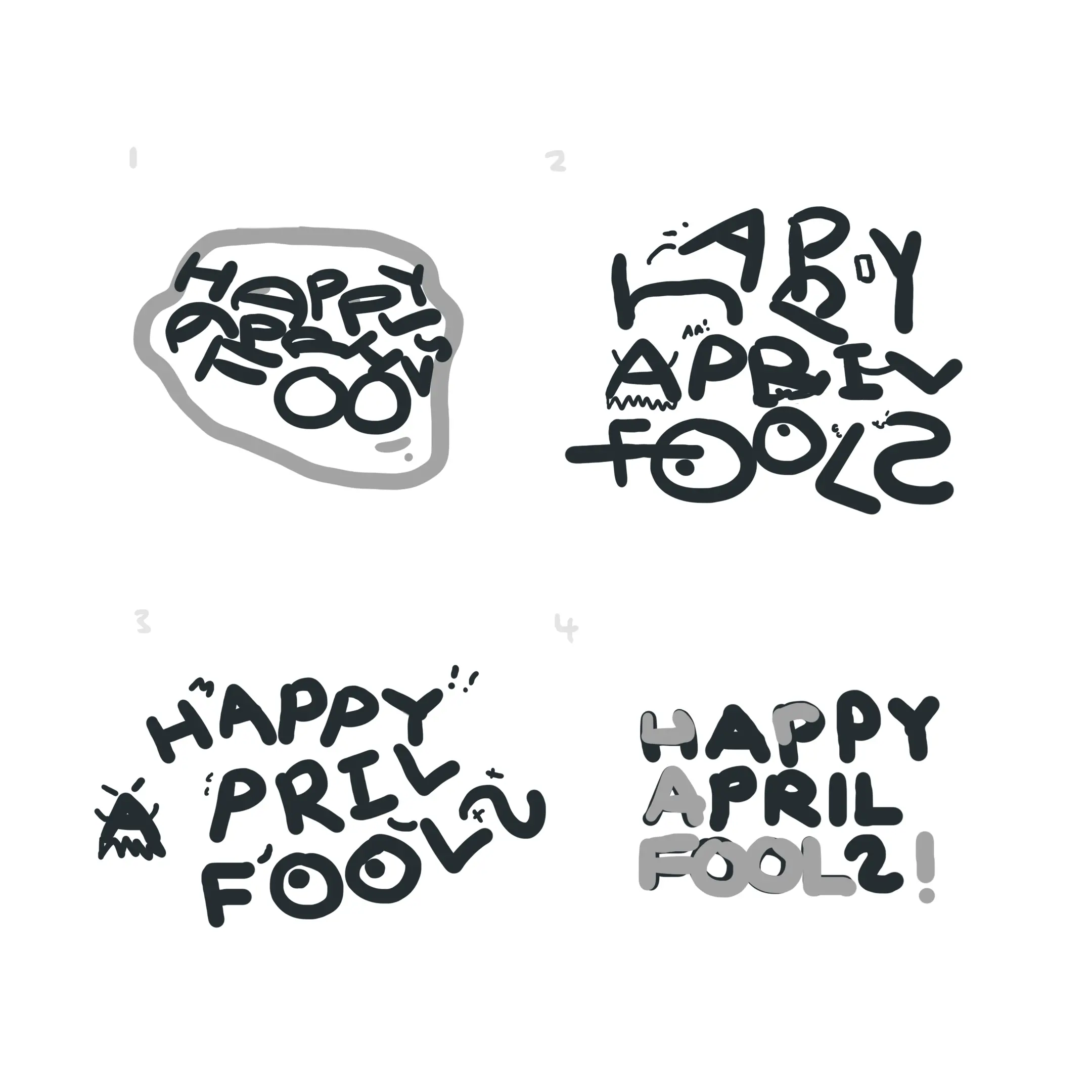 |
Figure 5.1.1, Sticker B/W sketches, 7/6/2021 |
 |
Figure 5.1.2, Screenshot of the sticker's usage, 15/6/2021 |
 |
Figure 5.1.3, Final sticker (B/W), 15/6/2021 |
 |
Figure 5.1.4, Final sticker (Coloured), 15/6/2021 |
Figure 5.1.5, PDF versions of all the above, 15/6/2021
reflection:
For the overall module, my experience was a nett positive. The positives include the great content of the module. The things we were presented to learn, as well as the ever evolving module tasks, make what we absorb feel fresh & entertaining. Mr Vinod's attitude to teaching was also really refreshing, with a great desire to improve the module & trying various techniques to force the students into a state of optimum learning. The negatives, all actually reflect back onto the positives. The teachings feel imbalanced in information density, with a large dump in the beginning of the semester via the lectures, which may be disorienting for ones who doesn't have their footing yet. Other than that, the technique of holding back feedback to force the student to birth a creative mind, I feel is kinda crap. A student new to a module, won't know what they don't know. The objective is great, but withholding teachings is not the best solution. Why not instead explain the thought process behind a design decision (eg. the visual weighting, the unfitting sharp corners, etc.)?
Secondly, the main observations I have about the module content itself is the true depth of Typography. Somehow, it feels like it's both deeper and shallower than I previously thought so. Deeper, as there was so much of discipline & jargon to untangle; shallower, as in one semester, we managed to create our own typeface & adjust our own layouts without knowing all of the discipline & jargon. This oxymoron seems simple, but without the dive into the depth, the journey wouldn't exist to contrast the bottom.
Finally, the findings. I've learnt bunch of software skills — Illustrator, InDesign, FontLab... I've learnt bunch of Typography skills — kerning, weighting, line spacing... I've learnt bunch of random tidbits — paragraph spacings, font embedding, how to style hair in 5 minutes to turn on camera... The main thing I took away from "Typography", was honestly a larger love for type in general. Going in depth to the nitty gritty really validated my hate towards text that doesn't look right. Whether or not this will form a healthy obsession or not is to be seen, but I know that it will help me avoid hypocrisy. Regards towards the far future, the knowledge gotten will follow me whether I like it or not, & fortunately it'll be both constructive & helpful to any future design venture.
Comments