task[3]B
0344034.
BDCM
.Typography
::task[3]B
instructions:
project[3]: Typographic Sticker Design
todo:
- Create a b/w typographic sticker design
- Add ✨colour✨
research:
Typographic stickers. The only place I knew of that had those was Snapchat, & thus I started there.


Figure 1.1.3, Examples of typographic stickers available on Snapchat, n.d
While these looked really interesting, neither my theme — April Fools — nor the typefaces I was provided with, really fit them.
I tried looking for April Fools themed typography,
 |
Figure 1.1.4, image-20210609143144030 |
 |
Figure 1.1.5, image-20210609143207829 |
Figure 1.1.6, April Fool's Day font logo with Jester hat and colorful confetti 2149486 Vector Art at Vecteezy |
 |
Figure 1.1.7, image-20210609143321461 |
but it just ended up with a list of things I shouldn't include in my final piece:
- Clowns
- Moustaches
sketches:
With research not really in my favour, I started to blindly sketch some ideas out.
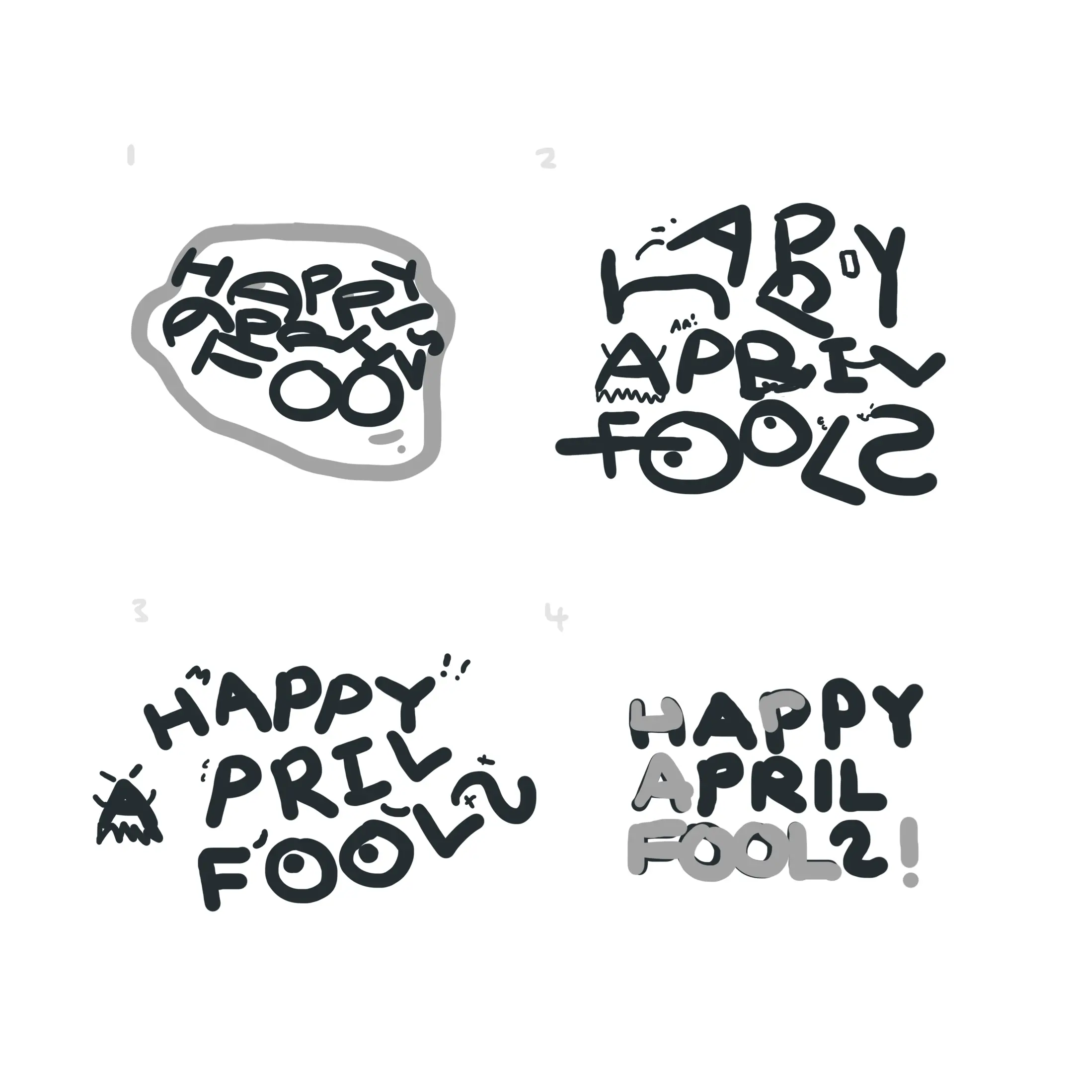 |
Figure 1.2.1, Sticker B/W sketches, 7/6/2021 |
I initially really liked the 1st idea, thus I tried to digitize it.
 |
Figure 1.2.2, Digitization of the 1st idea, n.d |
I'd say I think it was quite obvious what this stood for, but for others it might not have strong enough signals. This was reflected in the feedback given where the lack of distortion really restricted the practicality of this idea.
With that idea out, I tried my 2nd contender, coincidentally the 2nd idea.
 |
Figure 1.2.3, Digitization of the 2nd idea, n.d |
Feedback was given for this idea & it was subsequently approved for the go ahead. I thus continued polishing up, eventually ending up here:
 |
Figure 1.2.4, Polished version of the 2nd idea, n.d |
I was pretty happy with that not gonna lie. Holding that elegance into colour however, was going to be a challenge, as adding things outside of initial scopes is always a hassle & a half.
_1.webp)
.webp)
Figure 1.2.8, Development sequence, optimizing for readability while keeping """charm"""
Feedback was given to these in feedback.
With a little more spiffing up according to the feedback, I've the final.
feedback:
- 8/6/2021 — sketches/1st digital attempt
- The first option doesn't really work without distortion, try the 2nd option.
- 8/6/2021 — 2nd digital attempt
- There should be consistent stroke angles — angled or rounded.
- The snake is sus.
- 15/6/2021 — 4th colour attempt
- The slinky is nice.
- The low-contrast parts of the end of 'R' affects readability.
- The strokes of the outer elements could be made to seem like they were drawn/graffitied on.
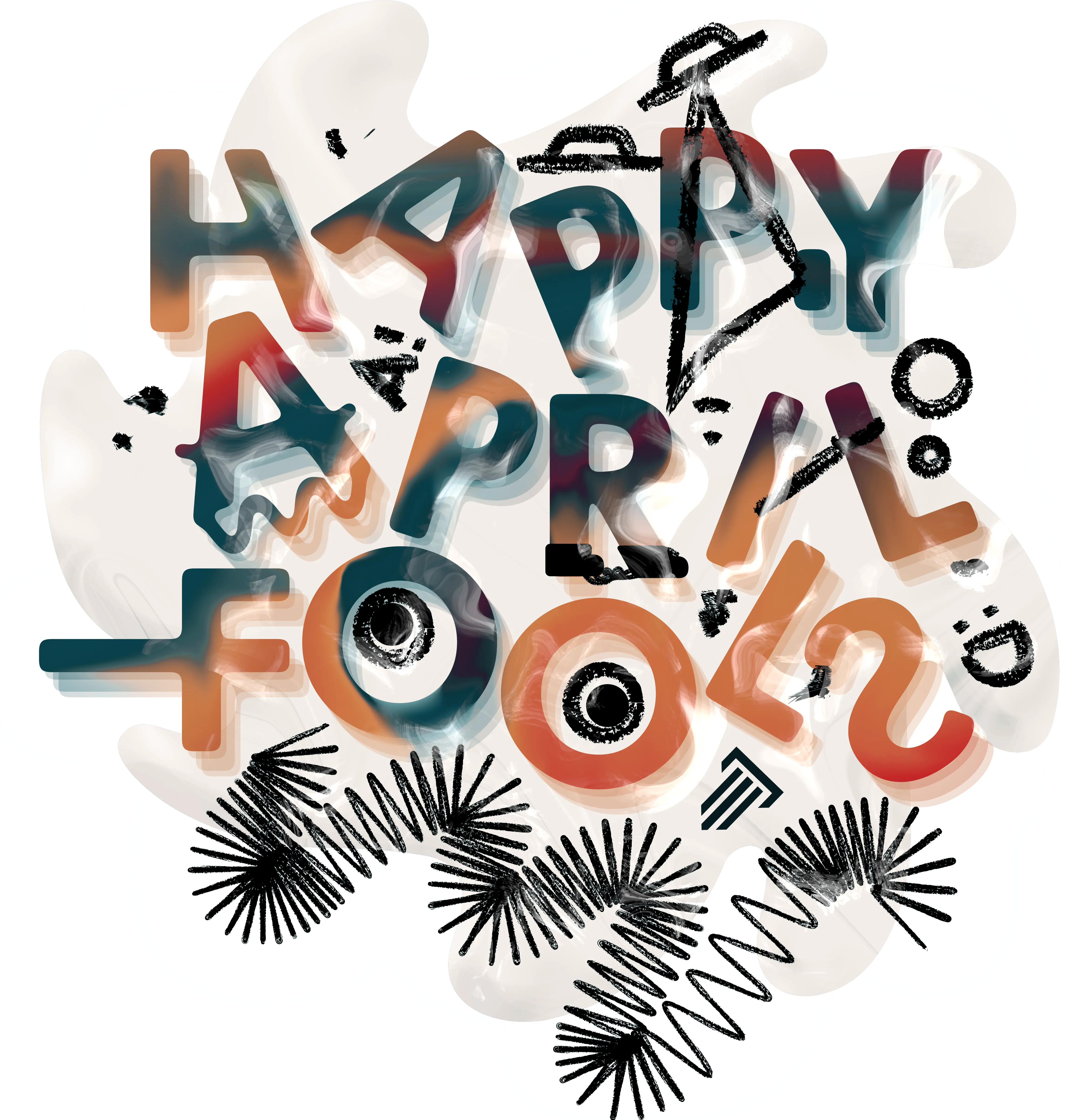
final:
 |
Figure 1.3.1, Screenshot of the sticker's usage, 15/6/2021 |
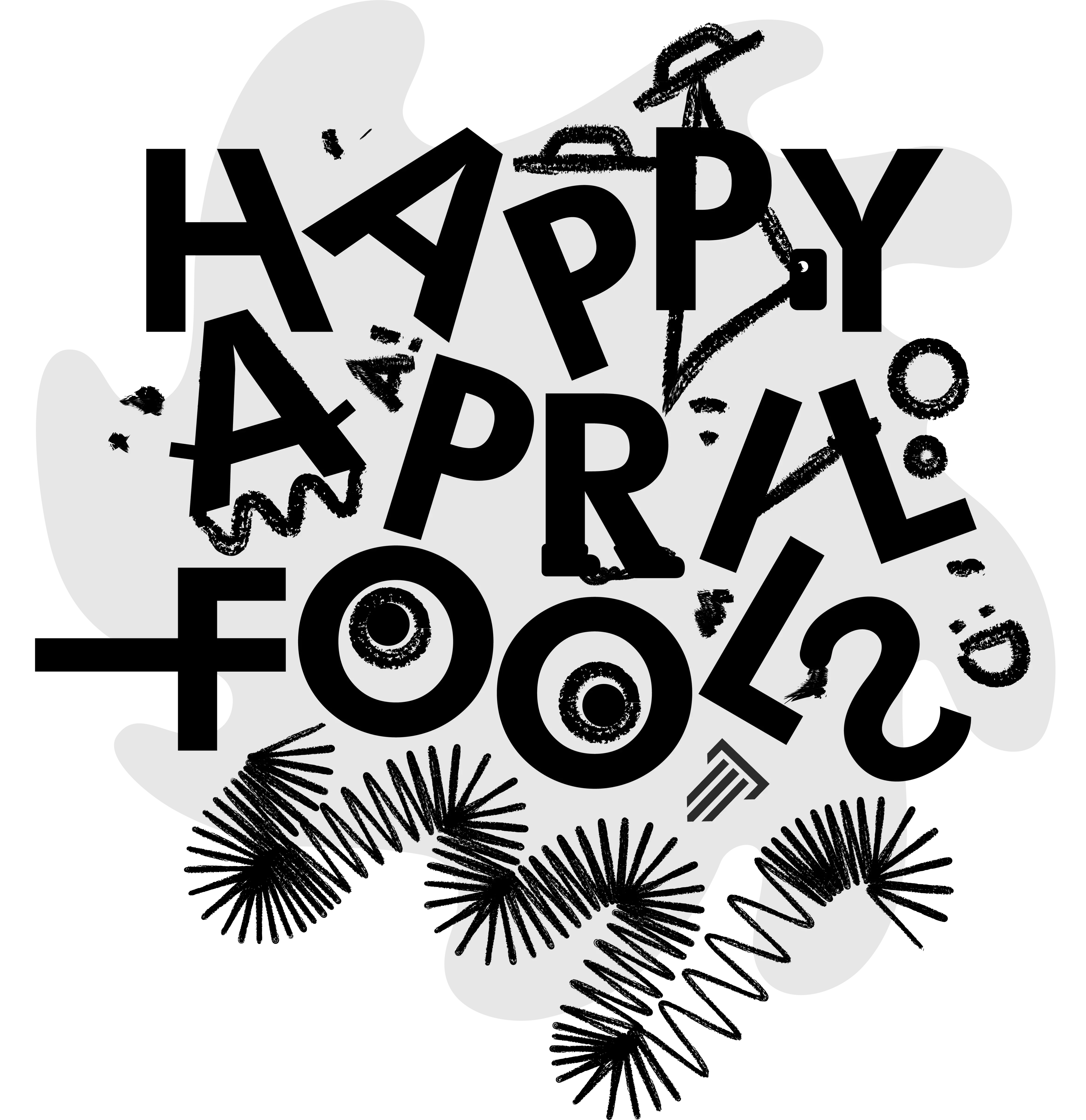 |
Figure 1.3.2, Final sticker (B/W), 15/6/2021 |
|
Figure 1.3.3, Final sticker (Coloured), 15/6/2021 |
Figure 1.3.4, PDF versions of all the above, 15/6/2021
reflection:
My experience through this task can be summed up as, intrigued. The restriction & challenge of working at a small scale is definitely interesting, as well as the typographic limitations. Going through it felt both familiar & foreign at the same time; doing familiar things with a weird outer lining context. With all the stumbling in the beginning, out came a result I was pretty pleased with though.
A few things I found while executing my ideas, is the challenge of transforming a designed-for-B/W design, into a coloured one. Now I know the point of the B/W was to force a focus on composition, but I felt removing the colour made it hard to keep in mind the contrasts & additional complexities it adds. Other than that, I also found the surprisingly stark effects of the clarity of edges when it came to readability. Without well defined edges (eg. edges polluted with graphical elements), the text became virtually unreadable at sizes a phone screen would deliver.
At last, the main things I've taken away from this task other than the practical stuff, is the general thinking of readability over everything. This I feel is especially true when creating for responsive displays which vary in sizes nowadays. I'm confident that I'll be able to utilize all that I've absorbed through project 3 & bring peace to all the worlds of small sized graphics.
further reading:
When type goes tiny: How brands can deliver legible text at small sizes
 |
Figure 1.4.1, Cover of article depicting type on an Apple watch, n.d |
This neat little piece details about the techniques used by larger brands to ensure their text stays clear in small sizes, much like what we had to do for our sticker. It talks about the widening tracking needed for smaller types, as well as tightening when larger. There are also typefaces specifically designed for small screens with different optical masters. Overall, pretty cool nerd stuff.
TypeTalk: Why Distorting Type Is a Crime
 |
Figure 1.5.1, Example of the artefacts from distortion, n.d |
This old gem (from when I was only 7) I found while scouring around gave great examples of the results of text distortion & objectively explains how it tanks legibility as well — thick & thin contrasts, axis positions, character spacing, all being wack. Great read for anyone considering committing said genre of typographical arson.
Comments