task[3]
.webp)
0344034.
BDCM
.Advanced Typography
::task[3]
instructions:
task[3]: Type Exploration & Application
todo:
- Create something typographic that solves/explores an existing problem (basically whatever we want as long as it contains text somehow)
research:
Things started out with me trying to come up with an idea.
New bundled typeface in Microsoft products
This first one I had was something to do with adding a typeface to Windows. This would be a new display type as it had been some time since any "fancy" types have been added to be included. Below is a table of a few older typefaces contrasted with the relatively mundane additions in recent years.
| Typeface | Date added by Microsoft to their product(s) | ||
|---|---|---|---|
Jokerman
| 1997 | ||
Juice ITC
| 1995 | ||
Matura MT Script Capitals
| 1997 | ||
Bahnschrift
| 2017 | ||
Cascadia Code
| 2019 |


While bringing this idea up to Mr Vinod, he suggested instead I could tackle a typeface, with a little more demand for improvement.
Caustic Sans
This would be a non-faithful descendent of the (im)famous Comic Sans, almost a parody of how bad it is. However, to bully someone you'd need to know some things about them — some uranium for the nuke. Thus, I started out by dissecting the type letter by letter:
 |
Figure 1.1.6, Comic Sans analysis, 18/10/2021 |
With a little more understanding of how it (kinda doesn't) work, I went ahead with conceptualizing my offences.
 |
Figure 1.1.7, Caustic Sans sketches, 20/10/2021 |
As one can tell, they look super different from Comic Sans. I make my case with how it fixes some of the gripes I found:
| Problem | Solution |
|---|---|
| Curvy where it shouldn't be | * Increase weight contrast to accommodate tighter — thus more accentuated — curves * Introduce oversized inktraps as an excuse to add curves |
| Straight where it shouldn't be | * Uniform roundness all around stroke ends * Attempt to curve every edge of the type |
| Unintentional looking stroke weight variations | * Increase weight contrast |
| Awkward stroke intersections due to not being designed for high resolution displays | * Add proper adjustments to reduce perceived additional weights at corners & imbalances on curves |
From the sketches, I took all the attributes I liked, mainly the inktraps, the 't', the "deflated tyre" form, & threw them all into a test digitization.
 |
Figure 1.1.8, Caustic Sans test digitization, 24/10/2021 |
Merging typefaces
So there's way too many typefaces out there. This was brought forth by my general search for ideas & inspo for this project. I thought, since the reason of each font is to bring forth new features, what features would making soup out of the typefaces retain? Here's the gist of execution that might work:
- Write a script to download maybe, top 100 sans serif fonts from dafont.com
- Write a script to lay & centre them in after effects/javascript canvas
- Vary clamp threshold & blur radius
- Run auto-trace on them
- Clean-up(?)
 |
Figure 1.1.9, Initial test combining 10 typefaces already installed, 24/10/2021 |
From this preliminary test, things were looking somewhat promising, as it didn't turn to mush. However, this was a pretty controlled environment with only regular-weighted sans serif fonts used, adjusted for font width. The dataset of merely 10 was probably way too little to risk any distortion; too little to generate any excited & weird results.
Typography in sound spectrograms
This is definitely the most experimental out of all. It exploits the concept of how sound can be converted to & from images via a spectrogram. In short, a spectrogram is just a mapping of signal strength to a visual graph, with signal strength in this context being frequency (20-20kHz), & the other axis being time.


Figure 1.1.13, Examples of visual content represented through sound spectrograms, n.d
This conversion can be done using tools such as this to go from audio to visual, & this for the inverse.
Figure 1.1.14, The at-the-end-useless proposal, 25/10/2021
process:
Strap in.
After giving it some thought, I decided to scrap the idea of Comic Sans completely, & go with something a lot more out there. I was thinking about the last two ideas, & how I could take em on. I vaguely remembered an idea of using a visual generation AI to generate music through feeding it spectrograms. This gave me a spark, as if I was doing the 2nd idea, & I wasn't the one combining the fonts by hand, I could take in a lot larger of a dataset!
This kickstarted me into the rabbit hole of machine learning, my first venture mind you. Here's a few terms I learnt if it might be useful for anyone reading:
Mini machine learning glossary
| Word | My crappy definition |
|---|---|
| Layer | An algorithm that transforms the input data. |
| Latent value | The number of data points to keep when transitioning between the input & output of a generator. |
| Model | A "stack" of layers. |
| Gradient | The change between function calls (each pass of a model most of the time). |
| Shape | A tuple (an immutable array) matrix (that grid thing that swaps x & y) describing how to construct a tensor (eg. (1,3,3) describes the tensor has a total of 3 dimensions, with 3x3 data points for the last 2 dimensions & 1 data point for the first — 3x3x1 expressed as x,y,z). |
| Tensor | A multi-dimensional vector (list of values) with a shape (eg. a vector of [[1,1,1],[2,2,2],[3,3,3]] with the shape (3,3)). |
| Generative Adversarial Network (GAN) | The type of ML model used for generating images, consisting of a generator & discriminator, which attempt to trick each other during the learning process. |
| Deep Convolutional Generative Adversarial Network (DcGAN) | A more advanced version of GANs that use Deep Convolutional Neural Networks (DcNNs), most often implementing the Conv2D layer. |
Info-hunting
With some foundation in place, I started looking for some resources to implement this model. I'm familiar with the NodeJS ecosystem, thus I went looking around implementations based on tensorflow.js — the web/NodeJS Javascript port of the traditionally Python & C++ tensorflow. Unfortunately for me, ML is a niche topic, GAN is a niche within a niche, GANs implemented in tensorflow.js instead of its Python equivalent is basically a needle in your mom a haystack.
Nonetheless though, I did find some resources that helped a lot:
tfjs-ganby mwdchang (based ontfjs-examples)tfjs-examplesby tensorflow themselvestfjs-dcganby talvasconcelosdcgan.jsby DavidCai1993
I also found some resources in Python, using either raw tensorflow or tensorflow.keras's layers API, which has a similar implementation in tensorflow.js (note the word similar):
tfjs-gan looked the most promising, as it was the only one who came with a working web demo using the MNIST dataset — a large collection of handwriting thumbnails. Thus, it became the backbone of the rest of the ML part in this experiment.
Scraping data
So I needed a lot of fonts, like, I'm talking enough to satiate a pretty dumb model (the example model in tfjs-examples & subsequently tfjs-gan aren't very advanced, not using CNNs). I knew I needed to at least come somewhat close to the MNIST dataset, which contained 10,000 28x28 images.
Now honestly I'm not sure how much of this process I can share, as it's definitely, at least ethically questionable. I used a script to scrape Fontshop. They serve webfont versions of their typefaces on sale, & I simply went onto their "best-selling" page, identified their internal API they were using for fetching + rendering data &, oh nice! It was here when I discovered they included the webfont CSS stylesheet URLs in the API response itself. This was 100% extraneous data coming down the pipe as it was nowhere rendering previews on the browse page (it was a LOT of entries, not sure how browsers would behave with say, 2000 different fonts going at once in a page), it instead used the sensible option of rendering it on their server & piping the thumbnail down.
 |
Figure 1.1.15, Text generated by Fontshop's `font_rend.php` endpoint, 1/11/2021 |
Initially, I thought of (ab)using this to get my thumbnails, but doing some napkin math, if I wanted to scale the operation by any amount, it would definitely nett me a 429 (a http error signalling I've sent too many requests & I should slow the hell down).
2000[no. of fonts] * ((26 * 2)[a-zA-Z] + 10[0-9] + 10[symbols?]) = 92,000 API calls — definitely very suspicious
Thus I went with the way of doing it saner, but with more work involved. Here's the gist of what my scraping script did:
- While our total number of fonts is still less than the total number on the server
- Download API data for the
nth search page - For each entry in the data
- Download the CSS stylesheet containing a url to
fast.fonts.net(which actually hosts the font) - Download the
.wofffont - Convert it from
.woffto.otfusing FontForge's CLI (they're using extremely weird containers for the.wofffile, making it incompatible with basically everything except browsers & FontForge. This included thecanvasmodule used later) - For each character in the character set (a-z, A-Z, 0-9, 10 symbols)
- Render the character out onto a canvas using the
canvasmodule - Calculate the bounds of the rendered character
- Take all the image data from the 1st canvas & dump it to a canvas with our target resolution (28x28), this resizes it to ensure the character stayed within bounds
- Transform the 2D image into a 1D array & dump it to a giant image sheet that looks like the MNIST dataset
- Render the character out onto a canvas using the
- Download the CSS stylesheet containing a url to
- Download API data for the
- Increment
n
 |
Figure 1.1.16, Image dataset sheet for 'A', 28/10/2021 |
 |
Figure 1.1.17, Partial dataset for 'A', 28/10/2021 |
There's quite a lot more to it, particularly things like padding, data type conversion, RGBA to single channel storage, exporting PNGs & binary files, supporting options to selectively run parts of the program, etc. If you're interested, there'll be an extremely messy Github repo linked somewhere in this post.
With the dataset gathered, I could now start the soup on low heat.
Scraping data's foreshadowed problems
You might recall me talking a lot about the amount of API calls I would make & me being afraid I might be throttled. Well, let's just say I'm glad I went with this """saner""" option.
Initially running my tests, I would be able to ping the API tonnes with no (perceivable) repercussions. I'm talking ~200 calls in 2 minutes. However, perhaps the web admins came back from break & noticed the massive uptick in (weirdly formed, as I was doing it not through a browser & via their normal paths) requests, they enabled Cloudflare's rate limiting.
 |
Figure 1.1.18, Example of Cloudflare blocking access due to rate limiting, n.d |
This prompted a lot more dirty tricks, like using VPNs to get around it. When I ran out of servers to connect to, I uh — (ab)used Runkit's node REPL (basically a code playground). I spun it up with a module that enabled me to access the internet, & started scraping from there. In my defence it was extremely effective, as it seemed like they had tonnes of shards (parts of a larger server network) that served the REPL experience, so I could just press "run" (& if it threw back the Cloudflare error, press it again) & get back the data I needed.
After this though, I was prepared to get the actual ML meat up.
Pre-processing
This step is super simple, just pick out the images that look weird. As you may have been in the image sheet for 'A' above, there's some odd looking, not-very-A shapes. Now to be clear, I definitely did not take out all the "weird" entries, only the "invalid ones". For example, this was kept in:
 |
Figure 1.1.19, Super weird looking '?', n.d |
While this was not:
 |
Figure 1.1.20, This is somehow a '?', n.d |
GAN, first attempt
Following what I was going about before I started the implementation, I started stealing copying taking robbing politely referencing it in my own code. (In my defence some of its files still had the Google license header on it, which by law means that it's literally straight from the examples as well xd)
This was surprisingly working after one uh, medium sized hiccup. tensorflow.js was (understandably) stubborn with deallocating memory, thus causing sequentially running the training on multiple letters to throw an Out of Memory (OOM) error:
tensorflow/core/framework/op_kernel.cc:1651] OP_REQUIRES failed at cwise_ops_common.cc:82 : Resource exhausted: OOM when allocating tensor with shape[2522,28,28] and type float on /job:localhost/replica:0/task:0/device:GPU:0 by allocator gpu Exception code=0xc0000005 flags=0x0 at 0x00007FF959BAA277. Access violation - attempting to read data at address 0x0000000000000010
My first solution of using worker_threads (a module in Node.JS to parallelize workloads) failed, as canvas would fail to load its backend shenanigans there. The issue for it is few months short of kindergarten, which meant I had to use, wonkier methods. I ended up spawning a new NodeJS process every character & destroying it after it was done. I mean, dirty, but very effective, since the only data I realistically needed to pass to it was the character it would be working on, & the shape of the binary file saved on disk (imagine you have a long string of numbers 1,2,3,4,..., that you want to turn that into a multi-dimensional vector [[1,2,3],[4,5,6],...], you'd need to know the points of where the 1st, 2nd, & 3rd dimensions started & ended; how long they each were).
After my laptop did some thinking, I got my results:
 |
Figure 1.1.21, AI generated characters, 28/10/2021 |
Not bad right? We'll come back to this.
(Dc)GAN, second attempt
I thought the images coming out of the 1st model was a little grainy, contrary to other GAN implementations I've seen. This set me out on a journey to rewrite a lot of the script core.
At this point I was still under the impression of feature parity between tensorflow's keras & tensorflow.js's Layers API. Thus, I went on to start porting over python implementations of a DcGAN, specifically the one from keras's documentation.
For the most part things went great. I managed to Object-Orientify a lot of the original Pythonic code & even enjoy the sequential API from tensorflow.js. However, the first sign of trouble was that the keras code used some metrics that just, wasn't in tensorflow.js. I thought to myself, no matter, how different could they be anyways, & moved on. The next issue though, was a little more blocking.
 |
Figure 1.1.22, Implementation note on the `Sequential#predict` function, n.d |
It doesn't sound like a big deal, but looking at the url of the guide I was following:
https://keras.io/examples/generative/dcgan_overriding_train_step ∟ overriding train "step"
& wouldn't you know it:
 |
Figure 1.1.23, "Override `train_step`" heading from keras.io, n.d |
I was hours deep at this point, literally learning more python than I probably would need in a lifetime. Frustrating it was, but we live & we learn.
(Style)GAN, third attempt
Hello I did not live nor learn.
While finishing the implementation for the first GAN attempt, I remembered where the video about AI spectrograms that inspired this whole ordeal was from. It was a video by carykh about feeding an AI spectrograms for it to generate music.
He wasn't successful in his attempt at getting StyleGAN up & running on his machine... but I was. The sunk-cost fallacy had fully set in & I was determined to get a higher resolution output somehow.
Let me just start this section off by saying that I thought my laptop was pretty okay in terms of specs, not the newest but an RTX2060 Max-Q isn't a slouch with 6GB of VRAM. Unfortunately, StyleGAN3 absolutely violated it. StyleGAN's native resolution is at 1024x1024, so naïve me went ahead & rerendered out characters for each of the fonts (which took absolutely forever because I had to rewrite parts that fit 28x28 but not 1024x1024 (133746.94% larger)).
The next step was converting all the individual images into a format StyleGAN would understand. Helpfully, they included a dataset_tool.py file which helped with exactly that... except it would refuse to process RGBA files, which my PNGs were in. After a long session of more learning python & fixing a previously bugged implementation (who knows why canvas exported PNGs has a line of #fff0 all around the actual characters), I got it working & exported my datasets. Here's the results of when I tried to run each resolution:
| Resolution | Result |
|---|---|
| 1024x1024 | Immediate OOM Crash, with no help adjusting parameters at all. |
| 512x512 | Runs for around 8 ticks before crashing with --batch-gpu (the option to split-up memory hungry training batches)of 4 — the lowest realistic option with ~1200sec/kimg. |
| 256x256 | Runs for around 16 ticks before crashing with --batch-gpu of 4 with ~700sec/kimg. |
| 128x128 | Runs with --batch-gpu of 4 with ~500sec/kimg. |
| 64x64 | Runs with --batch-gpu of 8 with ~300sec/kimg. |
 |
Figure 1.1.24, Example training log, 30/10/2021 |
There were other problems (like metrics taking longer to generate than actual ticks), but it doesn't really matter in the grand scheme of things. The keen eyed amongst you however, might've noticed the measurement of sec/kimg. This measures how many seconds it takes for the computer to chew through 1,000 generated images & train itself. The official implementation repository for StyleGAN3 notes that around 5,000kimgs are often enough for the network to converge (fancy words to say actually produce something usable), with the default set at 25,000kimgs. With some napkin math:
(350[secs/kimg] / 60[secs] / 60[mins])[hours] * 5000[kimgs] / 24[hours] = 20.25[days]
Yeah, no.
However, it's not to say I didn't try... Here's what the network managed to produce after 13.5hours:
 |
Figure 1.1.25, Fakes from StyleGAN3 at 152 ticks, 1/11/2021 |
Back to square 1 28x28
Honestly, over the course of the entire rabbit hole, the original distorted look has grown on me more & more. This is especially so after I let it train a little more & implemented some of the new things I've learnt into the original non-convolutional implementation.


Figure 1.1.28, '0' at 600 & 4900 training iterations respectively
I then took that Illustrator artboard with some of the characters, moved them around, & come out with:
 |
Figure 1.1.29, Kern-ed characters, 1/11/2021 |
I, really dig it actually!
Noise normalization
Things should be smooth sailing from here on out. Keyword — should. Unfortunately, this was a process that took the longest due to the little quirk of pixel mosaic creation I exploited.
Let me explain why this was even needed. The output of the training above was always 28x28 & the letters inside of them were maximized to fill the maximum amount of space. In the real world however, an 'e' & an 'E' have very different heights & widths, requiring them to be scaled down. This would cause inconsistent resolution across all the letters, & look horrid up close.


Figure 1.1.32, Raw output of model for 'e' & 'E'
 |
Figure 1.1.33, Actual sizes for 'e' & 'E' |
This would be done by creating a mosaic of all the characters with the same global pixel count (28x28).
Creating a mosaic basically means downsizing an input image to the specified pixel counts on each axis. It would take the pixels at the certain locations of an image & apply the colour to the new chunk of pixels starting at the same location as the input image. Think of it as systematically using the colour picker tool in Photoshop every n pixels & constructing a new image from all the colours u collected.
This however, meant there was math involved, & when math is involved, you can exploit its edge cases. In a properly constructed mosaic, you'd maintain a good idea of the original gradients & curves as the mosaic'd be effectively be a 1 to n scaling of the input image. However, not all mosaics are created equal. My exploit involves very minor losses in between Illustrator's (AI) exporting & After Effect's (AE) mosaic effect. There would be very minor sub-pixel deviations between the grid in AI & AE, which would create an extremely interesting artefact if the input image were positioned to align their grids.


Figure 1.1.36, A properly constructed vs one exploiting the sub-pixel differences, 7/11/2021
This result not only (imo) looked a lot cooler, but it also simplified the shape of the font & """diluted""" the noise.
Look cool it did, but was it worth 4 hours of moving things around? Absolutely, I regret nothing.
Vectorization
Vectorization is the process of turning raster (pixel) data into vector (path) data. Normally, one would do this manually by placing paths around an input image. However, not only was that not practical at all if I wanted to keep the noise & opacities, I kinda wanted to keep the 100% synthetic nature of this typeface going.
Tracing
Image trace (Illustrator)
This was the first choice I could think of, mostly due to it being the most effective version of this "genre" of tool I've used.
Firstly, I tried it with one of the 28x28 outputs.
 |
Figure 1.1.37, Image trace result on 28x28 input image, 6/11/2021 |
That doesn't look quite right, & stayed that way even after tweaking a bunch of the settings. However, there was an obvious workaround — give it more pixels. I thus exported all the assets at 33.33x scale & ran it through the tracer again.
 |
Figure 1.1.38, Image trace result, 7/11/2021 |
Not bad right? However...
 |
Figure 1.1.39, Wonky pixels from the image trace result, 7/11/2021 |
That doesn't look right. To fix it, I did try to use various snap-to-grid/snap-to-pixel techniques, but none of them worked.
Auto-trace (After Effects)
I mean, AE has it so why not try. It surprisingly did a way better job that AI in retaining angles, however, it could only do solid traces, meaning the opacity data would be lost & I'd have to set a tolerance the minimum opacity I'd trace over.
 |
Figure 1.1.40, Auto-trace result, 8/11/2021 |
Object mosaic (Illustrator)
So this was a technique I found doing research on converting pixel art (which the letters basically were) into vectors. It involved rasterizing the image at a high resolution & splitting it up into the exact grid of pixel squares.
 |
Figure 1.1.41, Raw result of object mosaic, 8/11/2021 |
Well there I had it, a working vector! ...Not quite.
Currently all the pixels go from black to white, instead of transparent to opaque. This would certainly pose a problem when translating into a font, as you kinda need the gaps to read.
Unmulting
Unmulting, short for unmultiplying, is the technique used most commonly in video to reverse the multiplying of the alpha channel into the RGB channels. Basically, if a pixel is transparent, it'll be 100% black, else it'll be whatever colour it is, multiplied by black. Unmulting reverses the process by mapping luminance to the alpha channel.
In order to achieve this I had to write a short script, which basically did:
pathItem.opacity = 100 - pathItem.fillColor.gray
to all paths in the document.
 |
Figure 1.1.42, Unmulted & inverted result, 8/11/2021 |
Optimizing
Now there were still way too many paths in the document. The most obvious optimization was to remove all paths that had a really low opacity (everything less than or equal to 1). This was done using a simple script as well.
The other optimization step was not as obvious however — to merge all paths with similar opacities. I tried to use a script for this too, scouring the internet to find ways to execute pathfinder commands from script files, as well as clumping to-be-merged paths into one single data structure. However, I just could not get AI to behave when it came to actually applying the merge operation.
I had spent an hour+ on this & was getting frustrated, which lead me to merge everything in frustration. Surprisingly... it just, worked. It would only apply the merge to shapes with the same opacity. Huzzah!(?)
The reason why I've never known the usefulness of this tool was because I'd always just used the Shape Tools "Unite" operation instead under the "Pathfinder" section of the properties (which would merge everything regardless of appearance & not keep the properties of each). This gave me the assumption that, those were the pathfinder operations instead of the vastly more useful actual pathfinder operations.
 |
Figure 1.1.43, Unmulted, inverted, & optimized result, 8/11/2021 |
Kerning
Now, it should be smooth sailing.
& surprisingly it was. Everything went well in the importing to FontLab (except for no one particularly knowing where it was actually storing the opacity data), & I managed to get it all adjusted well (enough).
 |
Figure 1.1.44, Kerned (sorta) result, 8/11/2021 |
Exporting
Now there's generally 3 formats one can export coloured fonts
| Format (creator) | Compatibility |
|---|---|
| OTF + SVG (W3C) | PS, AI, Ind, Firefox, Safari, Edge |
| COLR (Microsoft) | Chrome, Firefox, Safari, Edge |
| SBIX (Apple) | PS, AI, Ind, Safari, Edge |
The sweet spot is probably OTF + SVG, as it gives compatibility for the crucial Adobe apps while being the easiest to export (FontLab supports it natively). A notable omission from the compatibility is of OTF + SVG is Chrome (including new Edge, Brave, Opera, Samsung Internet) however, they're really stubborn about it so just use firefox or smtg.
final:
66 hours
the typeface itself
faint
font + AI = fAInt
.webp) |
Figure 1.1.45, Faint, 11/11/2021 |
.webp) |
Figure 1.1.46, Faint character set, 11/11/2021 |
rationale
Ai is a collective advocating for the ethical use of AI. Its mission is to spread awareness by utilizing AI artistically.
AI/ML have the potential to do amazing things, often times this includes things no human will ever be capable of. What if that becomes true for surviving on this Earth? We need no apocalypse to be able to perceive its loom among us, just ask GPT-3, no literally. Thus, every single one of us will need to equip ourselves with the abilities to fight back when the day comes.
collateral
Ethics campaign posters
.webp)
.webp)
.webp)
.webp)
Figure 1.1.51, Posters for an ethics campaign, n.d
 |
Figure 1.1.52, Poster mockup, 15/11/2021 |
Keychain
A simple magnetic keychain, able to wipe hard drives, floppy disks, & pick locks.
.webp) |
Figure 1.1.53, Ai magnetic keychain, 11/11/2021 |
Rubberducky
A rubberducky is a device that looks like a usb device, but when plugged into a computer, identifies itself as a keyboard & types commands to execute a payload. (eg. typing WIN + R, https://youtu.be/dQw4w9WgXcQ, ENTER, will commence certain death)
.webp) |
Figure 1.1.54, Ai rubberducky, what does it contain? No one really knows, 11/11/2021 |
Keycap
Put it on your Delete key & hammer away. This one's mostly a novelty; it's cool looking xd
.webp) |
Figure 1.1.55, Ai keycap, 11/11/2021 |
Captcha
An alternative captcha service utilizing the brand typeface to fight against bots. Introduction moving distortion also enables us to increase the total interference per frame, while retaining readability to humans.
feedback:
- 18/10/2021
- Good idea, but I can also try messing around with improving Comic Sans.
- 25/10/2021
- All 3 ideas are okay, but some are more safer than the others.
- Combining the fonts generated a pretty average looking result but with an interesting process.
- Not sure how the spectrogram idea will pan out, but it is definitely worth investigating.
- 1/11/2021
- I shouldn't modify what was generated
- I should embrace it & put forth the backstory at every opportunity
- I still needed an application for the typeface though
- 8/11/2021
- I shouldn't worry too much about getting it to work in browsers, just what is required to finish the task
- I may try Glyphs (sad window noises)
reflection:
Holy sh*t what a task. Can't believe it's all done & dusted. This was honestly simultaneously super stressful & super fun, & I'm glad I took the risky way in. Initially the lack of a proper brief was pretty daunting, & left me kind of lost. However as time went by & as I had a few nudges here & there on what might be good things to try, things started to materialize & formed something special. There were frustrating times & a lot of wasted effort (I hope you skimmed through instead of actually reading any of it lol), but I feel like I learned way more than I would've otherwise, in typography, programming, & just design sense.
The first thing I learnt was simply to start small & shoot for the moon if I don't hit the stars (if all else fails can hit bumi gemilang). This was the most apparent by the progressive nature of development for the font. I kept hitting checkpoints until I couldn't reach any higher up, which is when I can accept I've done my best & work with what I have; settling isn't always bad. Other than a few arbitrary skills like improving my Python, the 2nd large "lesson" I got was to exploit what I'm good at & bite off something on the way out. This in my opinion is the best way to learn, as you'll manage to integrate whatever you chewed off (in my case some ML bits) into what you're already extremely familiar with.
At the end of the day, this task was to create a problem, then solve it. Have I created a problem? Many. Have I solved them? I mean they're solved enough xd. Thus I count all of it as an absolute win. Even though I still do feel like there's room to further grow this idea, I'm more than satisfied as it's the best I've made so far. You bet I'm taking all the knowledge I got & using it to take over another colony of info in the future (DcGAN I'm coming for you).
further reading:
How AI Generates New Images: GANs Put Simply
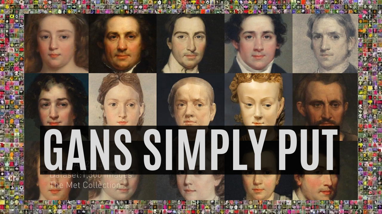 |
Figure 1.2.1, How AI Generates New Images: GANs Put Simply cover, n.d |
This article is a very high level look at the concept of GANs. It uses cute animations that anyone & their pet microbe can understand. In those animations they talk about the generator & the discriminator, using money counterfeiter & police respectfully as analogies.
A Gentle Introduction to Generative Adversarial Networks (GANs)
 |
Figure 1.3.1, A Gentle Introduction to General Adversarial Networks (GANs) cover, n.d |
Don't be fooled by the "gentle" in the title, this is the article that real nerds drool over. There's some use of jargon but they explain it relatively well. It goes into detail on what training even is, how GANs basically train themselves, the model which they use to do it, & even different types of implementation of GANs. I fully recommend giving this a read for anyone that actually enjoyed the article above this.
Comments