task[2]
0344034.
BDCM
.Major Project
::task[2]
task[2]: Project Management
todo:
- Make it
Phase 0: Inspo
pmndrs
I knew I wanted to make a 3D web experience, that merges with 2D & motion graphics. This led me to many fancy pants websites, but all of them seem to derive in some way from something that the pmndrs organisation has put out. I'm not talking just about how they use @react-three/fiber, or something like @react-three/drei, it's a big deal because drei is inherently just a side-effect of all the experiments & effects done by the team themselves.

Figure 1.1.1, 0xca0a's Geist Sans exploration, 28/10/2023
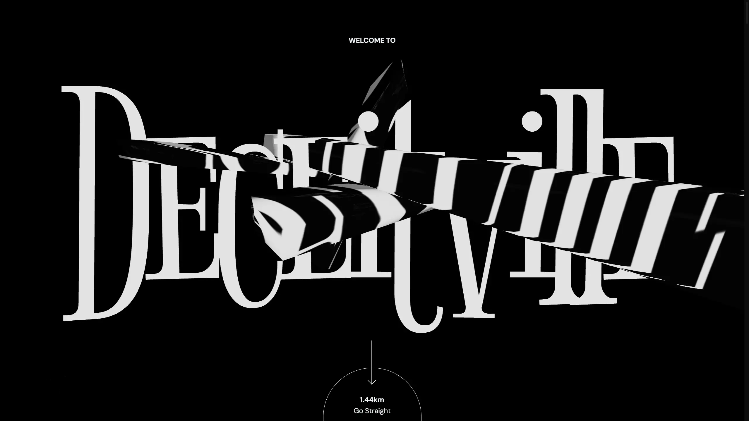
basement.studio
Basement has been at the top of the creative-web game for some time now. With high profile clients such as MrBeast & Ranboo, there really is no way you can look far & not stumble across their work as a web enthusiast. Sometimes I find myself just nerding out over how their work, works. How'd they get their elements to stick? Turns out they don't even use position: sticky. How'd they get their canvas-rendered elements positioned so well inline with other DOM elements? Turns out they're doing some funky stuff that takes from wheel* events ahead of scroll events that usually lag behind. How'd they get their stuff to perform so well? Turns out they're very clever about their use of 3D & models within their sites, usually going something like, "tada... okay that's enough", rather than having it as the emphasis of the site.
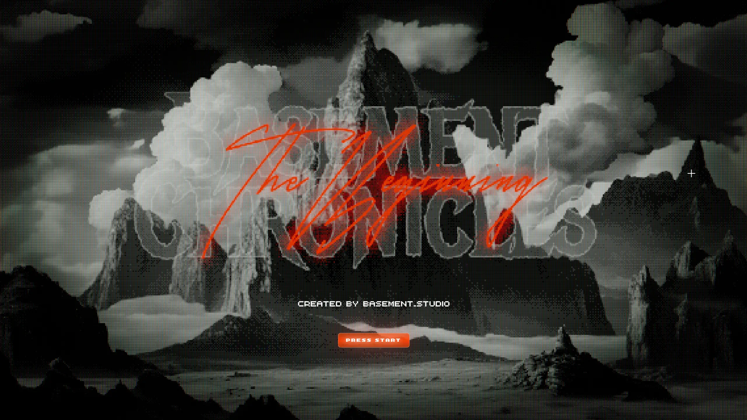
Figure 1.1.2, Basement Chronicles, 2023
Studio Freight
SF is another goliath in the creative web dev space. I've been following them for some time, & was one of the early adopters of Lenis — SF's ex-internal smooth scroll library, with an amazingly pink intro website. With high profile clients such as Valkyrae & Clyde, their pretty face gets remarkably serious & practical when it matters.
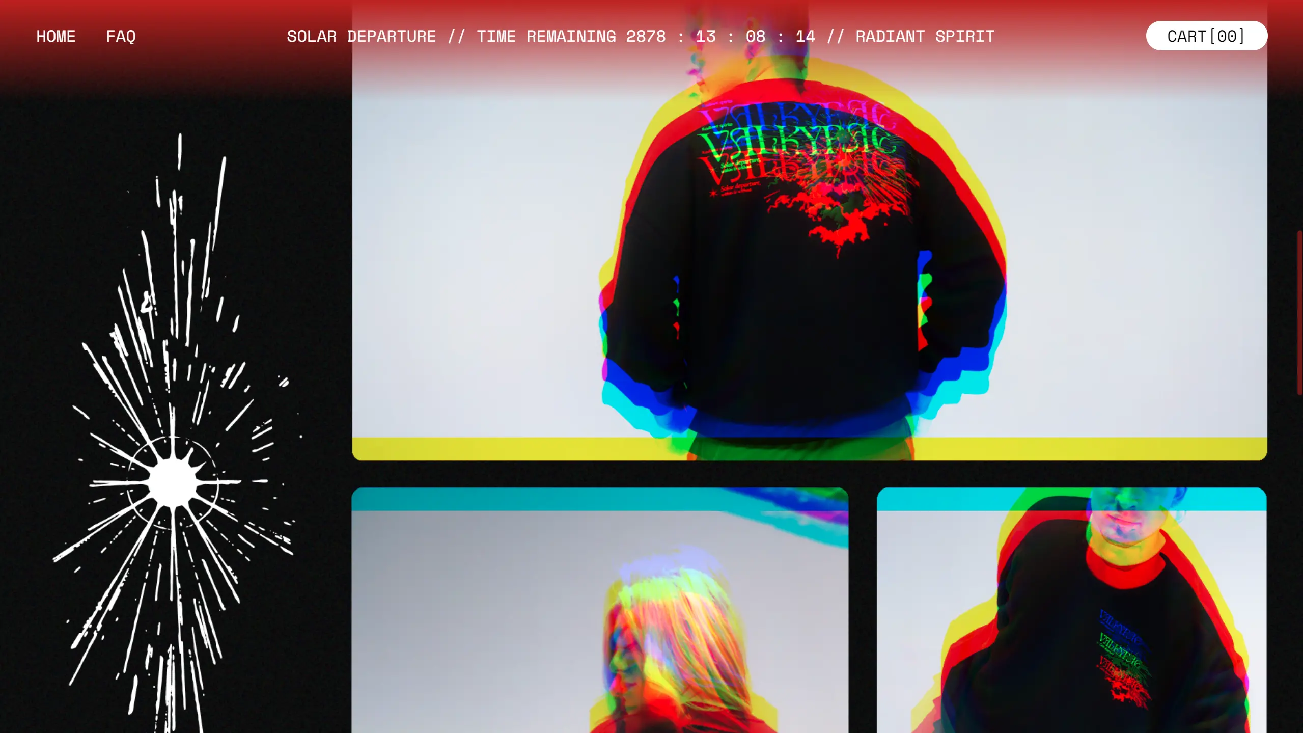
Figure 1.1.3, Scrolling through Valkyrae's shop, 2023
Phase 1: MVP
This post will only be documenting the process of creating the home page.
Levels are, excluded; have mercy, 5840 words is enough.
In the beginning, there was, light. Then, there was an empty @sveltejs/kit project paired with @sxxov/sv, @sxxov/ut, & maic. I already knew that I was going to use a lot of 3D (via THREE), having some experience of it with threlte on another project. However, building upon that would surely be a new challenge for me, as I had a vision — mixed dimension content.
Vision?
This project will practice design-in-code, mostly due to the time pressure, & the fact that I'm working in unknown technology, being able to work directly with its constraints will help tremendously. Come along for both the design & development journey.
3D model search
I hate modelling. Unfortunately, I had a vision to fulfil, & you can't really create 3D visuals without 3D models. Thus, commences the search for usable (free/cheap) models online. Going according to the initial sketch/idea, I needed a grand gate & a village. Finding both weren't difficult, but finding ones I could afford were the challenge of the hour.
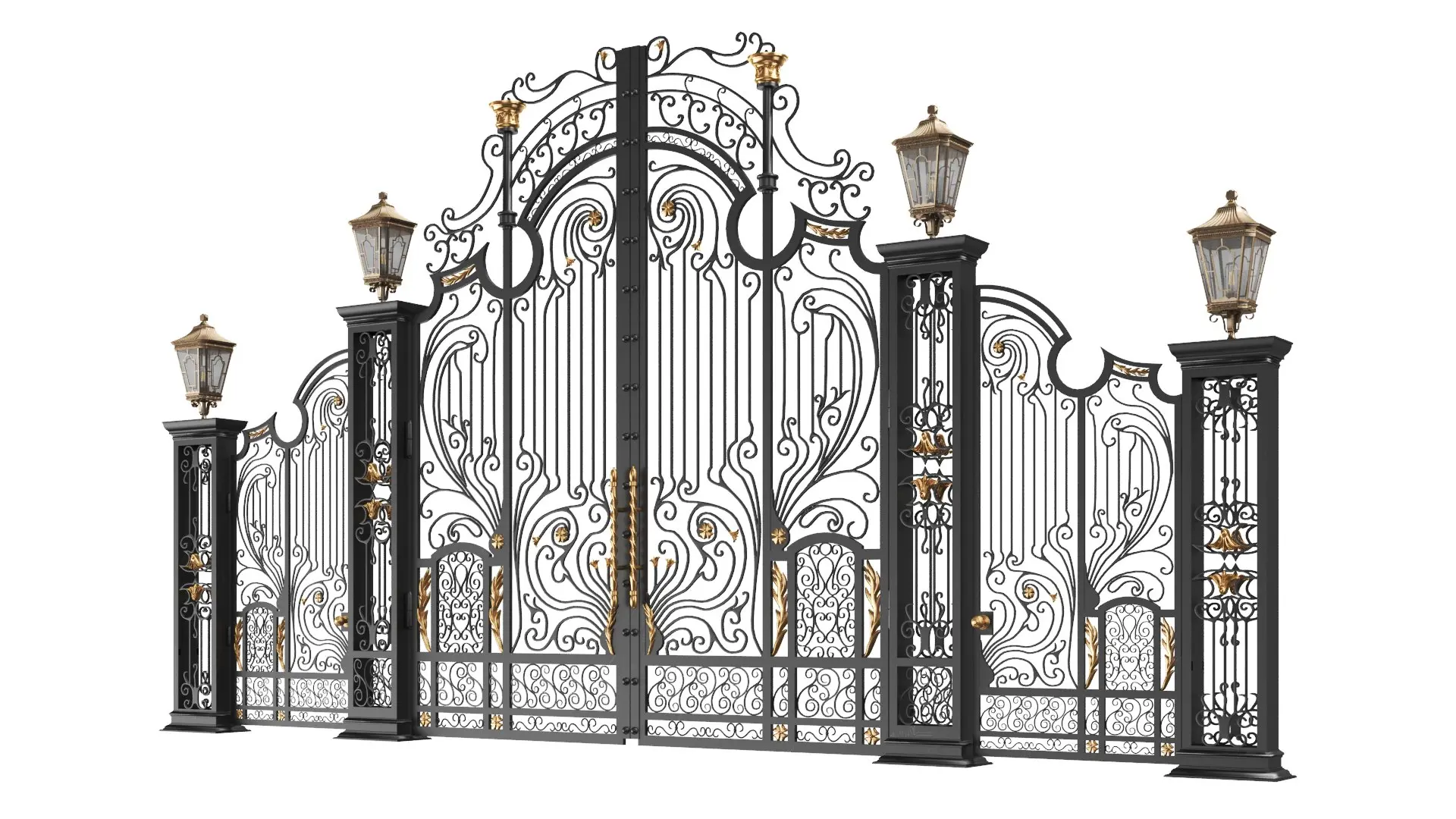
Figure 1.1.4, "Classic Iron Gate 3D model" on TurboSquid, 21/1/2021

Figure 1.1.5, "3D Fantasy Village Pack" on TurboSquid, 18/11/2020
I have since been notified that "3D Fantasy Village Pack" appears to be inspired by Genshin Impact's "Mondstadt", by literally everyone I know that plays Genshin.
Given the 1 month difference between Genshin's release date & the model's upload to TurboSquid, probably yeah.
However, the user korboleev seems to have already been working on these specific set of models previously, & just reskinned them in the wake of Genshin.
Unfortunately however, I was not going to pay $34 USD for a stupid model of a gate, so I shelved that idea. That as well as the fact that the gate was mostly there to act as a click funnel for the user to activate sound. As I thought more about the direction of Deceitville, the gate kinda got in the way (haha), as users' first action & expectation on a website is to scroll, & forcing a click reduced the "free" feeling being on the web, of being able to navigate wherever you wanted, whenever you wanted; I felt the restriction wasn't worth the payoff.
Thus, that leaves us with the budget-Genshin buildings. -$12 USD.
I did also look for other assets to be used, but these just became the main few that acted as the anchor throughout the app.
3D workflow
OK, I have the models, now how do I shove them into the web? THREE's "native" way of consuming 3D models is through a format known as GLTF. It's basically a JSON index of a 3D model, backed by binary for the actual data of meshes, materials, etc. Actually loading a .gltf (the plan-text variant of GLTF) or .glb (the pure-binary variant of GLTF) is a different story though, as these files can get BIG. Even then, I may need to poke & prod into the models to change parts of them at runtime too. As a foundation of basically the rest of the 3D parts of Deceitville, I needed to do some research...
@threlte/gltf
I started out scouring the native solution for threlte — @threlte/gltf. It was, okay. It generated .svelte files from .gltf/.glb models, that simply split them up into threlte components. However, there were some major drawbacks of that approach, namely the monolithic nature & non-modularity of the generated files.
- You had to use them as a unit, & you couldn't pick & choose what you wanted to do what.
- You had to use them as a
sveltecomponent, & you couldn't pass instances of the GLTF around without mounting them. - You couldn't make changes to the file to fix any of these problems without losing them every time a you made changes to the backing GLTF.
- They didn't export their types, so I wouldn't be able to access their children in a type-safe manner (renaming something in Blender could crash things at runtime instead of dev-time).
- They can't be loaded & streamed in individually, the whole
.glbmust be downloaded & uncompressed before JS can start parsing & instantiating them.
@threlte/extras::GLTF, useGltf
Going down a level, threlte also provides a few atomic components & hooks that @threlte/gltf uses. These were basically the same story — non-type-safe, unstreamable, & even slightly worse, because it didn't even provide the supposed improved DX of using a 3D model as a svelte component. It doesn't mean I won't use these later, but they weren't versatile enough as a full-fledged solution.
Taking matters into my own hands
Once again, here we go...
Streaming
A bit of scouring brought me to this StackExchange answer regarding exporting individual objects as separate GLTF files. This solves the streaming part of the equation, as I could now push down the pipe individual chunks of GLTF — glory to HTTP2! However, by default the Blender extension provided didn't offer any support for DRACO or punctual lights. However, you can trivially pass these options into the builtin GLTF exporter, that this extension uses. Hence, hacking them in & changing some defaults, this became the extension that drove the exporting.
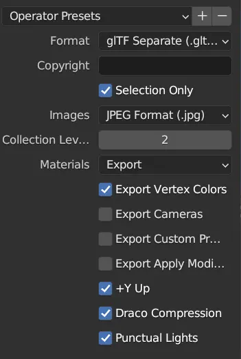 |
Figure 1.1.6, Panel of modified extension, 3/12/2023 |
Type safety & deduping
Beyond exporting, I also needed a way to, at dev-time, ensure I was accessing the correct things. This sounds like a codegen problem! Since I now had individual objects as separate GLTF files, & plain-text GLTFs were just JSON, it was trivial to extract names & types modularly into TypeScript files.
Unfortunately, it was around here that I realised there was tremendous amounts of waste when it came to the bytes that were outputted by the batch GLTF exporter above. It was because, many objects could use the same underlying mesh data, & exporting them separately meant that we needed to bundle every dependency, every single time, for every object. It gave a lot of duplicate files.
The initial idea & implementation was to naïvely associate all objects with the same name, but different number suffix as having the same mesh data. This worked, well enough, but it broke down the moment some one actually named something properly, or when you edited some of the duplicated data. Solving this was not as easy as it seems though, the solution needed to collapse binary data whilst taking account normalised names, writing out all the instances of these meshes to recreate the initial scene.
However, with a lot of precision hair pulling, the final result worked much better than I ever could've imagined.
 |
Figure 1.1.7, Size comparison between DRACO compressed outputs: GLB (left), GLTF separate (middle), processed parts (right), 2/12/2023 |
All that comes from scripts/gltfs-to-parts.mjs, which generates the following files:
gltfs.db.ts: Exports all the individual GLTFs.instances.db.ts: Exports all instances for each GLTF.index.ts: Barrelsgltfs&instances.[name].ts: Basically a.gltffile that integrates withvite's module imports directives to be able to be put anywhere in the project.[name].bin: The relevant binary data that backs each object.[name].jpg: Textures, can be manually replaced with more optimised versions.
Integration into svelte/threlte
Getting back the DX of @threlte/gltf, several part utilities were written up, such as the ≤Part≥ & ≤Parts≥ components that take in the imported props from the index.ts of a processed GLTF & dumps it into the threlte context.
Mixing DOM content with 3D canvas content
The main concept for Deceitville would be mixed DOM elements with 3D content inline with them. I've historically learnt that, this means one single, global canvas for everything to be rendered (browsers are really not great (performant) at compositing multiple canvases together). Since we're using threlte, its main container for things that it renders would be ≤Canvas≥. However, it's designed in a way where it depends on all components mounted as children of ≤Canvas≥. Adding onto that is that not only does ≤Canvas≥ wait for CSR to initialise the canvas element before mounting any children, it also voids out all mounted DOM elements by mounting them under the DOM ≤canvas≥, which basically mean they will only render for users using IE8 & below (which doesn't support ≤canvas≥ at all). I've filed an issue about this, asking the maintainers for mercy, but in the meantime, it's morbin time.
Okay, I'm getting ahead of myself a little here, SSR doesn't come in until a lot later in this story, so let's all huddle around & hear how portaling made this possible in the first place.
Once upon a time, one DOM element liked another DOM element very much, but one of them was stuck in their parents' house. The other DOM element, really wanted to be with them, so they asked a good friend's help in DOM manipulation. Since the DOM element was an only child, they successfully created a little script that targets the parents of the DOM element & commanded every single one of their children to be rehomed. Unfortunately, this meant that they would become the other DOM element's adopted child instead of their significant other. It is very messed up so don't worry about it too much. Stop telling me this is incest & a "bad story".
In technical terms then, a component named ≤AmbientCanvas≥ would mount at the top level of the layout, & everything else would slot under as its children. It would then slot said children under threlte's ≤Canvas≥ & use a svelte action (use:) to reattach them on mount into a sibling portal target.
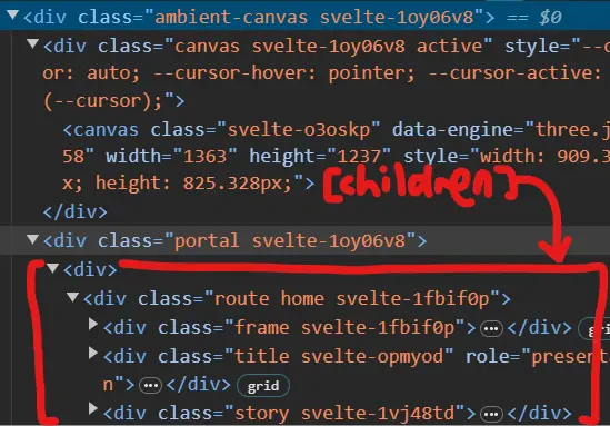 |
Figure 1.1.8, Very insightful diagram about portaling NOT drawn with MOUSE, 3/12/2023 |
Title (attempt #1)
With the most basic building blocks in place, it felt like maybe I could try shipping something that I could show Mr. Razif. The first thing I worked on then, would be the title, I mean how hard could it be? Create text, transform them on scroll, right?
Well, there's a reason why this is annotated "attempt #1", because in this version, I used troika-three-text through @threlte/extras/Text. Which, by default, except for passing in parameters to change the font, the letter spacing, & the size, would produce something like this:
 |
Figure 1.1.9, Recreation of text generated by `troika-three-text`, 3/12/2023 |
Notice the jagged edges & visible non-roundness of geometry. Even if I was okay with that, the text generated came as one single mesh, & if I'd wanted to control the transformations of each single character, I'd need to create a few of them aaaaaaand, do kerning on my own. If you know, you know, but I did it anyways. Not perfectly, but it was done. Adding some scroll linked animations (thank you for @sxxov/ut/map01, past me), & I had a basic title.
 |
Figure 1.1.10, Individually transformed text, 14/9/2023 |
Unfortunately, it was still a bit dull, because you could do exactly this just in the DOM. I really wanted something that showed people that this is not your grandma's HTML5. I thus reached for ol' reliable, optical distortion. Double unfortunately, rendering two cameras with different outputs onto a single canvas is not that easy. There were two approaches I could take:
- Multiple
RenderTargets- Creates a completely separate render pass that can be slotted in wherever during compositing.
- Technically enables a completely separate post-processing sequence.*
- Unmanaged by
threlte, requires our own render loop.
- Multiple
Scenes- Composited over the main renderer's image.
- No post-processing (they remove the alpha channel).
- Managed by
threlte.
Option 1 seemed better for flexibility, as I could then deep fry the title however I wanted, but I could not get it working for the slightest. Thus I went for option 2, which fit my needs & had the benefit of fitting into threlte's render loop & inherit all its creature comforts. With a sufficient amount of headbanging, operation opticAl diStortion compoSition (ASS) was a success.
 |
Figure 1.1.11, Optically distorted title, 14/9/2023 |
Hmm... still a bit dull, ain't it. Still not really clear that this will be Three Dimensional Website. Whilst scouring the web, I came across this example of using @react-three/drei/MeshTransmissionMaterial as well as OKCC Lab's site, & it is very pretty & not something you typically see in real time (refractions are expensive) — so why not let the user control this glass thing that messes with the text in front of them?
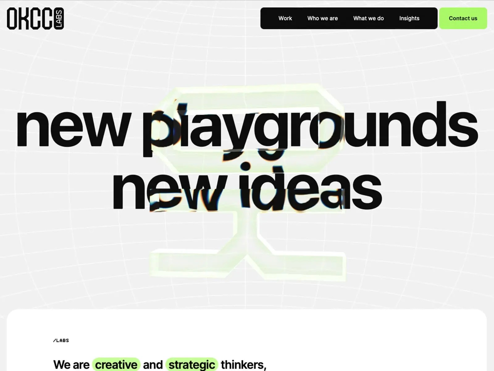 |
Figure 1.1.12, OKCC Labs, n.d. |
I could not get glass to work.
Turns out, the characters are created as alpha-having meshes, & stacking multiple transparent objects is very tricky in WebGL. For now, users will just have to settle for controlling a regularly textured mesh (boohoo).
 |
Figure 1.1.13, A fence post, distorted, following the user's cursor, 19/9/2023 |
Stupid title, I will come back for you.
Story
As seen in the original sketch, there was kind of an explanation right after the title. Very quickly I tried that format of a long string of text. I couldn't really read it, & it was kind of just boring. You could very easily skip past it, as there was no separation between chunks. Hopping into Figma, with the goal of creating something that both required you to pause to read it, & something that was interesting enough for you to stop & read.
 |
Figure 1.1.14, Typographic explorations of laying out the story of Deceitville, 12/9/2023 |
Implementing this was a little bit of a headache though. How the hell do you even lay this out? Well, I decided to go for something like a TailwindCSS/utility class approach, where I would have many, many different type of flexboxes, decided by the combination of classes they had.
Scrolling them sideways was another pickle. Maths!
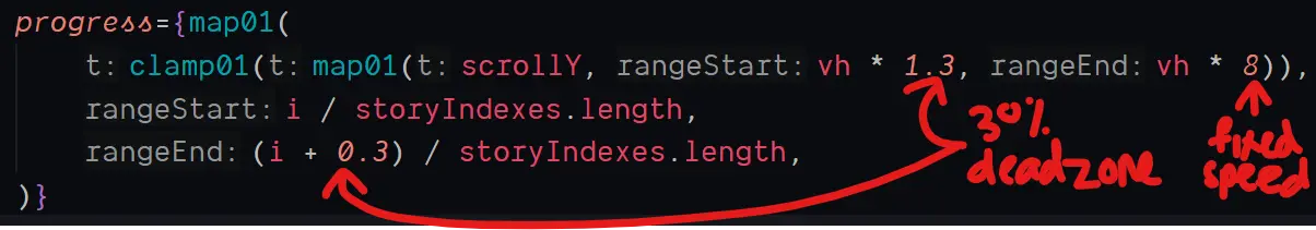 |
Figure 1.1.15, Code excerpt for mapping vertical scrolling to story scrolling, n.d. |
Then, the actual content would just span across a horizontally overflowing ≤div≥, & moved by using a .scrollTo() call.
CSS transform wasn't used because of mobile performance concerns. I've had enough nightmares with those, even though it should work the same as a scrollable container, both operations only happening on the compositor level.
.scrollTo()was used instead of directly mutatingscrollX, asscrollXdoesn't do any batching. Whilst that sounds like at first like a good thing, its performance is usually much worse than.scrollTo()because the browser can't predictively move scrolls. The effect is most visible on mobile (Safari 💀).
Village
I needed a way to entertain users whilst they were exposition dumped on. Deceptive design isn't the most hot & sexy topic on the block. If it was a person, it probably kicked dogs & smelt like garlic. Thus, the 3D streak shall continue.
Taking from "3D Fantasy Village Pack", I wanted the camera to follow a set path as the user scrolled along the site, inspired by this example from THREE themselves.
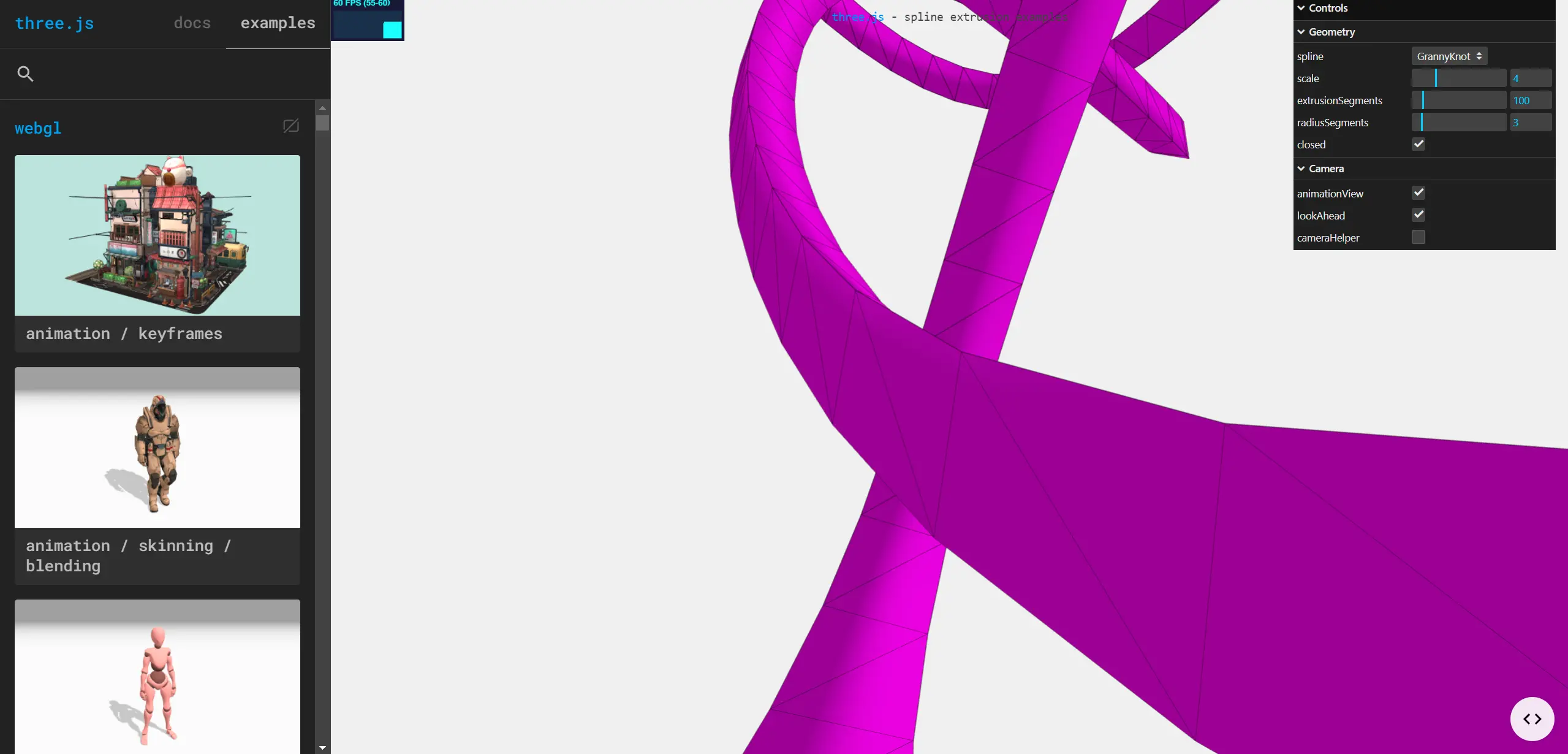 |
Figure 1.1.16, `THREE`'s example of a camera following a spline, n.d. |
Mapping out a route, I kinda just went wherever, doing the cool CGI movie thing & putting the camera super close to the sides of buildings. "This would be temporary", I said confidently (wrong) to myself.
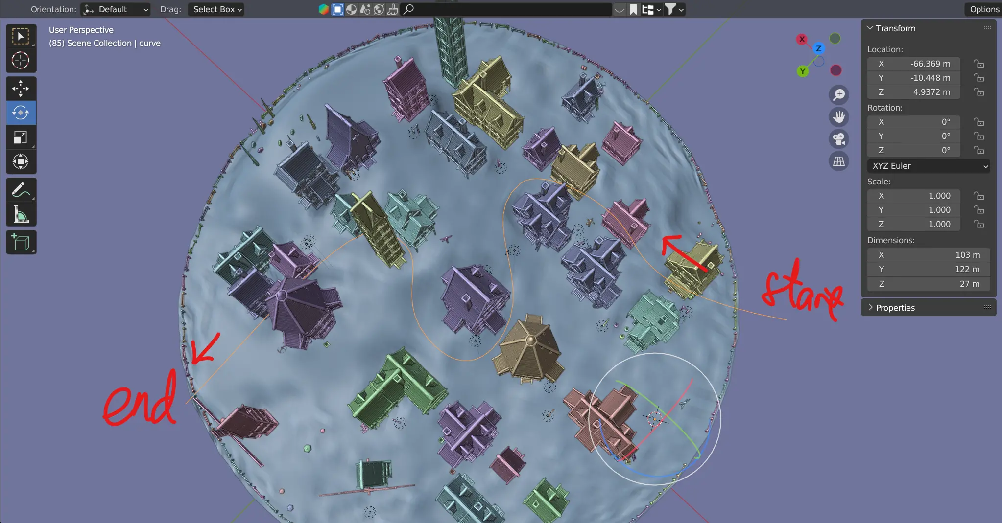 |
Figure 1.1.17, Overview of camera path, 3/12/2023 |
For the scene in THREE, I kinda just, loaded it in with the previously built tools & it just worked. Getting the camera following the points was just a copying exercise from the official example, as well as a little tool to export the path from Blender, as points in JSON to be constructed into a curve in THREE.
I would show you the tool, but I literally cannot find it anymore. It is lost to time. Life is ephemeral.
 |
Figure 1.1.18, Meshes + punctual lights, 21/9/2023 |
Well, these lights look really bad in WebGL, what happens if I get rid of them?
 |
Figure 1.1.19, Meshes only, 21/9/2023 |
Hmm... even worse.
Okay, what if I work with them, maybe a little fog, some reduction in exposure?
 |
Figure 1.1.20, Meshes + punctual lights + fog, 21/9/2023 |
Better, but the lights really slowed my machine down, & they don't even look that great! I maybe need to rethink this.
OK, in the face of a crappy renderer, there really is only one way to work around it, 🎨stylisation🎨. To the EffectComposer!
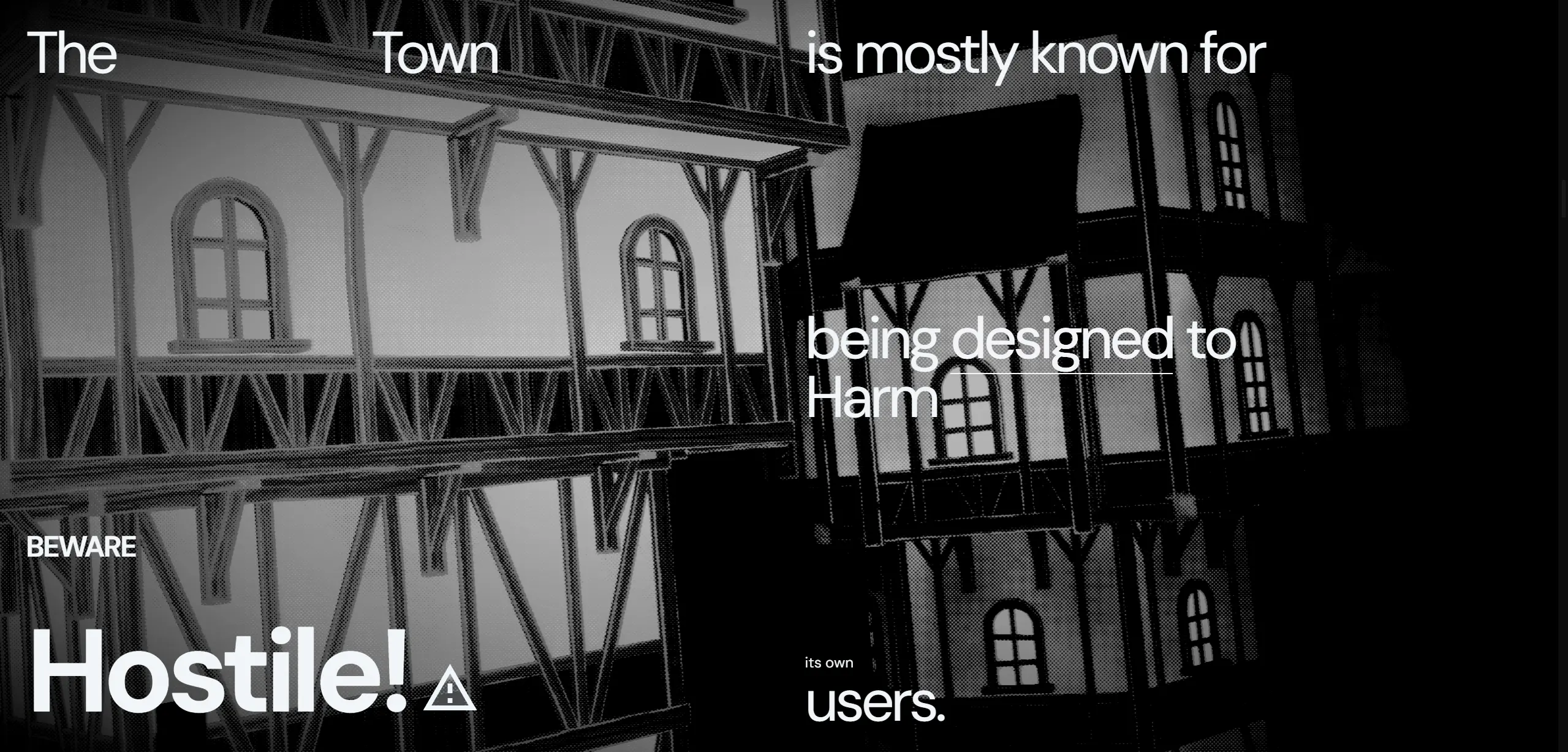 |
Figure 1.1.21, Such noir, much wow, 21/9/2023 |
A mish mash of typical crap, brightness/contrast, hue/saturation, vignette, SMAA (real AA is expensive), bloom, as well as special-er things like a LUT & drei's DotScreenEffect.
In retrospect, this village journey was big in proving the inefficacy of designing before entering a new environment, proving that, at least for this specific project, designing-in-code was very much the correct path. Check out the original vision in Blender:
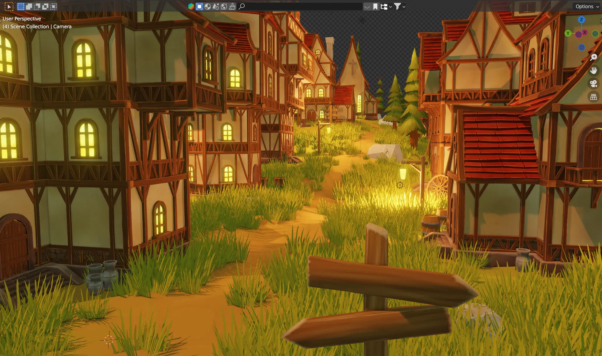 |
Figure 1.1.22, Screenshot of village in Blender, 4/12/2023 |
Such a big difference shadows, localised lighting, & ambient occlusion, makes, compared to THREE's PS2-looking attempt. On the other hand, I would not have been able to reach that stylised look in Blender either, & all of my sketches or renders outside of THREE would immediately be invalidated. THREE has a very specific set of strengths, & after getting over the culture-shock of not being able to plop in a three-point light setup for things to look nice, are definitely workable in order to get a web-accessible 3D experience.
Waze
I needed a way to tell users "Oi, scroll down, dummy!", because the initial screen otherwise doesn't have any indication of further content. Well, in line with the flying/navigating theme, a navigator that points to a direction, that happens to be "down" when you first enter the page, seems like a cheeky enough idea that it might work. Maybe something that would go according a predefined route that was mapped to the scroll position.
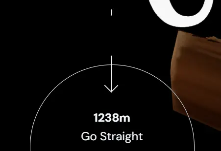 |
Figure 1.1.23, Navigator component, n.d. |
Well, that was exactly what was made, but with the majority of the energy put into the stupid arrows. What happens whenever a direction changes? The arrow pointing down snapping to direction arrow is quite jarring, it should animate to it on the next animation cycle! ...sigh. Hopefully now you'll notice that on the final page.
Welcome to another game of: attention-to-detail or hyperfixation?
Directory
As according to the sketch, I wanted a directory page that would showcase the buildings associated with each level by following the user's mouse. This is not as straightforward as it might sound, especially if slotting in with the other systems. You have to figure out where the mouse is relative to the 3D camera's current view — coordinate hell!
This took a LOT of effort, including a failed attempt at mapping 3D objects 1:1 to DOM elements & many more failed attempts at tinkering with trigonometry. All you need to know, is that eventually, I was able to accurately map a point in screen-space onto a plane on a specified z-coordinate, in world-space.
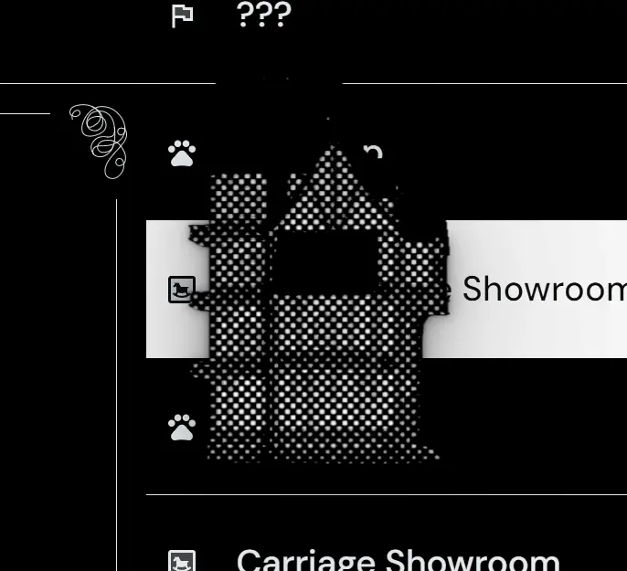 |
Figure 1.1.24, Building following mouse, n.d. |
Besides that, the rest of the UI was pretty straightforward, except for one exception:
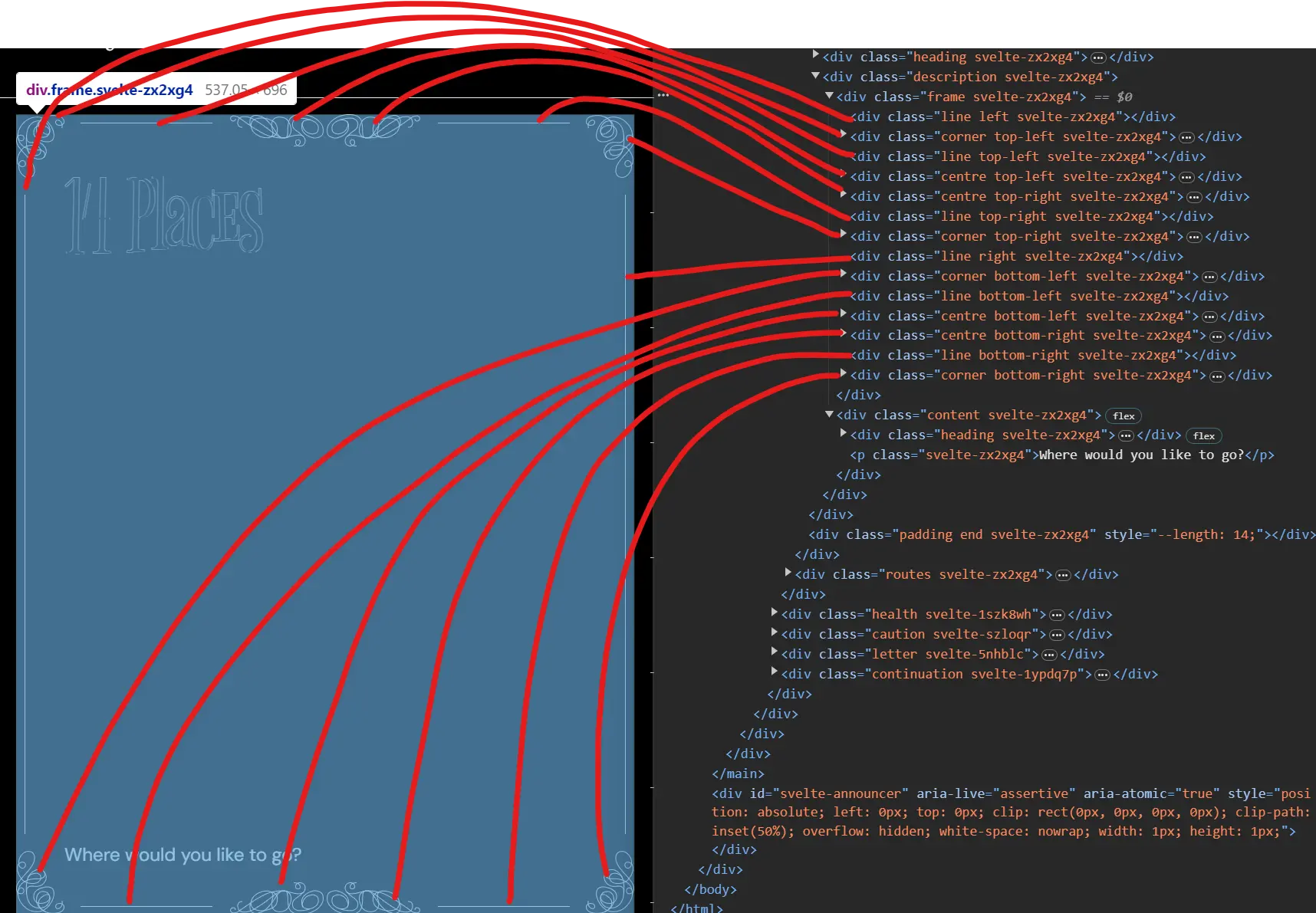 |
Figure 1.1.25, Vanity frame deconstruction, 4/12/2023 |
Yeah that's it. That's all I want to say/show about it. Just know it took WAY too long. Did I mention it's responsive?
Completion/Health
Users need to be able to see how much they've progressed, that's kind of the minimum I can do to call this a game. It was around here where the camera switching situation became serious, because it finally dawned on me that I would have lots of cameras for levels or even parts of levels. The solution? A camera stack! Woohoo Data Structures & Algorithms!!
Camera stack done, I was able to easily switch away from the previous cameras to one that looked at an overview of a very long spinning tower. I call it the kebab scene, but it canonically should be something like De Headquarters. Oh well, problem for future me.
This was the quickest part yet, & I can't decide if it's because all the previous engineering is paying off, or it just kinda sucks in its current form.
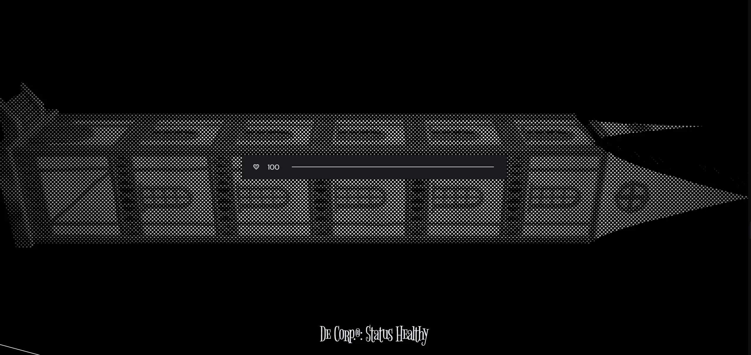 |
Figure 1.1.26, Simple, initial health bar, 1/10/2023 |
Separation between game stuff & info stuff
Beyond this point on the page then, would've been more on the informative content, either giving lore or lessons about deceptive design. Thus I needed kind of an on-theme way to present that. Presenting, my usual overuse of my custom ≤Marquee≥ tag:
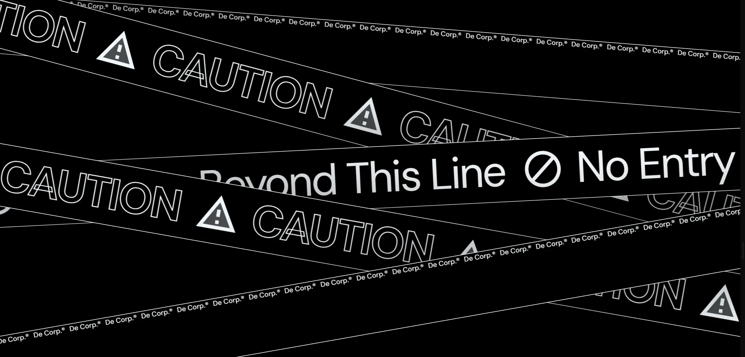 |
Figure 1.1.27, Scrolling caution tape, but it's a static image so you can't see it scroll, womp womp, n.d. |
Explainers
We come to the part where visitors actually need to learn what the hell this is all about. Originally, this was only supposed to be a super simple, summarising redirect to Harry Brignull's Deceptive Designs site, but I felt like it really didn't provide enough context to explain everything around Deceitville.
"Memo"
The LORE, think about the LOREE!!!! Educating people using text, in a normal fashion, would've been TOO boring. So, this section would basically try to explain the sinister tone of deceptive design, whilst keeping a air of mystery & intrigue, through an internal memo from within De Corp. The design of the memo itself was pretty straightforward, graphic design yada yada. So what was this section's hyperfixation? I wanted to make it look like the paper was being shredded as the user scrolled down.
Now, I could've done this properly, use a 3D mesh with the document as the texture, then slice it up in Blender & manipulate the mesh data in THREE, but no way am I going to be able to pull that off, especially because it meant manipulating raw vertex data to achieve a partial waving effect. What I could do instead is do it improperly! Which is why you can see in the final result, that the shadows don't quite match up with the shredding, because how this effect is achieved is purely through HTML & CSS, just with the same ≤div≥ cloned many times, clipped, transformed, & shaded individually.
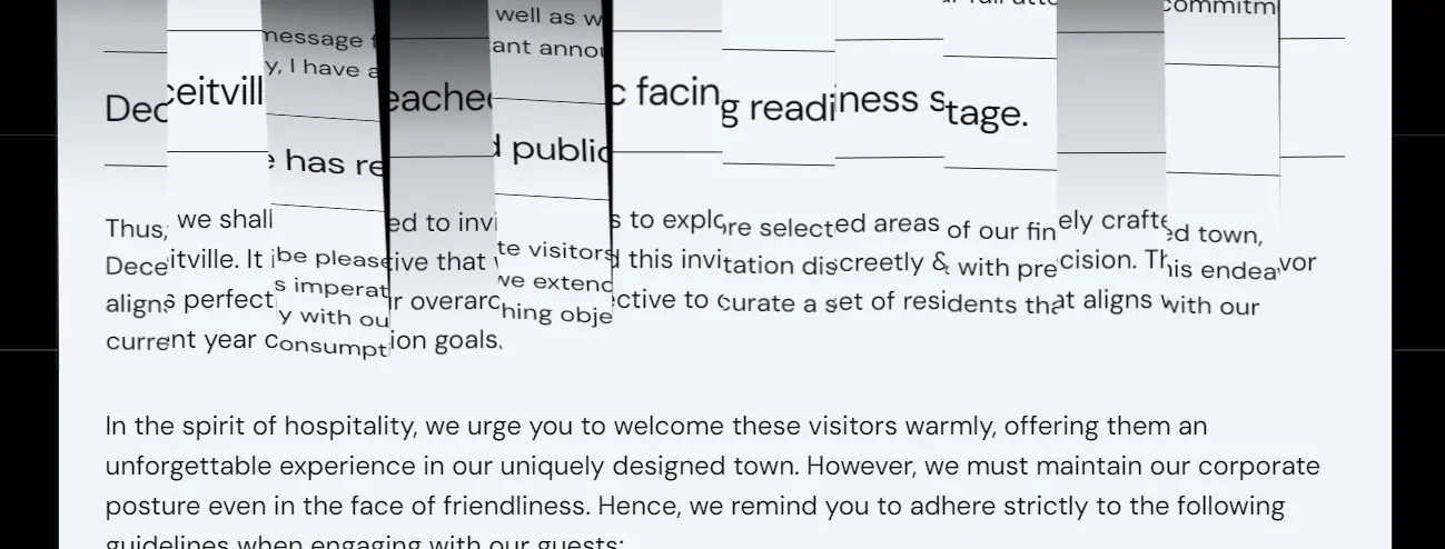 |
Figure 1.1.28, Programmatic shredding (not really), n.d. |
My high school math teacher better be proud of me, cuz the hands coming from sin, cos, & tan are HARD.
"Company Profile"
This section is the spiritual successor of the initial idea of a simple explainer, redirecting to Brignull's stuff. It does exactly that, but includes some more explanation, spoken from the perspective of De Corp.
Contact
I'm gonna be honest, this was basically 100% yanked from my previous client project. So uh, yeah. At least this means it's user-tested?
Footer
Same story, basically 100% yanked. Oh how great it is to write your own custom components!
⚙️ Progress check! de5831693866c3cb9a4f64241fcba4f1d552f5f0
Phase 2: Actually Usable
Various over the wire optimisations
This was the first time Deceitville was online, & it thus exposed quite a bit of jank that needs fixing. The major thing was unifying all the various environments/HDRIs that different components were loading in, & subsequently _decimating_ the resolution of that. You can't really tell now that the entire environment map is just 256x256, but you can tell that initial loading times have improved substantially.
Title (attempt #2)
OK, here we go. The main reason why I came back to the title wasn't actually because I was desperate for the glass effect, it's that the round-trip to fetch the font & then only start creating the title, took too long for the first & largest contentful paint of the site. Replacing the dynamically created text with static meshes enabled me to send everything down the wire together (once again, HTTP2 to the rescue), & drastically increase visual fidelity of the text, too.
The upsides keep on coming, as since I now had full control of the mesh, I could move the anchor points to locations that wasn't the top left, making for much more natural transformations.
The final nail out of the coffin (??) was the fact that I now no longer had any transparent materials, & that I could finally get my glass dream of refractions everywhere when people first open the site!
⚙️ Progress check! a1655f03fd2705dee653ae82d77cf08f4e97dfb5
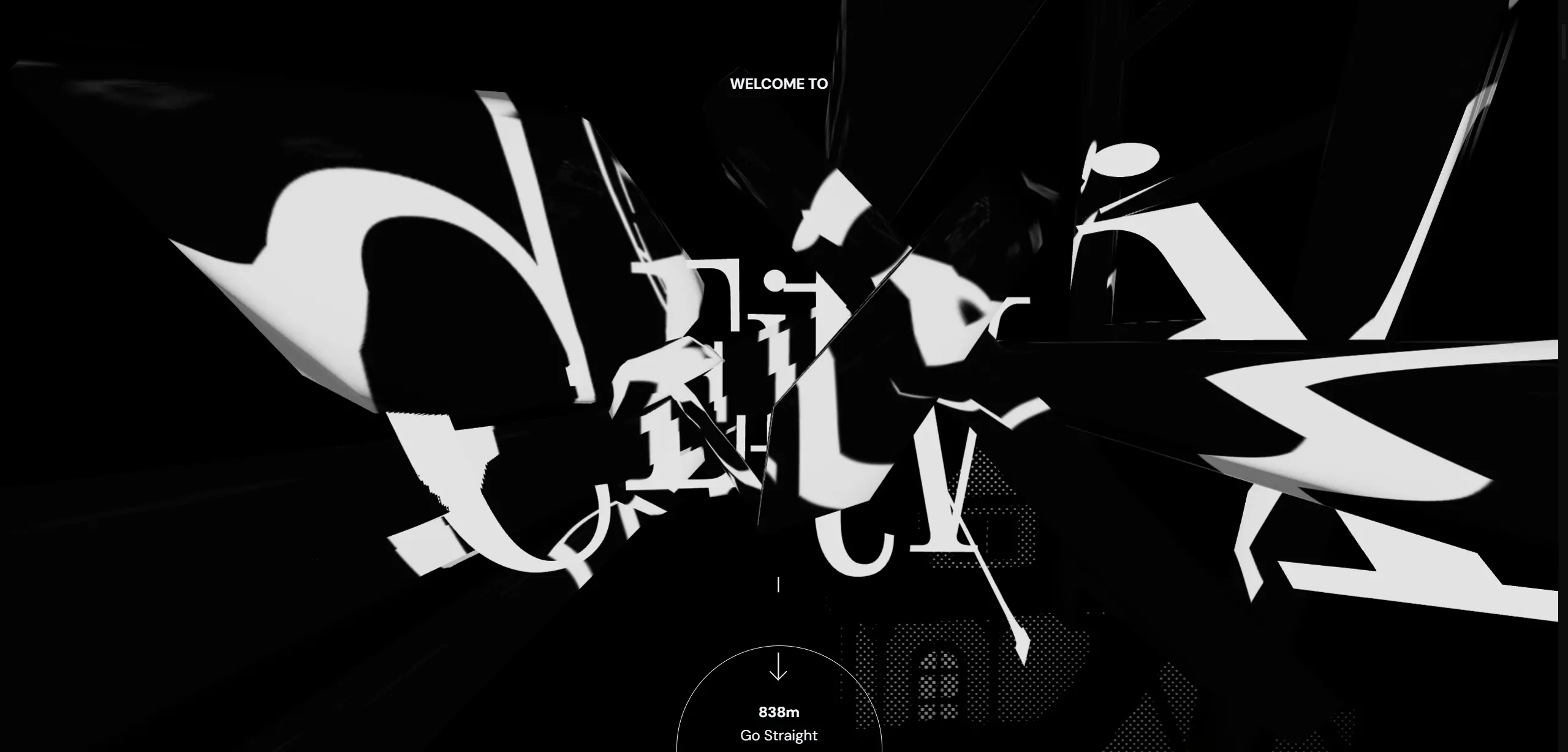 |
Figure 1.1.29, Glass title!, 30/10/2023 |
Server-side Rendering (SSR)
This was the first major overhauling of a combination of systems in Deceitville. Throughout the entire lifespan of the site until now, it only supported Client-side Rendering (CSR), due to the hackery required for DOM components to sit next to threlte components. Now that the site is online, it becomes quite apparent when content is hydrated & a sudden flash of content appears. Even worse, is that the flash's duration is non-deterministic, & it means it can leave users with no useful information on screen for a long time until the main bundle is downloaded & executed.
There are specifically two challenges that need to be solved to achieve idiomatic SSR:
≤AmbientCanvas≥allowing children components to be considered for SSR.- Currently, it swallows all children until the canvas is initialised.
- Proper scroll restoration.
- Currently, every time the page is navigated to, it jumps to the top.
They're more technical, so there's nothing much to detail here without just copying & pasting out the code, but just know it happened, & the site is much faster now.
⚙️ Progress check! b971b8caa0f49c6a899e60ebf7c3fea4a0e54daf
Non-obstructing directory buildings
According to feedback by Mr. Kanan & Ms. Anis, the building in the directory blocking the text is an issue, & hampers usability. Whilst it is definitely true, it's a shame because I really liked that motif. So, I set about coming up with a compromising solution, keeping the pointer control, but getting the actual 3D model render away from the text that it may obscure.
What I came up with was that the model would stay controlled on the Y axis at all times, but would snap over the the description pane when the user's pointer crosses a threshold determined by the width of the text.
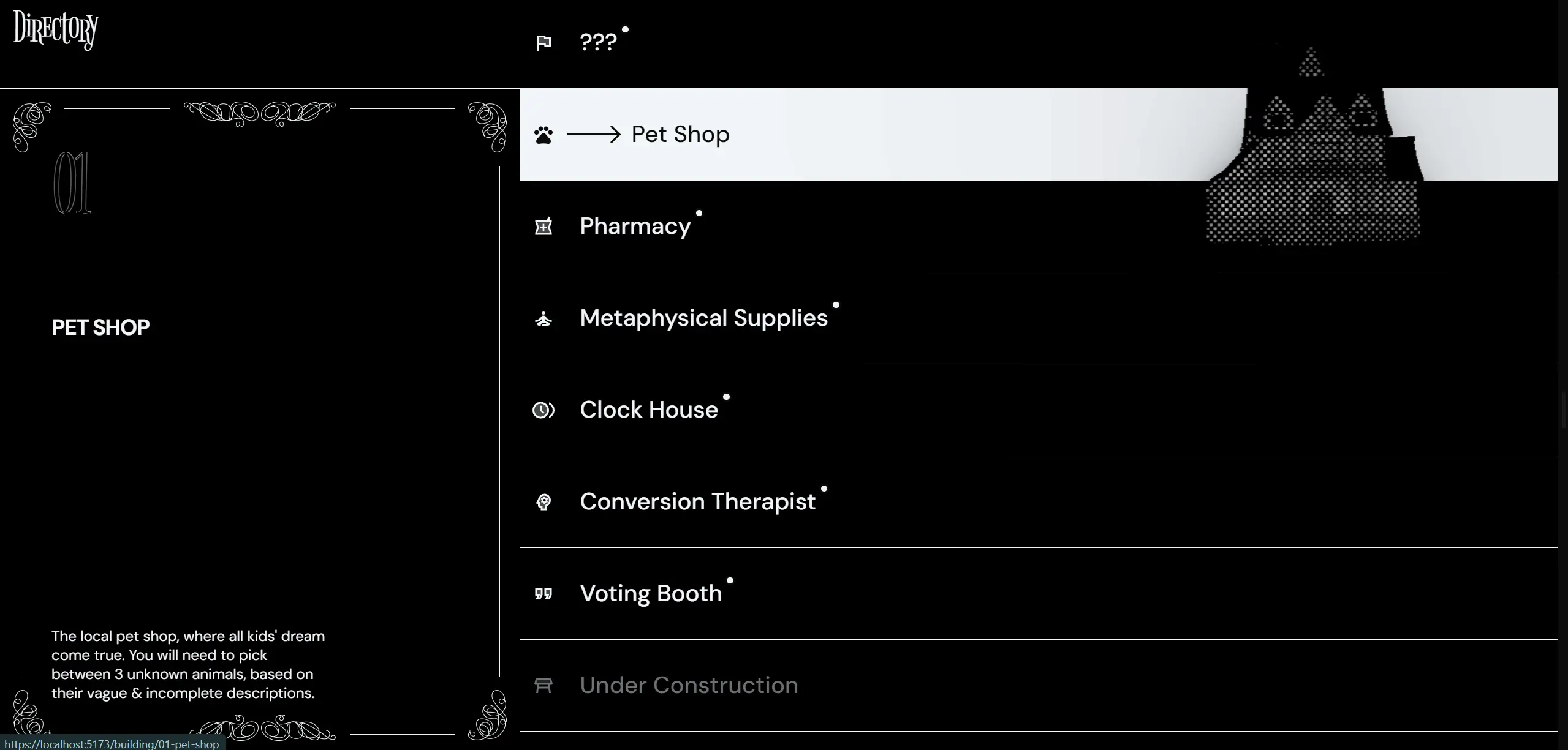 |
Figure 1.1.30, When cursor is not obscuring anything, building is small, & following the cursor, 9/11/2023 |
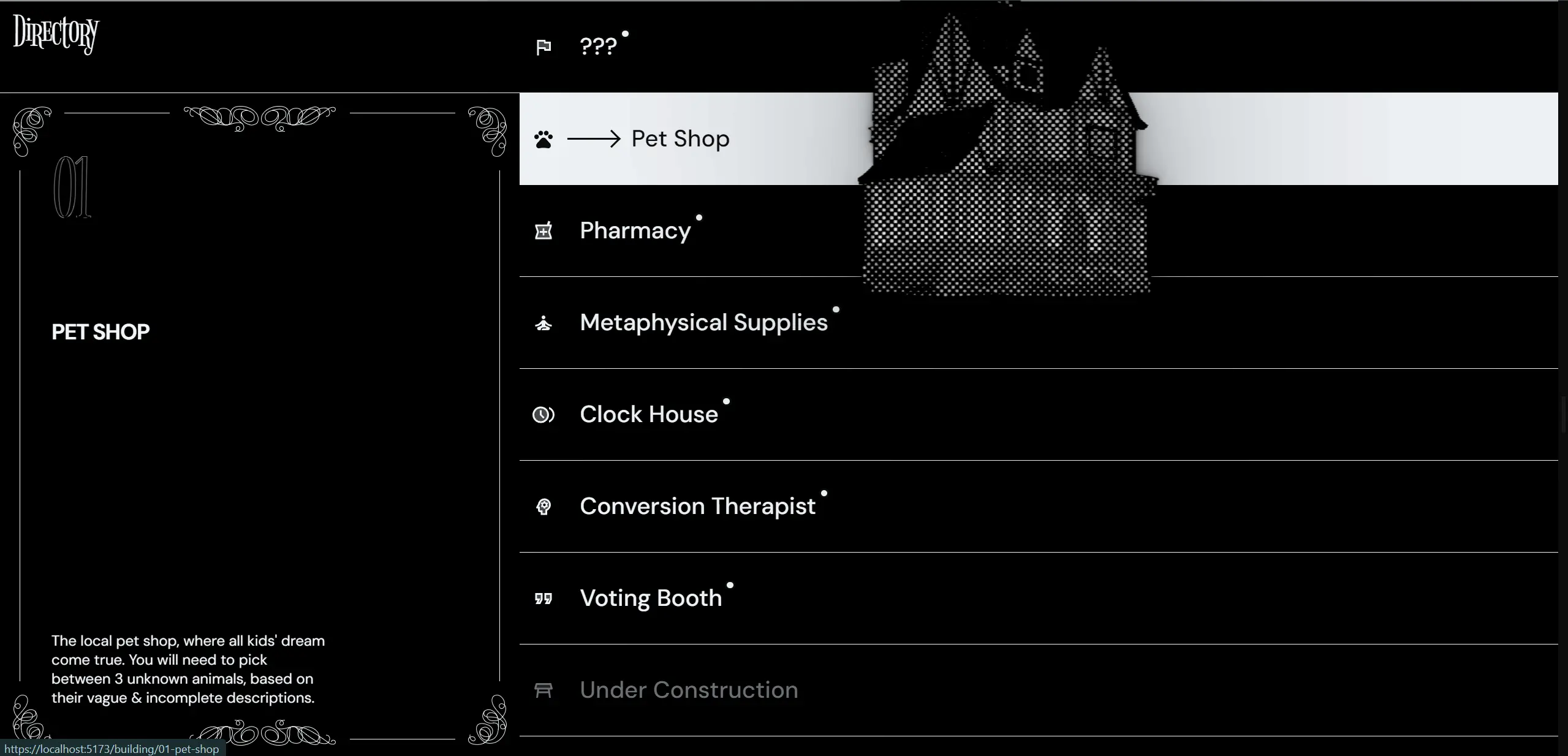 |
Figure 1.1.31, When cursor is riding the threshold of obscuring, building starts to grow, still following the cursor, 9/11/2023 |
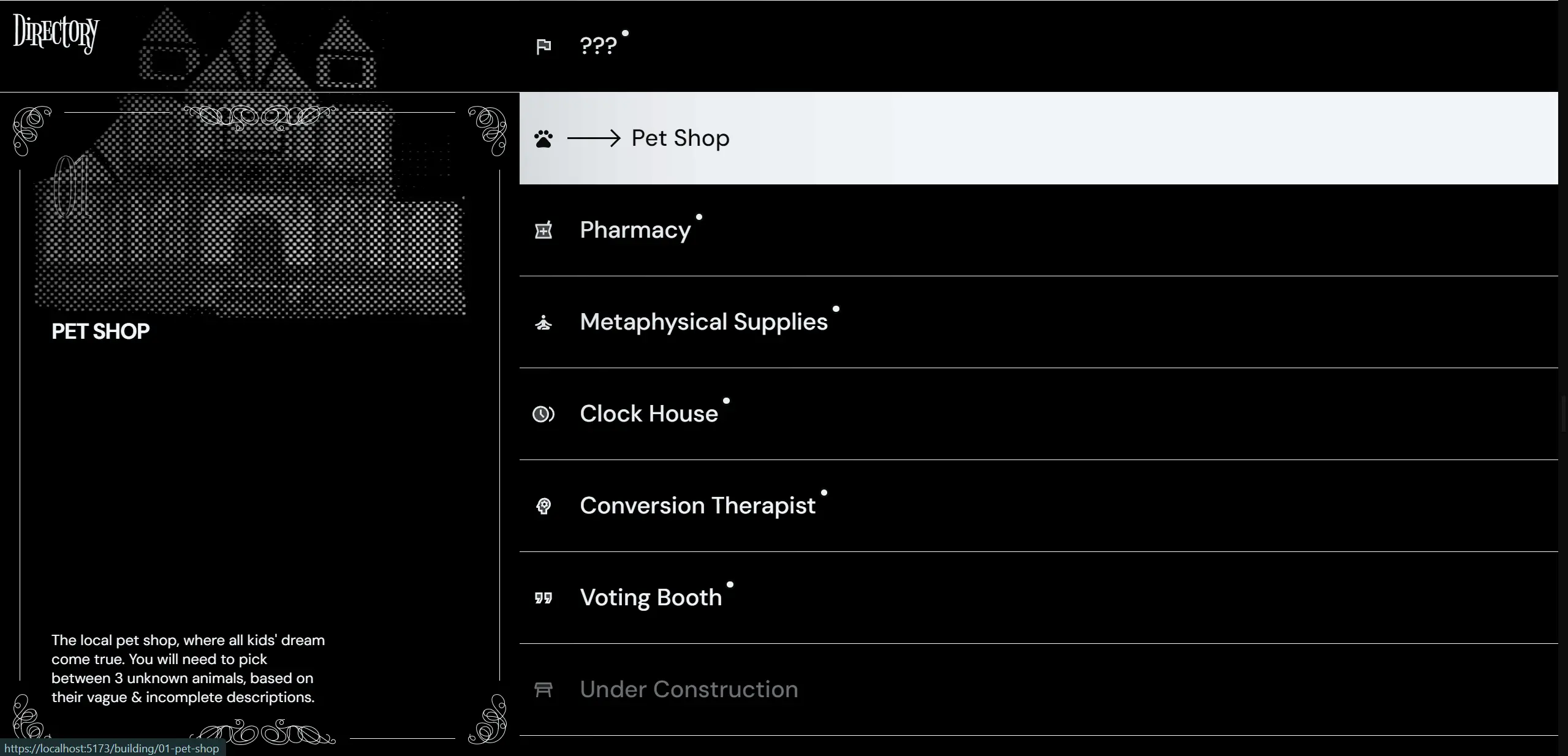 |
Figure 1.1.32, When the cursor is in a position that may obscure text, building moves over & under the pane, following cursor only on Y-axis, 9/11/2023 |
⚙️ Progress check! d0363a3e9ebcd37ef486ec9a285ab6d6d42235cc
The rest of the horse
Basically everything from here on out becomes iterative. Mostly fleshing out levels & sharpening the tools that such a task requires. However, there are a few final improvements.
Phase 3: De-point Points of Contention
Splash loader
Ever since SSR was introduced, the render between first load & hydration was always different enough that it would be distracting. This is especially pronounced when a user refreshed the page when they were mid-way through reading the story, as the scroll-linked horizontal scroll-translating logic wouldn't've loaded in by the time they were looking at something.
Initially I was just gonna let this be, because I was deadly opposed to adding a full page loader; it's not web like! You lose all the hard work the browser engine teams have done, just to get streaming HTML that starts rendering as soon as any discernible HTML tag is found. Alas, eventually I would cave, because the content flash without some sort of transition was distracting enough to be disorienting.
OK, a middle ground then. Create a full page loader, that doesn't actually obscure the browser's loading? Emphasis could then be put into the loading status, instead of attempting to abstract that away. The goal would be to inform the user as transparently as possible, & I think this is as far as we can go without literally printing to the screen the individual files that are coming down the wire.
The thing is, the reason why I got to get away with not implementing this loader for so long, was because I already had a guestimating progress bar up top. I just had to derive from it then, right?
Wrong. it's more complicated than that, because in order to have this loader, I'd need to exit from @sveltejs/kit & vite's compilation all together; I'd be raw-dogging JavaScript! Then passing around when the page has hydrated, along with sniffing from the DOM Pace's (the auto progress bar library) current progress, is a little bit of greasy elbow.
Pace, being a rather old library, also needed some help recognising certain network calls. It didn't track any fetch calls, so I just wrote my little progress source that took from any GLTF that was being loaded, which was basically all the big chunks that mattered anyways.
The shenanigans continued as even the browser engine fought back, where using CSS transitions would cause transform animations to fall back to non-compositor-only mode, & stutter like mad! One, problem, at, a, time.
Eventually though, all this work for you, i-Xcess, you slow little thing, it works.
 |
Figure 1.1.33, Splash loader entry animation, 3/12/2023 |
Refreshed story design
I've never been 100% pleased with the story design, mostly because it felt too, loose & light compared to the busy 3D background. Messing about it, I even contemplated rehashing the entire site's design language just to accommodate such an important piece of the experience. Alas, fortunately, I found a significantly better solution at not much higher of design cost — adding lines everywhere.
OK, it's not as easy as I put it here, but it was basically that. Adding auxiliary UI elements that complement the existing text, along with letting them span all the way to the edge of the viewport like in every other UI element, fits them in perfectly!
 |
Figure 1.1.34, First story pane of refreshed design, 3/12/2023 |
Refreshed completion/health design
Since the beginning, it was always kinda, eh. For the longest time it didn't even work, & when it did, it provided basically zero context to users on why they got that number of "health". A solution should be super clear & direct on why the health is the way that it is, & what they can do next. Maybe something heart-based, & maybe even something that placed "dead" hearts at the start of the row, to indicate that you're actually supposed to chase dead hearts.
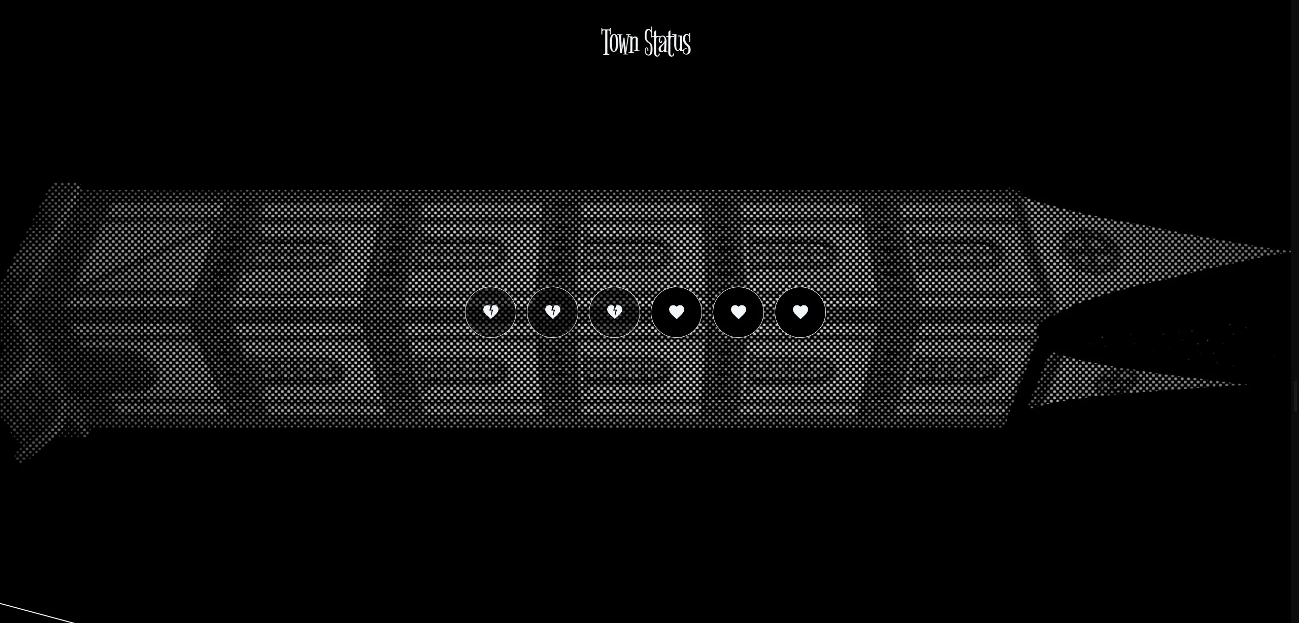 |
Figure 1.1.35, Health/completion with refreshed design, 4/12/2023 |
For even more extra double super clarity, users can also hover over them (or tap on mobile!) to reveal the correlated level & their status. Clicking on them would bring them to said level.
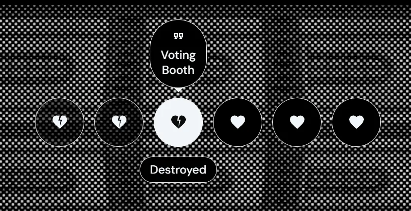 |
Figure 1.1.36, Employers, look! I can do accessible tooltips! 4/12/2023 |
⚙️ Progress check! 291d8ef33896925f442b1c1e8644772b91af958c
refllection:
Congrats, you made it till the end!
🔴 Live site! deceitville.ljs.lol
I'm sure everyone's shaking in their seats waiting for me to ask the important questions — "how did working on this project make you feel?" If you're not tired of the yapping yet, it made me feel quite optimistic for my future in this career path. Whilst yes, it probably isn't healthy to crunch like this for any extended period of time, & whilst yes, I did burn out a few times working on this, every time I come back I can't help but want to improve it further & work on it just a little more. Right now I'm still looking at writing a monkey patch for fetch that will drastically ease the network burden of first time user by batching the same GET requests together across a set interval.
The fact that I made it this far though, is only because of the things I've learnt along the way. I would not have been able to create a site exactly like how it is at the current moment, even 3 days ago. I've learnt countless technical skills & tid-bits, that I don't doubt will make it into my future projects. Maybe ≤AmbientCanvas≥ might just become a reoccurring component?
Besides that, managing the work I have to perform to complete this project & everything else, also was an experience that my teeth got dirty gritting through. I've learnt that I code faster drunk, which is probably not a great learning, but I did also learn how to schedule, balance, & prioritise features I need to get into the site. Like what levels should go in, & ensuring I leave the iterative stuff till the last.
Overall, would I do something like this again? Within the near future? No, I need a holiday. Within the same timeline? No, I need a proper sleep schedule. Eventually? Probably, yeah. As much as it was difficult, I'm looking forward to mingling in this domain for the foreseeable future... or until I get bored of it, whichever comes first.
Hire me & find out.
Comments